The post Verbs, nouns and kanban board structure appeared first on This view of service management....
]]>I have often been called upon to help organizations that have gotten off to a bad start in using kanban. Often, the team lack understanding of the scope of work items and the definitions of workflows. The kanban board structure suffers heavily. What approach have I found useful in making sense of these interrelated concepts? How can such easy more easily improve the kanban board structure?
Too often, the existing situation reflects more of a cargo cult approach to managing the flow of work. The work items consist of a hodge-podge of all sorts of work with all sorts of scopes. Those scopes range from short meetings to months-long projects. What do I often see when the workflows have more detail than To Do / Doing / Done? In such cases, the columns of the board often consist of an incoherent mixture of high-level tasks, minor details, milestones and queues. The cards on the board, too, reflect a lack of effective policies defining card scope.
Some cards are redundant with the workflow columns. For example, there might be a column labeled Review the document and, sure enough, there is also a card entitled Review the document. The breadth of the work varies from large projects to minor activities, such as attending a short coordination meeting, and everything in between.
Such situations often exist because the team had been advised that all of its work should appear on a kanban board. While the team should indeed start to make visible all its work, doing so without any guidance or policies is not a sustainable practice. Thus, seeing cards of all sorts might be normal during the first few weeks that a team works with a board. But the team should quickly evolve from that state. Otherwise, it is not likely to get much benefit from either the board itself or from the kanban method. At worst, the board is apt to die out, being considered as administrative overhead with little added value.
Teams in such situations need quick and simple remedial actions to start making sense of the kanban board. They need clear and easily understandable principles to apply to the use of the board. Only then can teams start using their boards as fundamental tools for the continual improvement of the flow of work.
The analogy of language syntax1 helps to provide this clarity. At the simplest level, I have found it useful to think of the columns on the board as verbs and the cards as nouns.
Let’s take a simple example. Suppose a team’s value stream consists of analyzing, building and testing work items. The columns on the In Progress portion of the board should all be labeled as verb phrases. Thus, the column labels might be Analyze, Build and Test.
Avoid noun phrases, such as Analysis, Construction and Testing, to label the columns. Noun phrases lead to confusion between the action performed and the object upon which that action acts.
Avoid adjectival or adverbial column labels, which tend to reflect the status of work rather than the activity the team performs. Work status should be obvious based on the position of the work item in the relevant column. Trying to express work status in another way is supererogatory. Labeling columns, too, with status information is redundant and leads to confusion about where to place a card. You might object that the classic column names Ready and Done do not obey this rule. I discuss that issue below.
How would we label the columns used to model queues? After all, by definition teams do not actively operate on work in queues. There might be a tendency to label queues with adjectives. Thus, you might see something like Doing Analysis followed by a queue called Analysis Done. I would recommend rather to maintain verb phrases. Thus, the columns would be Analyze and then Wait for Building (assuming the following column is Build). Similarly, we would see Build and then Wait for Testing. Using verb phrases for queues renders clearly why a work item is in the column and what is expected to happen next.
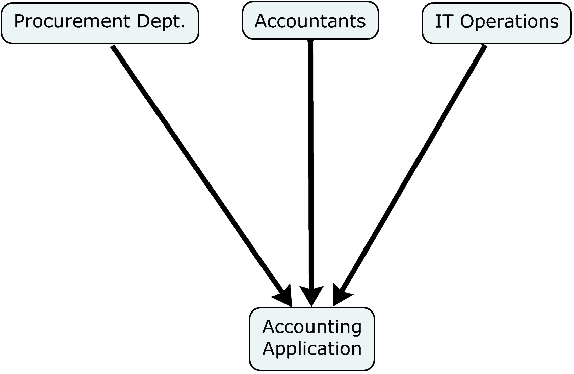
If columns are verbs, then the work items associated with cards are nouns. More particularly, they are the objects of the verbs. If, for example, a column is labeled with the verb Analyze, we need to ask the question, “Analyze what?” The title of a card provides the answer to that question. That same card title answers the questions, “What is waiting for building?” “What is being tested?” and so forth.
Suppose the team does marketing work. It defines a value streams for creating and executing a marketing campaign. Each marketing campaign (a noun) would have its own card. Suppose the team is managing the on-boarding of a new employee. Each new employee would have her or his own card. Suppose a pharmaceutical team manages a clinical trial phase. Each deliverable in the phase would have a corresponding card. Suppose a finance team is preparing a quarterly budget update. Each budget reforecast would have its own card, and so forth.
Using nouns and verbs as described above makes it much easier to think of a workflow or process as a value stream. The noun is the bearer of value. It is the noun whose value is increased incrementally as it passes through the value stream. In the pharmaceutics example, each column of the clinical trial phase leads to a better estimation of the safety and effectiveness of the drug. In the financial example, each column makes the budget reforecast more likely to be accurate. In the marketing example, each column brings the campaign closer to prospective customer apt to buy the company’s product.
The verbs are the successive transformations of the noun that progressively add value. When thinking in such terms, many of the problems to which I alluded above would readily disappear. A card with a label such as “Coordination meeting” would make no sense. One does not “analyze” a coordination meeting as part of the normal workflow (unless that is a feedback loop/retrospective type of workflow). One does not “test” a coordination meeting, etc. Since such activities as coordination are not, by definition, value-adding activities, they should not appear as In Progress columns on the board.
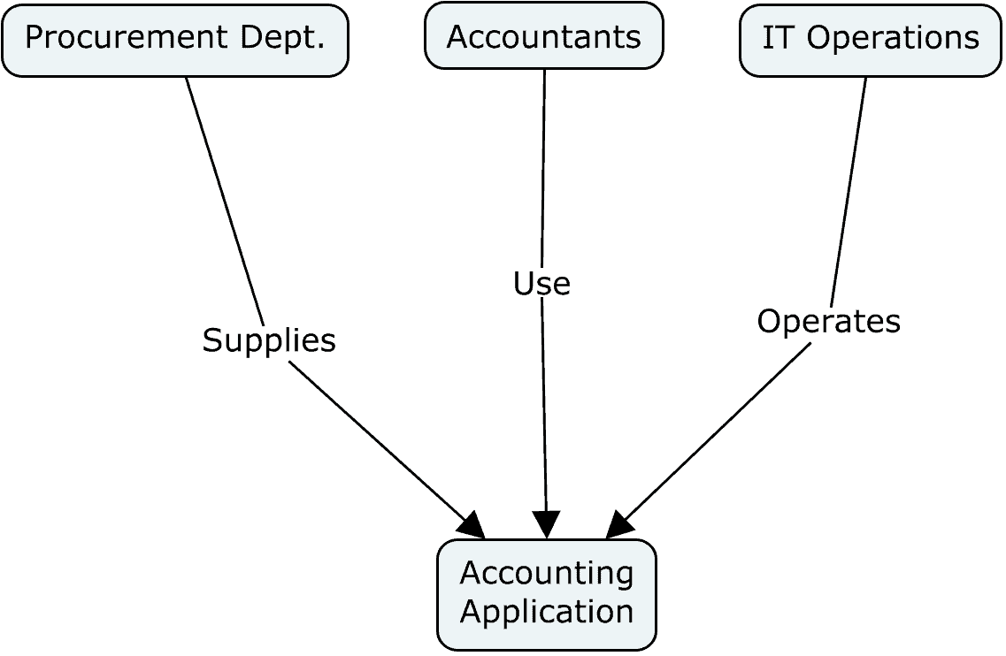
Continuing with the syntactical analogy, what would the subjects of the verbs be? Clearly, the they are the actors performing the value-adding actions that correspond to each column.
These subjects, or actors, are typically visualized as attributes of the individual cards, not as attributes of columns. Why is this so? The simple answer is that making them card attributes considerably enhances the flexibility and adaptability of the board. But let’s take a closer look.
Suppose a team consists of specialists, where each action or column is performed by a distinct function. It might make sense to display the name of that function as the subject of the verb describing the column’s activity. Suppose a team working on a drug’s clinical trial consists of statisticians, programmers, medical writers and data managers. One might imagine that a column called Analyze the Probability might be more precisely labeled as Statistician Analyzes the Probability. Similarly, a column labeled Write the Report might instead be labeled as Medical Writer Writes the Report.
That approach makes little sense if the team consists of generalists, where many team members are capable of performing many different types of work. Indeed, much of the early development of kanban for knowledge work concerned such teams. As a result, the inclusion of function names as the subjects of column labels never gained traction.
In other cases, a team desires a separation of duties rather than being constrained by distinct technical expertise. In such cases, the team decides that the person performing one activity should be someone other than the person performing the previous activity. This approach could add value by avoiding many cognitive biases and by adding the thoughts and experiences of multiple people to the work item. It is also a common practice intended to improve information security
Thus, if you have as succeeding columns Build then Test, it might be desirable that the tester be someone other than the builder. In this case, the identity of the worker—rather than the worker’s function—is important. Normally, worker identity is an attribute of the individual work items, not of the columns.
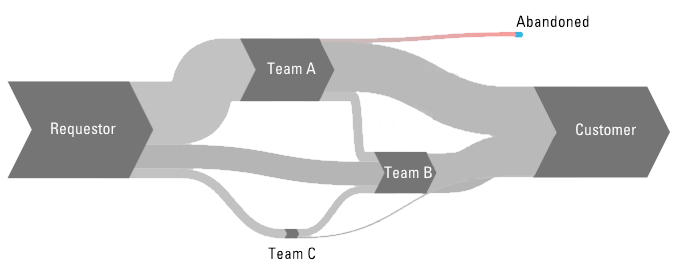
When a board’s workflow starts with “Backlog” and ends with “Done”, the visual presentation gives the impression of the team’s work being isolated and independent of activities elsewhere in the organization. But such isolation is seldom the case. It smacks of edge-of-the-world, flat earth thinking. Rather, the object to which the value stream adds values is delivered to some customer, for the purpose of achieving certain outcomes.
As the value stream mapping exercise makes clear, it is of critical importance for a team to understand who are its suppliers (deliverers of input to the work) and customers (recipients of the output of the work). From the perspective of the enterprise, work is not “done” when it reaches the last column on the last kanban board. Rather, work is in a queue waiting for the next team or customer to make use of that work.
Consequently, it might make sense to rename a column from “Done” to “Wait for Team X to Handle” or something of the sort. This is particularly interesting if a team provides shared services, directing its output to various customers. Rather than a single “Done” column, the team might have multiple sub-columns for its output, depending on who should be receiving the output. A similar principle could be applied to the backlog.
A backlog is not simply a queue in which work items passively await further handling. What is really happening to work items in a backlog? It makes sense to limit the non-value-adding effort to manage items in a backlog. There is nonetheless certain work to be done.
The first task is to decide to which backlog items the team should commit execution. The second task is to make more precise to what the team is committing. I intend to discuss this second task in a future article. In any case, it behooves the team to limit its effort in performing these tasks, given the risk that a work item might never go through the value stream and deliver some value.
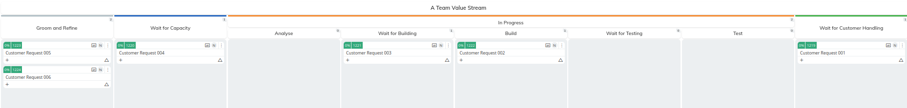
How, then, might we label this column with a verb phrase, rather than as simply as Backlog? Perhaps a more expressive label would be Groom and Commit or Groom and Refine. What are the objects of this verb phrase? They are simply the requests made by customers to do work. As such you may even wish to label the column as Groom and Refine Customer Requests.
This label makes it clear that the team needs to remove from the column any work items it does not intend to perform and refine those work items as a prerequisite to committing to doing the work. It is useful, then, to move to a new column those work items to which the team has committed doing the work.
That new column is a true queue, in the sense that work items simply wait there. No work is done on them. Indeed, the moment any work is done on such a work item, the card should be moved to the first In Progress column. How might we label this column, rather than something like Ready? Following the verb phrase recommendation, perhaps we could label it Wait for Capacity to Handle. Once that capacity is available, the next work item is selected, based on whatever priority policy the team has defined.
By modeling the column labels and card scopes using a language syntax analogy, we can visualize more clearly how work progresses through a value stream. We have simple rules to help teams define workflow structures and the scopes of cards.
In summary, each column is labeled as a verb phrase. Each work item is labeled as a noun phrase. That noun phrase is syntactically the object of the verb phrases in the columns. In certain cases, especially when agility is not very important and teams are composed of specialists, columns may be labeled as sentence fragments, including the name of the function responsible for doing the work in that column. In such cases, the function name would be the subject of the verb.
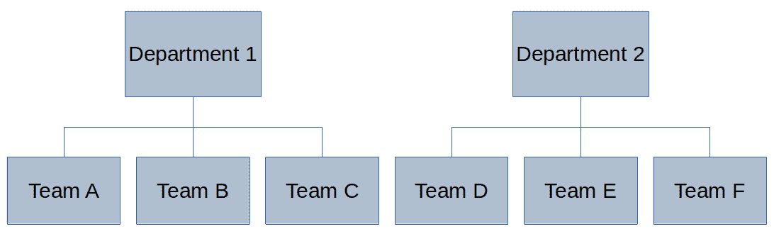
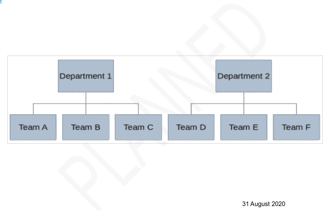
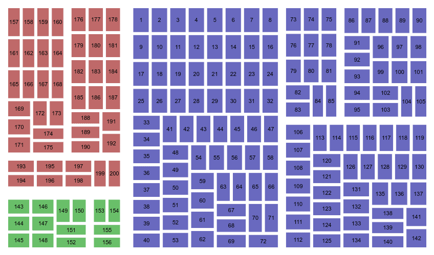
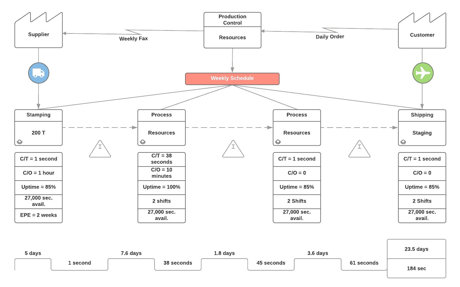
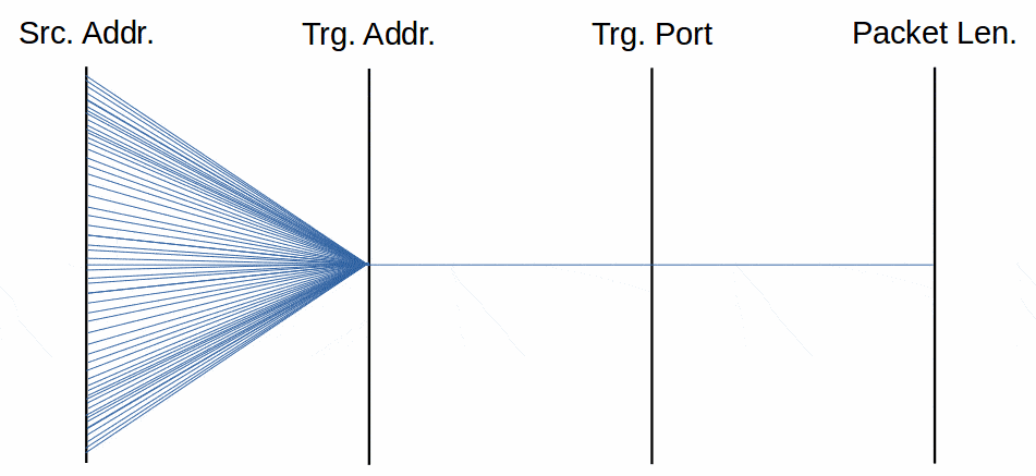
A simple example of a board applying these principles is illustrated below:
The article Verbs, nouns and kanban board structure by Robert S. Falkowitz, including all its contents, is licensed under a Creative Commons Attribution-NonCommercial-ShareAlike 4.0 International License.
Notes:
1 I am aware that the analogy I make in this article to language syntax is meaningful only for many of the Indo-European, Hamito-Semitic and certain other languages. However, such concepts as verb objects and so forth might be meaningless in many other languages. I hope the linguists among the readers will excuse the ethnocentrism.
The post Verbs, nouns and kanban board structure appeared first on This view of service management....
]]>The post The role of the problem manager appeared first on This view of service management....
]]>Before I talk about what I think a problem manager should be doing, we might start by summarizing what problem managers typically do. Of course, every problem manager performs differently a role that each organization defines differently. So, I can only make a list of some of the major responsibilities of problem managers. Rare are the problem managers who perform all these activities.
If an organization has a formal problem management discipline in place, it probably has a problem manager making records of problems and how they are being handled.
The formalism of problem management requires someone to identify problems and when the organization meets the entry and exit criteria for each phase of the problem management value stream. The problem manager generally plays this role, if anyone does.
Since problems often require multiple sets of expertise to resolve, an organization needs a means for identifying who can reasonably contribute to that work and for getting these people to contribute.
Although some problem resolution teams might be self-organizing, many organizations have a culture requiring the presence of a formal meeting chair who calls meetings, fixes meeting agendas, conducts the meeting and often documents what was done and decided during the meeting.
To the extent that an organization has a problem management process that it expects resolvers to follow, the problem manager might be the person who trains those resolvers. Sometimes, the training also includes the use of various problem management tools.
Due to the limited effectiveness of one-off training, the organization might find various follow-up activities useful to develop the maturity of problem resolution over the long term.
Problem management has many close relationships with other disciplines, such as risk management, incident management, change management, inter alia. The managers of these disciplines exchange information, negotiate boundaries, agree on the handling of specific cases and many other little details of the interfaces.
Sometimes, problems just seem to disappear without anyone having done anything explicitly to resolve them. Of course, something did change, but the link of that change to the resolution of the problem was not recognized. So, a problem manager may periodically review the lists of open problems and determine if they still exist.
Problem managers oversee the creation of periodic reports about the health and progress of their discipline, as well as analyses of the aggregated problems being handled.
I wouldn’t ask this question unless I thought something were missing from the typical roles performed by problem managers. Most of the activities described above are non-value-adding activities. Problem resolvers—the people who figure out the causality of a problem and define what should be done to mitigate the problem—perform the real added value of problem management.
OK. A little bit of coordination does indeed help. However, many organizations have a culture that perpetuates control and coordination activities. Is problem management not as effective as you might like? Maybe you need more detailed processes, more training, more policies, more control. In short, more problem managers. A command and control approach to problem management thus dictates such behavior.
I would argue that a good measure of the success of the problem manager may be measured by the decreasing need for the role. There will always be problems. There will always be a need to handle them. But can we find a way to achieve the goals of problem management with less and less input from the problem manager?
As an ad hoc team, a problem resolving group usually has a short life span. What percentage of that life span does the team spend in figuring out how to collaborate and what percentage does it spend in the value-adding work of resolving problems?
In my role as a problem manager, I have frequently seen cases where the strength of personalities in the resolving group determines its working approach. Some people make snap judgements about the causes of a problem and refuse to listen to the contributions of others. Other people have ideas about the problem, but are afraid of appearing foolish should their ideas not pan out. In any case, they might be unwilling to enter into conflict with their outspoken teammates.
In other cases, team members don’t know how to handle uncertainty. Many technicians either believe they know something (with 100% certainty) or they are simply unwilling to commit themselves. In other words, they see no useful ground between 100% sure and not knowing at all. And yet, that is precisely the ground where we almost always find ourselves.
Wouldn’t problem resolution be more efficient if the team’s storming and norming phases could be skipped? Shouldn’t it be possible for an ad hoc team to be performing from the start? I suggest that the problem manager should play a coaching role to develop teaming skills, encourage psychological safety, help people learn how to calibrate their levels of uncertainty and advise on appropriate levels of risk in the problem resolution activities.
Often, existing organizational units have all the skills and authority required to handle a problem from end to end. In such cases, the presence of an external problem manager can be viewed as a form of external interference in the affairs of that organization. And yet, left to their own devices, such organizations often let problems fester until they provoke serious incidents.
Self-organization is the lowest overhead approach to resolving such problems. But teams often have hierarchical managers who dictate their activities and priorities. An organization will not likely transition spontaneously to a self-organizing culture. Thus, a problem manager/coach may usefully nudge organizations in a lower overhead direction.
But is this truly a role for a problem manager? In my view, the most fundamental problem of all—organizational units that perform ineffectively and inefficiently—is indeed matter for a problem manager/coach.
Although many problems may be handled by existing teams, handling other problems may require a consortium of people from multiple organizational units.
Some organizations depend on formal methods to re-assign people temporarily to ad hoc tasks. These cumbersome methods impede the rapid and flexible resolution of problems. Often, teams do not share the same priorities or have conflicts between internal priorities and enterprise priorities. A classic example of reinforcing and rewarding such attitudes and behavior is the use of personal and team bonuses based on achieving personal and team objectives.
Again, such situations are unlikely to change spontaneously. Indeed, I have seen more frequently the reinforcement of the causes of the issues rather than a true improvement. Is the team’s work ineffective? Enforce better compliance with the process! Find a manager who better controls the team! Increase the frequency of audits! Add more validation and approval steps. And so forth.
Instead of such regressive, illogical behavior, a problem manager/coach could play a role in helping diverse teams find a consensus in priorities and develop low-overhead behavior to ensure that people are available to address problems. Organization members should move toward spontaneously volunteering to work on problems rather than waiting for a manager to formulate a request, which is submitted to a resource allocation board and approved by a top level manager with a budget.
I promote a vision of problem managers becoming more like problem coaches. The problem coach’s role is to encourage a culture of behavior to rapidly and flexibly address problems with a minimum of overhead. The more successful the execution of this role, the more the organization becomes capable of spontaneously addressing problems as part of normal work. At the same time, the role of the problem coach becomes less and less needed. Ideally, the problem manager/coach role should tend to wither away.
The article The Role of the Problem Manager by Robert S. Falkowitz, including all its contents, is licensed under a Creative Commons Attribution-NonCommercial-ShareAlike 4.0 International License.
The post The role of the problem manager appeared first on This view of service management....
]]>The post The Three Indicators appeared first on This view of service management....
]]>Using the Kanban method leads us to rethink the indicators of performance and work management. Traditionally, we speak of lead indicators and lag indicators. But neither of these do justice to the essential benefit of Kanban allowing teams to improve how they work while they do the work. Thus, it is useful to speak of a third type of indicator: the along indicator.1
Suppose you are racing down a road in your car and come to an unexpectedly sharp bend. There is danger that you might not safely negotiate the curve.
Lead indicator: When you get into the car, your passenger says you should not drive too fast. You risk not being able to react in time to unpredictable conditions in the road. But, since your passenger is always nagging you about your driving, you may or may not pay attention.
Along indicator: While you enter the curve, your passenger shouts “Slow down!”. If your reaction time is sufficient and the road is not too slippery, you brake enough to safely negotiate the bend.
Lag indicator: The police report about yet another fatal accident at that bend concluded that the car was going too fast. As a result, they had a large sign erected near the start of the bend saying “DANGEROUS CURVE AHEAD. SLOW DOWN!” Alas, that sign will bring neither the driver nor the passenger back to life.
The usefulness of the along indicator may be brought into relief by looking first at indicators used in the scrum method. Consider the sprint during which the team executes its value stream (or process) multiple times. Lead indicators are measured before the start of a sprint. Lag indicators are measured after the end of a sprint. As we shall see, I think it useful to speak of three indicators: lead, lag, along.
The story points associated with user stories exemplifies the lead indicator. Estimating story points provides an indicator of how much work should be planned for a sprint. On the other hand, velocity might exemplify a lag indicator, measuring the user stories the team completes during the sprint.
Lead indicators supposedly indicate how well an organization will likely perform. However, our VUCA world can severely limit the usefulness of such indicators. We make decisions using lead indicators as input, then perform actions based on those decisions. So often, the volatility of circumstances and the uncertainty of the lead indicators make those indicators less useful than desired. Lead indicators offer no guidance in addressing those unexpected changes that occur while the work is being done.
Wer nicht von dreitausend Jahren
Sich weiß Rechenschaft zu geben,
Bleib im Dunkeln unerfahren,
Mag von Tag zu Tage leben.
He who cannot draw on three thousand years is living in the dark from hand to mouth.
-Johann Wolfgang von Goethe
Lag indicators have the accuracy of 20-20 hindsight. Well, they do if the data selection is not too biased. And the calculation algorithm must be correct. And that algorithm must be applied correctly. And the indicator should be part of a balanced decision-making system.
As systems become more complex, consequently, deciders find it more difficult to predict the results of any change. Lag indicators reinforce the illusion that a change in the recent past causes the current state of a system. Such illusions may lead to Bermuda triangle-type phenomena.
The idea that the future is unpredictable is undermined every day by the ease with which the past is explained.
-Daniel Kahnemann
Lag indicators might be useful if teams exploit them in a PDCA-style improvement cycle:
For some, improvers are always at least one cycle behind when they choose improvements based on lag indicators. If the work done in step 1 (above) has unsatisfactory results, lag indicators come too late to prevent the problem in the current process cycle. Using lag indicators to make decisions about the next cycle of work faces the same VUCA issues as lead indicators. Such use of indicators reminds us of the phenomenon of the general always fighting the last war.
Often, a lag indicator aggregates multiple measurements of multiple cycles of work. Such aggregation increases even more the lag between the activities measured and the supposed improvements based on those measurements.
Carpe diem quam minimum credula postero.
Seize today and put as little trust as you can in the morrow.
-Quintus Horatius Flaccus
So, the question is whether we can find indicators that help us make decisions while work is being done. Can we make a difference in performance of the current process cycle, given the current circumstances, not the predicted circumstances in the future? This is where the Kanban method shines.
Take the example of cycle time, a typical lag indicator. More often than not, we seek to reduce mean cycle time for a given type of work. Kanban provides us with visual indicators of the current conditions that slow cycle time:
By themselves, such indicators do nothing to improve performance. Improvement might come when those indicators are input to a cadence of reviews, decisions and actions. Certain of these cadences are along cadences, whereas others are lag cadences.
The daily team meeting and any immediate follow-up actions exemplify the along cadence. They typically address the issue of blocked work items. Or certain bottlenecks might be addressed by an immediate re-balancing of how the team uses its resources.
But suppose you need to address a bottleneck by changing a team’s quantity of resources or by changing the value stream. Indicators aggregated over time support such decisions. A monthly or even quarterly cadence of such decisions addresses these aggregated indicators. While “number of days blocked for a single work item” might be an along indicator, “mean number of days blocked during the past month for all work items” might be a lag indicator.
Note that aggregation does not, by itself, determine whether an indicator is lag or along. For example, traditional project management measures whether a single project is on time and within budget, both classic lag indicators. And both are measured too late to make any difference for the project concerned. They remain lag indicators when aggregated.
The astute reader will have noticed that along indicators are measured after one or more events occur, like lag indicators. Technically, this is true. The difference between a lag indicator and a alonge indicator lay in the granularity of the work we measure. A alonge indicator is useful only if the cycle time is significantly longer than the time to measure the indicator and react to the measurement.
Let’s return to the analogy I provided at the start of this article.
Lead indicator: The scope of the indicator is too broad. It refers to your driving in general or to the entire trip. The indicator is not specifically tailored to the event of approaching a sharp bend in the road. Indeed, neither of you may have been thinking about the risk of unexpected sharp bends.
Along indicator: The indicator is tailored to the specific segment of the road on which you find yourself. It is communicated in such a way that the action to take is unmistakable and needs to be immediate.
Lag indicator: Like the along indicator, it concerns only the immediate segment of the road. It might have some impact on the behavior of future drivers. But it comes too late the mitigate the current situation. Indeed, prudent drivers or slow drivers might end up completely ignoring the sign. If one day the driver is in a particular hurry, the sign might have no impact.
Management methods promoting agility encourage patterns of behavior enabling along indicators. These methods emphasize the value of adapting the granularity of work items. When properly defined, a work item is sufficiently large to output something useful to clients while keeping the administrative overhead low. It is sufficiently small to be measurable with along indicators and to allow for changes in direction with a minimum of lost effort. At the same time, whether the work item is completed successfully or not, it is of a size the encourages learning from work experience.
I hope this discussion encourages you to seek out along indicators and make the three indicators—lead, lag, along—part of your continual improvement efforts.
The article The Three Indicators by Robert S. Falkowitz, including all its contents, is licensed under a Creative Commons Attribution-NonCommercial-ShareAlike 4.0 International License.
Unless otherwise indicated here, the diagrams are the work of the author.
Speedometer: By Bluescan sv.wiki – Own work, Public Domain, https://commons.wikimedia.org/w/index.php?curid=3457127
Figs. 1-3: The embedded image of the protractor is drawn from Scientif38 – Own work, CC0, https://commons.wikimedia.org/w/index.php?curid=12811448
1 In using the term “along” I attempt to preserve the alliteration of “lag” and “lead”. Terms like “while” and “during” are less happy. Other sources speak of “coincident indicators” (for example, https://www.investopedia.com/terms/c/coincidentindicator.asp). I hardly wish to give the impression that such indicators are coincidental.
The post The Three Indicators appeared first on This view of service management....
]]>The post Visualization of Configurations appeared first on This view of service management....
]]>In this article, I will delve into some of the issues associated with visualizing the configurations of systems.
As with many other disciplines in service management, the use of visualizations in configuration management can be problematic. I hope to highlight some of these issues with a view toward:
Many IT organizations have a high opinion of tools providing visualizations of configuration information. One organization with which I worked 15 years ago used this capability to justify choosing a particular ITSM tool. I was not surprised, however, when they never used that capability as part of their configuration management work. It was a good example of an excitement factor in a product or even a reverse quality. But why was this so? What qualities should visualizations have for them to become performance factors in managing configurations?
In sum, the configuration visualizations I will discuss here document only the structure of a system. They do not document the activities of managing that system or even the activities of managing the system’s structure. However, configuration visualizations generally document structures from the perspective of only one, or perhaps a few, functions of the system.
Often, we wish to know the configuration of a system in the current tense. How is the system configured now? People changing systems also want to know the future tense of the configuration. After a change will be made, what will the configuration look like? (Such configurations might be understood as imperatives rather than futures since changes often have unexpected or undesired results.) Part of the diagnosis of a problem involves understanding how a system was configured in the past. Sometimes the diagnostician wishes to know the past perfect (aspect) configuration. This aspect might show how the system was configured at an instant in the past (perhaps as part of an incident). Other times the configuration stakeholder needs to know the past imperfect configuration—the configuration during a continuous period in the past. One might also consider intentionally temporary configurations, often as part of a transitional phase in a series of changes.
The above examples mainly concern the indicative mood. Planners of potential changes also take interest in the conditional mood. “If we make such and such a change, what would the resulting configuration look like.” Configuration controllers need to distinguish between the indicative—what is the current configuration—and what the current configuration should be. Architects might establish jussive principles—principles that the organization expects every configuration to follow. Finally, strategists and high-level architects concern themselves with the subjunctive, presumptive or optative moods. “If we were to adopt the following principles or strategies, what might the resulting configuration look like?” As often as not, such hypotheses serve to discredit a certain approach
I suggest here how intelligent visualization tools might express the various tenses and moods described above.
Analysts often wish to compare two configurations of the same system, differing by tense or mood. Animation provides an intuitive way to achieve this by highlighting the transitions between states. For example, a visualization might have a timeline with a draggable pointer. The viewer drags the pointer to the desired date (past, present or future) and the tool updates the configuration accordingly.
If the visualization depicts a small number of changes to a system, animating each change separately makes the nature of the change more visible (see Fig. 3).
Fig. 3: An example of an animated change to a server cluster. Animation makes visible each change (namely, the new servers and their connection to the load balancer).
Animation may be useful but only under various conditions. First, the elements that change must be visually distinct. For example, visualization viewers might have great difficulty perceiving the change from IP address 2001:171b:226b:19c0:740a:b0c7:faee:4fae to 2001:171b:226b:19c0:740a:b0c7:faee:4fee. The tool might mitigate this issue by highlighting changes For example, the visualization designer might depict the background of changed elements using a contrasting color.
Second, a stable, unchanging visual context should surround the elements that do change. Lacking this stability, the viewer might have great difficulty visualizing what has changed.
Third, the layout of the elements should be stable (excepting those that change, of course). For example, if two new elements replace a single element in the upper right corner of a visualization, those new elements should also be in the upper right corner. Tools automating the layout of elements using a force-directed placement algorithm might not respect this constraint. Such algorithms intend to position the elements and their links in the most legible way.
For example, they might attempt to make all nodes equidistant and minimize the number of crossed links. However, if the change involves a significant increase or decrease in the number or size of elements, such algorithms might radically change the layout. The change in layout makes it difficult to perceive the change. Allowing for very slow animation might mitigate this issue.
See also Fig. 8.
Visualization viewers can easily detect the saturation, or vividness, of color (although certain people might have difficulty seeing colors). We might assign different levels of saturation to different tenses or moods (see Figs. 5–7). Of course, such a convention would require training to be correctly understood.
Used in conjunction with animation, though, the change in saturation would both highlight the change and be intuitively obvious (Fig. 8).
Fig. 8: An example of combining animation and color saturation to indicate a change in configuration tense. The unsaturated color indicates a future configuration. Of course, the animation could be more sophisticated but would be labor-intensive and its creation very hard to automate.
Designers might use many other attributes of color to indicate different moods or tenses. However, we already use most of these attributes for various other purposes. Using such attributes as hue, which often indicates element type or location, to reflect mood or tense risks creating confusion.
Watermarks might be an excellent means for indicating the tense or mood of a configuration visualization. Authors often use them to distinguish between a draft version of a document and a final version. A simple text watermark highlights in an unobtrusive way precisely which configuration the visualization depicts.
One might imagine that a visualization without any watermark would represent the present. Any other tense or mood would have the pertinent watermark. To correctly interpret older visualizations, they should display the date at which the visualization was last known to be valid.
As with the analysis of any data sets, visualization designers often find it very useful to reduce the number of dimensions being analyzed.
When I speak of “multi-dimensional” visualizations, I am referring to more attributes than just the positioning in Cartesian space. In addition to “2D” or “3D” dimensions, I refer to any other attributes of a system’s elements or relationships useful for depiction and analysis.
As I mentioned above, a visualization takes the perspective of one or a few functions of the system being documented. Let’s take the example of the map of a transportation network (see Fig. 10) to illustrate this point.
The network functions to transport people or goods from place to place. Therefore, the map must give an idea of the relative positions of those places and, often, their surroundings. Often, the map depicts these positions schematically, but close enough to “reality” to be useful. A second dimension of the map illustrates the possible interconnections among routes. A third dimension might indicate the types of vehicles used on the line, such as train, boat, bus, etc.
The map depicts each dimension using a different convention. It might indicate stations with a circle or a line perpendicular to the route, together with the stations’ names. Different colors might indicate the various possible routes. Solid or dashed lines might indicate the type of vehicle. Other symbols might indicate the types of interchanges.
Only the designer’s imagination and the visualization’s messages limit the types of dimensions that a configuration visualization might display. The classical dimensions include:
Other dimensions might include, for example, the age of the element, its manufacturer, its model, its vendor, its guarantee status, its maintenance contract status, etc., etc. and so forth.
A graph consists of a set of nodes some of which are connected by lines, called “edges”. A directed graph is a graph whose edges have directions. Configuration managers commonly use directed graphs to represent a network of components, such as computers and other active network devices. Node-link diagram is a synonym for directed graph in this context.
Unless the system documented by the visualization is trivially small, a directed graph quickly becomes unwieldy. The tool creating the visualization may handle the complexity of such systems in four ways:
Collapsing nodes uses such principles as physical location or logical function. For example, all nodes located in a building, a floor, a room, a city, etc. may be collapsed into a single symbol. Thus, a cluster of computers each with the same function may be collapsed into a single node. Interactivity with the viewer makes such diagrams most useful. The visualization user should be able to collapse and expand nodes at will or filter on node and link attributes.
Any two nodes in a socio-technical system may interact in a variety of ways. Consider the relationships between a set of devices used in an organization and its various teams or personnel. In a graph, what does an edge between a certain machine and a certain team or other entity signify (see Figs. 12-14)? It might indicate many different types of interactions, such as:
Thus, each edge or link should characterize a relationship between two nodes expressible as a verb (see Fig. 14). Unfortunately, many configuration managers—as well as the tools they use—use verbs so ambiguous that they add little value to the management of configurations. “Depends on” and “relates to” offend the most. These catch-all terms mean “a relationship exists, but one unlike any type of relationship that we have already defined.”
Of course, a single entity or team might have multiple types of relationships with a single element. A semantically unambiguous visualization would require a separate link type for each type of relationship between any two nodes. But this approach quickly clutters the diagram, rendering it less legible. The visualization becomes a poorer communication vehicle (unless the vivsualization purports to describe that complication). As a result, some visualization designers collapse multiple relationship types into a single type of edge or link. The resulting visualizations might be simpler to view, but their ambiguity makes them much more difficult to interpret. Thus, they would be much less useful for any particular purpose.
Recall the discussion above about visualization modes. Designers of directed graphs often ignore this concept and mix different modes. A precise visualization would depict only a single mode at a time. The same issue applies to any configuration visualization idiom. I address it here given the popularity of using directed graphs for documenting configurations.
As an example, let us consider a visualization of nodes and the communication of data packets among them. We might be interested in the imperfect indicative aspect of such a system. In other words, between which pairs of nodes are packets being sent. Or, we might be interested in the pairs that could transmit data to each other, whether they do or not. Or, we might want to see the pairs that should be sending packets to each other, again, whether they do or not. Capacity management can make good use of all these modes. Others are particularly interesting for problem or incident management. And yet others are useful for system design, availability, release and change management.
Tools may draw graphs of a particular by gathering data from various management tools. Network sniffers can gather the data about which pairs of nodes are communicating with each other. An appropriate lapse of time must be selected for performing this analysis.
Describing which nodes could communicate with each other requires knowledge of both the physical connection layer and the network layer. Intelligent switches could report which nodes have physical connections. Routers and firewalls could report the rules allowing for or forbidding the routing of data. The visualization tool could then draw a diagram based on this data. But however could a tool automate the creation of a diagram depicting the lack of communication between nodes? Tools can hardly detect physical connections that do not exist.
Such visualization automation might suffer from several constraints. Firstly, a communication defect might prevent the collection of the very data useful for managing an incident. Secondly, while the tool could collect current and historical data, collecting data for a planned, future configuration would additionally require some simulation capability.
Link density is a key metric for managing graphs. This metric measures the ratio of edges to nodes in the graph. If the link density is greater than three or four, it becomes very difficult to interpret the graph. The drawing tool should be able to detect link density and propose a collapsed, initial view of the system with a lower link density. The view should then have the chance to interactively filter the data displayed and expand collapsed nodes.
Most systems consist of elements whose attributes may be organized in a hierarchic taxonomy. The physical locations of the nodes in a system provide a simple example of this. Consider the hierarchy Country→City→Site→Building→Floor→Room. Suppose you wish to analyze the numbers of end nodes of a data network, by location. A treemap gives an immediate view of the site or building or room that has any number of such nodes.
If the visualization tool allows for searching based on node identifiers, a treemap also gives a quick means for visualizing the value of the attribute for a given node. For example, suppose you seek the node “ABC123”. If the tool shows it in a contrasting hue, you can see immediately its position in the hierarchy.
This feature may be expanded to include queries on attributes outside of the taxonomy (see Fig. 17). For example, suppose you have a treemap showing the locations of the desktop computers. You do a query to display the computers of a certain model. You see immediately the location and the clustering of those computers.
In theory, a treemap might document different node attributes at different levels of the hierarchy. However, viewers are likely to have difficulty interpreting such maps.
An adjacency matrix has all the nodes to be documented laid out on both the vertical and horizontal axes. The information in the cells at the intersection of the columns and rows documents the relationships between the corresponding two nodes.
Depending on the link attributes being documented, the matrix might contain redundant information. For example, in Fig. 18 the color of cells 1:2 and 2:1 must be identical. On the other hand, the arrows may be different.
Fig. 18 shows a very simple adjacency matrix. A more sophisticated matrix might add rows and columns to document other attributes of the nodes. An analyst might use the values in these additional cells to interactively sort and filter the matrix. Thus, adjacency matrixes can be powerful analytical tools.
An enclosure diagram displays one or more collections of nodes around which a line is drawn. Visualization designers commonly use enclosure diagrams to display clusters of nodes with similar functions. An example might be a set of IT servers that can fail over to each other. Figs. 17 & 20 provide examples, wherein nodes are enclosed by a set of circles.
An enclosure diagram is thus visually cleaner and simpler than a directed graph. Suppose a cluster contains four servers that can fail over to each other. A directed graph would require ten edges to display the cluster (see Fig. 19). An enclosure diagram would require only two lines (see Fig. 20).
Product managers or manufacturers often use labeled illustrations to help device managers to understand what they see. For example, a technician might enter a machine room to remove a device from a rack. A labeled illustration of that rack could indicate the slots and the locations of the installed devices. Technicians find such illustrations especially useful if the devices themselves are poorly labeled. Examples include labels being damaged, lost, too small to read, or in inaccessible positions.
Service agents might also use such illustrations for identifying the type of system before their eyes. This is especially true if the organization describes the attributes of the system using a highly standardized taxonomy. Anyone having used a guide book to identify birds or plants understands this.
Thus, the illustration designer makes a trade between the level of detail shown and the details helping to identify the object. In other words, the designer should abstract the gestalt of the object in question. For example, a data switch model might be readily identifiable by its overall shape, the number and the layout of its ports and other significant details.
We have seen that many different visualization idioms have the capability of documenting configurations, especially networks of elements. Each has its strengths and weaknesses. Why not make hybrid visualizations, combining the strengths and palliating the weaknesses?
Containers work well at the highest level of a visualization. They effectively portray completely separate domains and parent-child relationships within a domain. Although they can also overlap, as in a Euler diagram, such visualizations provide little information about the nature of the shared area.
Graphs or trees may effectively document the higher-level details within a container. If the number of nodes is not too great, they could go to the leaf level. In particularly complex structures or hierarchies with many levels, containers might indicate sub-graphs. A drill-down function would allow viewers to visualize the details within those containers.
A network of great depth may be too confusing or too computationally intensive to display a graph’s full level of detail. Illustration designers may resolve this problem by replacing rooted sub-graphs by adjacency matrixes, trees, treemaps or, as we saw above, containers.
It would seem that configuration data has everything to gain from visualizations. System stakeholders have difficulty in grasping the connectivity of IT components using words alone. And yet, so few organizations really benefit from creating diagrams. Why is this so?
In include among the reasons:
The problem of inaccurate or incomplete configuration data is not, strictly speaking, a visualization issue. Nonetheless, I will briefly summarize some of the reasons for this issue.
Consider, though, that a visualization drawn directly from data recorded in some database can hardly depict missing information. If a cluster contains ten servers but the configuration management system records only seven of them, do not imagine that the visualization will show the ghosts of those three missing machines.
Service personnel often consider maintaining configuration data as non-essential administrative overhead. Updating the data is a low priority step distinct from performing the corresponding changes. As a result, that personnel sometimes do not update data at all. Or, they might update data long enough after the fact that the details are no longer fresh in mind.
Some organizations attempt to address the poor integration of data management into change activities by automating the discovery of new or changed configurations in a system. Indeed, recording of configuration data often not established at the very start of a system’s creation. In such cases, automated configuration discovery is often adopted as the means to address the daunting task of documenting existing configurations. And yet, such automated discovery is often blocked in its attempts to discover. Furthermore, it often reports unmanaged elements and attributes, needlessly complicating the data. And automated discovery can circumvent the intellectual process of struggling with understanding how a system is pieced together. It can thereby yield large quantities of data without much understanding of how to use those data.
How do organizations measure the “quality” of the configuration management? I have often seen them use the percentage of configuration elements registered in a database. They struggle to move incrementally upwards from a very poor 10%. By the time they reach 70%, their progress thrills them and the effort exhausts them so much that they reach a barrier beyond which they hardly advance. They trot out a cost-benefit analysis to justify why it is OK to make only a symbolic effort to maintain or enlarge these data.
Ben Shneiderman described the process of finding information from a visualization as:
So common is this organizational principle, visualization tool designers have come to view it as a mantra.
Most ITSM tools with configuration diagramming capability do indeed provide zooming and filtering capability. Many allow the viewer to see the details of a component via a simple mouse-over or other simple technique. The problem is in how an overview is defined and how users implement the concept of an overview.
In the worst case, an “overview” is implemented without any aggregation of detail. In other words, For example, suppose you document a data center with 500 physical servers. A graph overview might attempt to display those 500 servers with their various network connections. The processing power of the computers used to do this is probably inadequate for the task. Even a high-resolution screen could only allocate a few pixels to each server, making the entire diagram useless. The network connectivity of the servers would probably be so complicated that the screen would be filled with black pixels.
Showing more components is not a useful way to provide an overview. There must be some aggregation principle applied, one that allows for the simplification of the visualization. Systems with very few components are the exception to this principle. In the latter case, visualization would have relatively little benefit.
The nature of the aggregation depends entirely on the purpose of the visualization. There is no single “right” aggregation principle. Components could be aggregated based on the business functions they support. Another form of aggregation could be the models or versions of components. Physical location at various levels would be another example. Thus, an overview might show first the racks in the data center. With an average of twenty servers per rack, a much more manageable twenty-five nodes would appear in the initial overview.
Remember that this aggregation is not a form of filtering. Instead, the visualization needs to display an aggregate as a single glyph or shape. Suppose you wish to depict the set of components supporting a given business function, such as all financial applications. You might achieve this using a rectangular box with three overlapping computer icons. An overview visualization might show as many such rectangular boxes as there are supported business functions. It would then be possible to zoom in to a single rectangle and filter the visualization according to other principles.
Such an approach would adequately implement Shneiderman’s mantra, but most ITSM tools do not implement the required logic. After all, the business function is an attribute of the application running on the server, not of the server itself. Most users of these tools do not structure configuration data in a way that would support this approach. I cite various reasons for this:
Architectural drawings are a subset of configuration visualizations. They are subject to the same constraints as other visualizations. In many fields, there is a direct relationship between an architect’s drawing and the physical objects to be created based on that drawing. In some fields and organizations, however, there appears to be a barrier between the visualizations created by architects and the visualizations of the corresponding physical layer. Many IT departments are a case in point.
There are various reasons for this segregation, which may be organizational, procedural or technical in nature. This is not the right place to investigate these reasons in more detail. But the result is often that IT architectural drawings are generally created from tools specific to the architecture role. These tools may be of two types. Some draw diagrams based on the data in an underpinning database managed by the tool. Others are dedicated to the production of IT architectural diagrams, without an underpinning database. On the other hand, the configuration diagrams are created either from service management tools or from dedicated drawing tools.
In theory, organizations should have some policies, procedures and techniques for ensuring the coherence between architectural data and configuration management data. While good coherence probably exists in some organizations, I have never seen it myself. At most, I have seen one-off attempts to co-ordinate, for example, a list of IT services as defined in the service management tool with the list defined in the architecture tool. The result has been two lists with two different owners and no practice of keeping the lists synchronized. In time, however, there will probably be increasing convergence between architecture and service management tools.
Why is this important? We have already seen, according to Shneiderman’s mantra, that it is useful for tools to first provide a collapsed overview of configurations and later allowing users to drill down or expand to the details. Architectural drawings at the business, application or technology levels provide an excellent set of principles for depicting a collapsed, high-level view. One might even imagine a three-level hierarchy: a top, business layer; a middle physical element layer and a detailed physical element layer.
Most service management tools capable of generating configuration visualizations rely on relationships to decide how to collapse and expand details. Often, only the anodyne parent-child relationship is the basis for this feature.
As a result, configuration managers sometimes end up having the tail wag the dog. They create artificial or incomplete relationships in a CMDB just to enable the tool to draw a certain diagram. In the worst case, the distinction between a “service” and an “application” is lost.
Suppose you wish to use a configuration visualization to help diagnose an incident or problem detected on a certain component. Given the pressure, especially in the case of an incident, such an approach would be practical only in trivial cases. Suppose the component being investigated had only a handful of first and second degree relationships with other components. In this trivial case, a configuration visualization is not likely to be useful. But cases with so few relationships are rare, even in simple infrastructures. Or, it might be true if only a tiny fraction of the relations were documented.
Otherwise, the tediousness of clicking on connected components and checking their status would far outweigh the possible benefits. In short, which approach to diagnosis would be better: using an application that simply delivers an answer or the trial-and-error use of a visualization?
A rule of thumb for graphs is to limit the number of links to four times the number of nodes. Too many links result in occlusion of elements or the inability to discriminate elements (see Fig. 25). Alas, modern technology brings us well beyond that rule of thumb. Servers contain many more than four managed components. Data switches are typically linked to 16 or even 32 nodes. Racks might contain 40 1U computers. This high link density is not a problem when drilling down to a single node and its connections. But, at the overview level, such a high density makes visualizations difficult to draw and harder to use.
The article Visualization of Configurations by Robert S. Falkowitz, including all its contents, is licensed under a Creative Commons Attribution-NonCommercial-ShareAlike 4.0 International License.
[a] Johnson, Brian, and Ben Shneiderman. “Tree-maps: A space-filling approach to the visualization of hierarchical information structures.” Visualization, 1991. Visualization’91, Proceedings., IEEE Conference on. IEEE, 1991.
[b] Shneiderman, Ben. “Tree visualization with tree-maps: 2-d space-filling approach.” ACM Transactions on Graphics 11.1 (1992): 92–99.
[c] Shneiderman, Ben. “The Eyes Have It: A Task by Data Type Taxonomy for Information Visualizations.” In Proceedings of the IEEE Conference on Visual Languages, pp. 336–343. IEEE Computer Society, 1996
Unless otherwise indicated here, the diagrams are the work of the author.
Fig. 21: By Charles S. Demarest – Demarest, Charles S. (July 1923). “Telephone Equipment for Long Cable Circuits”. Bell System Technical Journal. Vol. 2 no. 3. New York: American Telephone and Telegraph Company. p. 138. Public Domain, https://commons.wikimedia.org/w/index.php?curid=84764475
Fig. 25: AT&T Labs, Visual Information Group. Downloaded from http://yifanhu.net/GALLERY/GRAPHS/GIF_SMALL/HB@gemat11.html
Fig. 26: AT&T Labs, Visual Information Group. Downloaded from http://yifanhu.net/GALLERY/GRAPHS/GIF_SMALL/HB@gemat11.html
The post Visualization of Configurations appeared first on This view of service management....
]]>The post How to increase visualization maturity appeared first on This view of service management....
]]>In this series on information visualization, I have suggested many techniques for improving how we visualize service management information. However, we communicate information via a two-way street. Visualization designers could benefit from these techniques, but viewers also need to understand them. How can you increase the visualization maturity of those viewers?
The bias that visualizations should be self-explanatory hinders efforts to expand visualization techniques. After all, if one picture is worth a thousand words, adding a thousand words to explain the picture makes little sense.
As with any form of human communication, learning its grammar, syntax and semantics enriches the use of the communication medium. We can appreciate music at an atavistic level. How much more can we appreciate it with an understanding of harmony, rhythm? We might find a poem beautiful for the sound of its language. How much more beautiful could it be by knowing something of the meaning and allusions of its words and images. We might appreciate the paintings of Leonardo as pretty pictures. But also knowing the work of his teacher, Verrocchio, shows us Leonardo’s genius. In short, we can communicate at the level of baby talk or we can make efforts to enrich our communications, adding insight, economy, beauty and effectiveness.
Developing the maturity of visualization audiences requires the audience members to attend to the visualization.1 In other words, they must pay attention to the visualizations, on the assumption that they contain useful messages. The more the audience trusts the visualization designer, the more likely will it attend to the visualizations and their messages.
Suppose you were to receive a registered letter from the tax authority. The letter apparently requires some action but includes a word you do not understand. You will make it your business to learn what that word means and retain that knowledge for future messages. Compare this to the case of opening an unsolicited commercial message where the message obviously intends to sell, not to inform. You will be much less likely to look up any words in that message that you do not understand.
The relationship between trusting the designer of visualizations and the maturity of the visualizations can be either a virtuous cycle or a vicious cycle. If you start on the right foot and from the very beginning provide timely, accurate and useful visualizations, your audience will increasingly trust you. But if you start on the wrong foot, your messages might be ignored. Your communications become increasingly viewed as SPAM. Perhaps you have seen examples of these phenomena when looking at visualizations of the progression of COVID-19. You tend to return to those visualizations that provide you with the information you want in a way that suits your level of understanding. You tend to ignore sources that appear to be untrustworthy.
A key question: how shall we start on the right foot in the journey toward greater trust and greater maturity?
A visualization creator might first think to annotate a visualization as a means for explaining it. Annotations include:
Only the latter type concerns us here.
Let’s take a simple example. Our vision can easily determine if a line is more or less straight. However, our brain has much more difficulty assessing the degrees of curvature. Consider Figs 1 and 2. Can you guess the functions represented by the curves in these two diagrams? Probably not.
Now consider Figs. 3 and 4. These diagrams represent the same data as in Figs. 1 and 2, but the scale of the Y-axis is logarithmic. If you understand how to interpret a log scale, you would know immediately that the curve in Figs. 1 and 3 represents a tangent or exponential function. The curves in Figs. 2 and 4 unambiguously represent an entirely different function (the function happens to be 1 – cosine).
If you understand how to interpret a log scale on a graph, you immediately benefit from using that convention. But what percentage of the visualization’s audience understands the use of log scales? If not high, an annotation can help train the audience and explain what the graph depicts (see Fig. 5).
We make take a cue from the preceding discussion for the next learning technique. This technique directly compares a “baby-talk” visualization with a more mature visualization that better communicates the message.
Suppose you wish to illustrate the continuous evolution of relative proportions of a variety of categories, such as the market share of services used by customers. Doing this with baby-talk graphs, such as bar charts, requires multiple bar charts, one for each point in time (see Fig. 6a). Grouping the bar chart (Fig. 6b) improves the visualization, but it aggregates the data into discrete periods, rather than showing continuous values. A streamgraph makes a more economical visualization of the same data and includes much more information (see Fig. 7). Comparing more than two bar charts challenges cognition. In streamgraphs, viewers see at a glance the growth and waning of each category. The visualization displays data continuously rather than at discrete times. Ideally, streamgraphs should interactively display data values according to the position of the mouse cursor (if the message being communicated requires such data) (see Fig. 8).
If the designer shows the two different versions of the visualizations side by side, the viewer will quickly realize the many advantages of the more mature visualization, so long as it communicates the desired message more effectively. The viewer would need little text to understand the inherent advantages of the one over the other. We seek an “aha!” moment when the scales of lazy tradition fall away from the viewer’s eyes.
Fig. 8: AFTER: Interactive measurements at each point in the chart can provide details.
Formal training in the interpretation of information visualizations will probably not stimulate interest. However, formal training in the creation of information visualizations will more interest a population of analysts and managers. At the same time, such training will help increase the maturity of the population of information visualization viewers.
The value of a formal training program depends on the habits and existing training infrastructure in an organization. Some organizations maintain a large catalogue of available courses, often delivered on-line. Organizations should encourage employees to follow courses and should recognize their success.
Many of the online training platforms have courses, some being free, on data visualization. Be aware, however, that some of these courses principally concern the use of specific tools, such as Tableau or even R, to create visualizations. I would strongly recommend a more generic study of visualization before learning any tools. Many other courses treat visualization as a discipline subsidiary to the main theme, such as data science, statistics or marketing.
However, if the organization lacks a formal training infrastructure, informal self-study might be more effective. I hope that my series of articles on information visualizations would serve this end. Many of those articles reference standard texts of visualizations which the reader might consult.
Some people will try anything, at least once. Others will doggedly stick with their existing practices, thinking change is always for the worse. But most people feel too busy to invest in new ways of doing things—unless they have a strong reason to believe a change will be beneficial. Testimonials help to provide that reason.
A testimonial states how using a certain visualization made achieving a goal more effective and/or more efficient.
Using the statistical control chart allowed me to identify two underlying problems we never recognized before.
I could replace 12 pie charts with a single heat map, making the weekly usage patterns clear at a glance.
The stream graph showed the evolution of categories, convincing our manager to reallocate resources.
Both formal and informal communications may include testimonials. They may be written or oral. You might even consider using the sort of visual testimonials that appear as marketing materials: mawkish perhaps, but effective.
Fig. 9: An example of a testimonial
Using testimonials:
Remember that information visualizations are a form of communication. The receiver of a message can provide feedback to the sender to confirm that the message was well-received, understood and useful.
Organization members should seek to increase incrementally the maturity of their visualizations. Jumping from baby-talk to the most sophisticated of visualization might leave the recipients perplexed. Communications using conventions they do not understand might demotivate them.
Incremental improvement means creating visualizations only slightly richer and more sophisticated than the last ones. If I speak a sentence using six words unknown by my conversational partner, he or she might ignore the message. Using only one unfamiliar word might trigger my partner’s curiosity, who thereby learns a new word. Visualizations are similar. (I am reminded of William Faulkner’s critique of Ernest Hemingway: “He has never been known to use a word that might send a reader to the dictionary.“)
Feedback from the visualization recipient to its creator provides the means to assure that improvements remain incremental and comprehensible. Engaged discussions about the visualizations provide the most useful feedback, but such exchanges are not always practical. Consider using a simple feedback method, such as providing a 1-10 rating system or a set of “good”, “bad” and “neutral” icons (see Fig. 10). A “1” would mean the recipient has no idea what the visualization tries to communicate. A “10” would mean that the viewer finds the communication as useful and concise as possible (given the level of maturity of the recipient).
Fig. 10: A method for capturing feedback about visualizations.
The article How to increase visualization maturity by Robert S. Falkowitz, including all its contents, is licensed under a Creative Commons Attribution-NonCommercial-ShareAlike 4.0 International License.
Unless otherwise indicated here, the diagrams are the work of the author.
Fig. 10: Includes a diagram by Deepthiyathiender – Own work, CC BY-SA 4.0, https://commons.wikimedia.org/w/index.php?curid=45541728
The post How to increase visualization maturity appeared first on This view of service management....
]]>The post Measuring Flow Efficiency appeared first on This view of service management....
]]>Flow efficiency is one of the most important, startling and difficult to measure flow metrics. Flow efficiency describes the ratio of time spent on doing real, transactional work—the touch time—to the total calendar time needed to deliver output to a customer—the cycle time—expressed as a percentage.
If it takes a team 10 days to perform all the required work on a work item, but during those 10 days it was really working on the item only a total of 1 day, then its flow efficiency for that work item was (Touch time) / (Cycle time) * 100%, or 10%.
When team members are first presented with the idea of flow efficiency, something often clicks in their minds. It helps describe the phenomenon of taking months to deliver something when they had worked so little on the item. It brings to mind those endless delays, those fruitless meetings, the long periods of waiting for someone else to make a decision, return from holiday, get well again and so forth.
If we find flow efficiency so useful a metric, why don’t teams measure it and use to regularly to document improvements and to encourage yet further improvements? Rightly done, flow efficiency can be very difficult to measure.
The easy part of measuring flow efficiency is the measuring of cycle time.1 A team may easily take note of when it starts work on an item and when it has completed that work. It may find it hard to measure when it works on the item—the touch time. Two reasons explain this. First, the stakeholders might disagree or misunderstand what constitutes that real work. Second, the administrative effort to note the starting and stopping of that work may be difficult to perform consistently and accurately. In short, many workers might not bother doing it, or they might record some fictive and imaginative values long after the fact. Completing weekly timesheets poses the same problem.
As a result, manual measurement of flow efficiency might be too time consuming and unreliable to perform without intensive supervision. This additional cost and overhead translates into rare and difficult to compare measurements.
Different teams might have different concepts of what work duration ought to be measured. Cycle time might be divided into three categories: the time during which no one is working on the item; the time during which someone is performing the work that directly leads to completing the work item; and the time spent on coordinating and communicating the real work.
Some people might distinguish between poor quality work that leads to defects and must be repeated, on the one hand, and adequate quality work. As important as this distinction might be, I do not believe it reflects on the maturity of flow management and should not enter into the calculation of working time. Instead, worker ineffectiveness or inefficiency leads to longer cycle times. This explains why I emphasize the importance of measuring the end of cycle time as the time the work item is completed with the right quality. If you take 1 week to complete a work item, only to learn a week later that the quality is insufficient and then you take another week to fix the defects, the real cycle time is three weeks, not one week.
If you are using a physical card board to visualize and track work, it might be very difficult to track the start and end of every period of real work on every work item. I suppose you could do it by writing on the backs of the cards. However, using a virtual card board with the necessary features offers a simpler method requiring much less administrative effort.
Remember that teams, especially those performing knowledge work, tend toward very low flow efficiency. When a team does not actively manage flow, analysts report the typical flow efficiency at around 5% to 15%.2 But even when a team has reached a good level of maturity in flow management the efficiency can still be under 50%. Consequently, the most common state of a work item is “not being worked on”, i.e., “not being touched”.
When you first create a work item, its state should thus be “not being worked on”. There are two ways to reflect this state:
The first reason is under the control of the team (a team might refuse to expedite an item, for example), while the second is largely not under the control of the team.
The following steps, illustrated with videos from a kanban software tool, show how a team may calculate accurately its flow efficiency with a minimum of administrative overhead.
The team pulls a work item into a new value stream phase only when it intends to start work on it immediately. The state of that work item is set to “working on it”, “being touched”.
In the example below, a worker pulls a card from the Requested column into the Analyze column. The worker makes no special changes to the card attributes. The cycle time starts at this moment. The touch time starts to accumulate.
As soon as the team finishes its current session of work on the item, it sets the state to “not working on it”. As per the discussion above, the tool might include various flags to distinguish the reasons for stopping work: voluntarily switched context; switched context due to expedited work; waiting for a third party; etc.
In the example below, a worker flags a card to indicate that the touch time has ended and the team no longer advances in its work on the item. The changed card color indicates the new state. The touch time stops accumulating.
The next time the team starts work on the item, it resets the state to “working on it”. The touch time starts accumulating again.
If the team finishes work on the current value stream phase, either it moves the item into a queue or, if explicit queues are not used, a worker resets the attribute to “not working on it”. Otherwise, return to step §2.
In the example below, a worker pulls the card into the “Analysis completed” column, a queue. While in the queue, the touch time accumulation ceases.
As soon as the the team completes entire value stream for the work item, a worker drags the corresponding card into the “Done” column. The cycle time comes to an end and the touch time stops accumulating.
At this point, the kanban software may include the work item in its calculation of flow efficiency. The software sums all the periods during which the item was either in a queue or flagged as not being worked on to calculate the touch time.
The team can easily detect unfeasibly long periods of work when data is collected this way. For example, if workers only work done during single, daytime shifts, the team should investigate and fix durations of working periods greater than, say, 12 hours (or any duration it wants). Automated alerts in the software can help detect such cases.
If a user attempts setting the state to “not working on it” when the item is already in that state, it is likely that the start of the session was not recorded. The software should indicate this missing datum and allow the user to set a feasible start time.
Finally, if the card lacks both the start and end times of a session, this omission could be detected, but only if workers also tracked their coordination and communication activities. In that case, there would be periods for which the touch/wait state of the work item is not being accounted.
The calculation of the cycle time should be straight forward. In case a work item had been marked as completed and then returned to an active phase of the value stream, the software should replace the initially recorded end time by the subsequent end time.
The software should calculate the touch time as the cycle time minus the time spent in queues during the cycle time, minus the time flagged as “not working on it”. In case the team reactivates the work item after it having been moved to a “done” phase, all the time in that “done” phase should be considered as if it were a queue.
The article Measuring Flow Efficiency by Robert S. Falkowitz, including all its contents, is licensed under a Creative Commons Attribution-NonCommercial-ShareAlike 4.0 International License.
Unless otherwise indicated here, the visualizations are the work of the author.
The post Measuring Flow Efficiency appeared first on This view of service management....
]]>The post Automated Value Stream Maps appeared first on This view of service management....
]]>The previous article in this series gave an overview of visualization types useful for managing services but rarely seen. In this article, I will examine in detail a key visualization, the value stream map (VSM). I do not intend to explain how to use VSMs. This article assumes a basic understanding of value streams and of value stream maps. Instead, I will examine how you might automatically create and update that visualization within service and operations management tools.1
A value stream map is one of the key visualizations used in lean management. It describes the flow of information and materials through a value stream. Many readily available sources describe these maps, so I will not go into any detail here. I will only note the iterative use of the maps in value stream mapping. This activity supports the continual improvement of an organization. It especially concerns identifying waste in the flow of materials and information.
Many different tools are capable of creating value stream maps. Virtually all these tools provide a VSM template, icons and drawing tools to enter text, position icons and draw connections.
I might mention in passing the simplest of tools: pencil, eraser and paper or whiteboard, marker and eraser. Using these tools, especially in a group activity, allows for personal interactions like body language and tones of voice. Automated tools have no channels to communicate those interactions.
However useful such manually created diagrams might be, they have no built-in intelligence. They do not connect automatically to any underpinning data. Users may validate the accuracy of the diagram only manually. Their maintenance of the maps is labor-intensive. In short, such tools cannot create automated value stream maps.
Certain tools go a step beyond this sort of simple drawing. They allow shapes in the VSM to be related to data in spreadsheets. As the data in spreadsheets changes, managers may need to alter the diagram. In some cases, this synchronization may be automated.
In their simplest form, such tools remain essentially drawing tools. The user must create manually the objects on the VSM. In the more sophisticated form, these tools can draw complete VSMs based on data in the spreadsheet. To my knowledge, such tools hard-code the style and layout of the resulting VSM. Such tools represent the simplest form of the automated value stream map.
The next step in the creation and maintenance of automated value stream maps would be to bypass the spreadsheets. Service management or operations management tools may directly provide the data to VSMs from the operational data they manage.
We may divide the setup of such automation into six areas:
Once the designers complete this setup, the system may create VSMs in a largely automated way. As we will see, we may also automate some of the uses of VSMS, once delivered to the desired audience.
A VSM template may define the default attributes for a VSM. These attributes might include the shapes and icons to use, the color palette, fonts and so forth. Technically, the template might take the form of an XSL style sheet applied to XML data.
The manual choices made by designers prevent the automation of template creation. Of course, some future and particularly sophisticated AI might be capable of executing this task.
Value stream managers may define the value stream in a map either visually or by direct coding. Designers already do such work using business process automation tools or BPMN notation. They might find it easier to define the value stream phases and other VSM components using a visual tool. Theoretically, designers could directly write, or tune, the underpinning XML code. We might dub this technique “value stream as code”, analogous to “infrastructure as code”.
Lean management calls for gemba walks at the workplace to identify the phases of the value stream used in practice. How shall we conceive of a gemba walk when an IT system performs the service or process?
Certain tools can sniff network packets and trace other system artifacts. They add the intelligence needed to the flow of these virtual materials. Using such tools, it might be possible to identify flow based on the reality of how the service system processes information. If possible, we should prefer this approach to basing the value stream on the theoretical architectural designs of a service.
For example, an electronic mail delivery service has unique identifiers of messages allowing tracing the real processing of messages. We could apply a similar approach to other services if they had the necessary identifiers. There might be other methods to identify automatically how a system processes data.
Among the factors influencing the usability of such methods are:
Automating the identification of the value stream phases might be possible if the service system were designed to allow the necessary tracing.2
Data maintained in automated management tools may supply most of the object attributes displayed on a VSM. I note below the exceptions depending on manual updates.
You will see in the diagrams below that I suggest automated updates based on data in log files. In principle, those data represent the reality of what happens in a service system. This reality may well be different from what we find in normative configuration records, agreements and other such sources.
Cycle times may be measured and reported using various sources. Computer inputs and outputs might be timestamped. Kanban boards, whether physical or virtual, might record start and end times. Executors of purely manual tasks might report their cycle times.
In some cases, designers might calculate mean cycle times using Little’s Law:
Mean Lead Time = Mean work items in progress / Mean work items per unit time
Make sure that the measured times do not include non-value-adding time.
When machines perform work, we can distinguish between value-adding time and non-value-adding time in a straight-forward way. When people perform work, only the executor of the task can really distinguish what was value-adding from what was not. Consider the issues associated with completing a weekly timesheet, recording the amount of work done on each assigned project.
Who knows what percentage of the time spent on a single task was value-adding? In general, only the person performing a task knows that. Note that the mere fact of recording such information is, itself, non-value-adding. Furthermore, worker biases and other forms of error depreciate the reliability of such time estimates. Consequently, you may wish to collect these data only periodically, not continuously. Too, independent controls on the data recorded could help reduce bias and improve accuracy.
Take care to avoid high levels of measurement overhead. Random sampling may help to reduce that overhead, especially for a high volume of work items during the measurement period.
A value stream map should report aggregated values of queue size. Instantaneous measurements of queue size support proactive allocation of resources and unblocking activities. However, they do not support optimization activities based on value stream maps. Instead, we seek such statistics as mean inventory size and standard deviation over the sample period.
If computerized agents perform services, monitoring agents can measure queue sizes. For example, a message transfer agent (MTA) will have an input and an output queue. Standard agents can measure the size of those queues and report those data to the event management system.
For manual work, designers may derive queue sizes from kanban boards. The board designer may split each value stream phase into an “in progress” sub-column and a “completed” sub-column. In that case, the queue sizes may be viewed directly from the “completed” sub-columns. Otherwise, the “Ready” or “Backlog” columns to the left side of kanban boards display such work. Portfolio kanban software would be particularly useful for gathering such data. Furthermore, it can help ensure the same data are not counted multiple times.
For physical materials, the machines that automate the handling of materials may provide inventory sizes. Supply chain data may also provide the data needed for their calculation.
In an information technology context, inventories of goods might include computers, spare parts and other devices. These components may be in storage, awaiting use or in the intermediate phases of a value stream. For example, a technician may clone a batch of disks to prepare computers for deployment to the desktop. After preparation, but before installation in the computers, they form part of an intermediate inventory.
The diagram for cycle times (Fig. 4) is also mostly relevant to capturing queue sizes.
In an automated value stream map, we should consider the availability of the whole system required for each value stream phase. Drilling down to the individual components becomes important only to define specific actions to improve availability.
Analysts may measure the availability of computing devices and other machinery in many ways. For value stream mapping, the most appropriate way is to subtract the downtime due to incidents from the planned service time, divided by the planned service time. However, I would not generalize the use of this metric for availability.3
The service management tool should understand the relationship of system components to the successful completion of each phase of the value stream. Incident tracking needs to be able to identify when any of those components have failed. It further needs to relate those failures to the components. In this way, the service management tool can automatically calculate availability for the value stream maps.
The size of a batch of work can have a very significant effect on the flow of that work. Consequently, it can have a significant impact on throughput and lead times. Despite this impact, service management tools do not generally provide a structured way of defining and managing batch sizes. Therefore, it might be difficult to automate the reporting of batch sizes in a VSM.
In a retail store, batch size might be the quantity of items ordered from a distributor when it is time to restock. In a factory, batch size might be the number of components to assemble when it is time to fetch more to a station on that line. But what do we mean by “batch size” in the context of services delivered via software applications?
Software applications might manage the flow and processing of information in batches, as distinct from handling every transaction separately. The daily accounts closing aggregating the day’s transactions and balances exemplifies this. Responding to queries in blocks of data, rather than delivering all results at once, is another example. Thus, you might see the results of a query in, say, 25 lines at a time. If you want to see more, click on the “See more” button.
Batching of work also occurs in the management of technology components. For example, when a user in your company needs a new computer, do you prepare just a single computer and deliver it or do you prepare a batch of computers? Technicians use the logic that larger batches of computers prepared in advance permit more rapid deliveries. Of course, doing such work in batches may also lead to various forms of waste, such as overproduction and rework.
Therefore, there is a case for knowing and reporting the sizes of batches. Tuning batch size is part of the incremental changes you might make to optimize the flow of work.
Data about the sizes of batches might hide in various places in management tools. Work orders instructing someone to prepare x number of components might contain batch sizes. Application configuration files or database records might contain them. Or they might be implicit in the capacity of the infrastructure used.
For example, the size of a batch of goods delivered by truck might be “as many as can fit”. The number of new disks in a batch might be “the number of connections to the ghosting apparatus”. Remember, though. A gemba walk might reveal actual batch sizes that differ from the planned or theoretically sizes.
Changeover times might have a high impact on the flow of work on assembly lines. However, software systems, by their very nature, do not have such issues. Or, at least, they perform changeovers rapidly. The waste of such changeovers may become noticeable only when value stream managers eliminate far more important sources of waste.
We may consider two types of software changeovers. First, system managers might stop some software running on a platform to free up resources for a different software. Shutting down a virtual machine and starting up another virtual machine on the same platform exemplifies this need. Another example is shutting down one application followed by starting up another application.
The second case is typical of any operating system supporting pre-emptive multitasking. The processor cycles dedicated to process context switching are a form of changeover and waste. Monitoring the number of context switches, as opposed to their duration, might be is generally possible.
Whether a system is hardware or software, it may require shutdowns for maintenance purposes. Technicians often perform manual maintenance tasks according to work orders generated by the production control system. However, derive data for the VSMs from the aggregate of the actual maintenance times. We prefer this to the expected times that work orders might indicate. Log and report automated maintenance tasks (which are generally non-value-adding activities). Examples include the periodic rebooting of servers or the shutdown of applications during the reorganization of indexes.
Similarly, virtually all software batch operations are non-value-adding actions. Think of importing daily exchange rates, adding the day’s transactions to a data warehouse or the periodic closing of books. These are not forms of maintenance, however. Report these activities as phases of the value stream, especially if they are performed frequently.
We have seen that a VSM may contain automatically reported data derived from various management tools. Some data, however, might be difficult to obtain automatically. Other data might reflect planned or expected values rather than the actual operational values.
The VSM designer must link the identified data sources to objects in the value stream map. For example, link each inventory shape to the calculation of its inventory size. Link mean cycle times to the segments in the VSM’s timeline, and so forth.
I have already alluded above to the benefit of creating a value stream map manually. The creators struggle together in finding the best ways to present the information on the map. They might decide to adapt the map for the particular purposes of a given service. In the end, they understand the details of the map because they created each part themselves. Merely being presented with an image created by a third party makes learning from the map harder.
I described above how an automated value stream map might include visual indicators of factors that lead to waste. While they enhance map usability, they also present the risk of ignoring factors that are not visually dominant. Compare this situation to the bias assuming all is well if the light on the control panel is green.
Setting up the automation of value stream map creation is itself a labor-intensive activity. It makes sense only if the resulting system will create value stream maps regularly. This would be the case if value stream maps were being used as intended. However, some immature organizations might think of value stream maps as one-off types of documentation. They might create them once and then file them. In such cases, automation makes little sense.
As with any form of automation, it makes sense if it solves one or more problems an organization is facing. But if the organization cannot identify the problems it is trying to solve, it cannot understand the value of automation. Such automation efforts are likely to be misguided and wasteful.
The article Automated Value Stream Maps by Robert S. Falkowitz, including all its contents, is licensed under a Creative Commons Attribution-NonCommercial-ShareAlike 4.0 International License.
1 This is not a tutorial on how to use any particular service management tool. To my knowledge, no service management tool currently has the capability to automatically create and maintain value stream maps. However, if users are aware of what is possible, without very much effort on the part of the tool designers, they might start to request such capabilities.
Unless otherwise indicated here, the diagrams are the work of the author.
The post Automated Value Stream Maps appeared first on This view of service management....
]]>The post Information Visualizations for Service Management appeared first on This view of service management....
]]>In this installment of my series on information visualizations, I will describe a variety of visualization types that could be very useful for managing services but are rarely seen. There are many reasons for this rarity:
I do not include in this article the types of charts that are commonly available in the tools service managers tend to use: integrated ticketing tools and spreadsheet tools. These charts—bar charts, dot plots, area charts, radar charts, pie charts, bubble charts, diverse gauges, combinations of these types and yet several other types—tend to be designed for data visualizations rather than information visualizations. They are a form of baby talk in the realm of visualization. Let’s try to use a more mature language to communicate our messages.
My purpose here is not to review and compare products available in the marketplace. That being said, a few remarks about the existing products may be helpful to service managers seeking support for more sophisticated information visualization.
In preparation for this article, I reviewed more than 20 different service management tools, selected based on their longevity, sophistication and popularity. For many of these tools, I benefited from the advice and support of their sales and support personnel, for which I am very grateful.
I do not intend to publish the accumulated data about chart types availability here, as the focus of this article is precisely on what these tools do not provide as visualizations. However, if there is sufficient demand for this information, I might consider publishing it elsewhere.
Many tools make it possible to create visualizations using external tools, either by batch exporting data, real-time query of their databases or by using protocols, such as REST, to feed data into other tools. This capability leads us to ask what the added value of internal visualization functionality might be. In other words, if it is possible to create visualizations via third-party tools, why bother including this functionality within service management tools at all?
There are two ways to answer this question. The first answer is based on the eternal best of breed versus best overall integrated functionality debate. I do not intend to step into that basket of crabs here.
The second answer is based on the value of increasing levels of functionality. As a tool adds functionality, it generally reduces the time needed to create visualizations. At the higher levels of functionality, it may also help visualization creators to avoid errors, especially when the visualization depends on a good knowledge of statistical analysis.
At the low end of that gradient is the tool that allows you to draw straight lines, circles, polygons and splines and fill in spaces. You can make any visualization at all with such tools, but:
At the next level is the tool that automatically creates the coordinate system and places the data objects of the visualization, based on the underlying data. This saves a huge amount of time, compared to the first level, but at the cost of limited freedom in what objects can be displayed. Such tools might be able to update the visualization (semi-)dynamically, but they do not offer any drill-down capability. Any sorting and filtering capability depends on sorting or filtering the underpinning data, rather than the visualization itself.
Those capabilities are added in the next level of functionality. The more sophisticated service management tools are at this level. But there remains one higher level that most of these tools lack.
A few (very few) service management tools take visualizations to a higher level, providing (mostly) out-of-the-box charts that address issues specific to doing the work of managing services. The characteristics of such visualizations are best described using a few examples.
I call these visualizations “service management-specific” for lack of a better title. Of course, most of them may be useful for communications about fields other than service management. The mere fact that a type of visualization is available in a service management tool does not mean that the tool is producing service management-specific visualizations.
Let’s take the example of a histogram displaying the distribution of lead times for a certain service. Creating a good histogram requires the following capabilities:
Do not think that I am criticizing service management tool developers. They are all positioning themselves according to their perceptions of the marketspace and the niches in which they hope to deliver their products. The service management eco-system also includes the tool customers and the authors of service management frameworks. They have accorded relatively little importance to the sorts of analysis and communication that the visualizations described below are intended to support.
In this section, I list a variety of visualizations that are particularly useful for managing services but are generally not available within service management tools. Indeed, many of them are available in only a few sophisticated charting tools.
Where possible, I have used a nomenclature based on the idioms defined by Tamara Munzner in Visualization Analysis & Design. That being said, there is little standardization of the names of visualizations.
The examples I provide below are more the raw visualization idioms (using Munzner’s terminology) than complete information visualizations. I would expect them to be embedded and adapted for the communication purposes, as described in my previous discussion of visualizations.
The control chart, also called a Shewhart chart or a statistical control chart, is the classic example of visualizing whether a process is under control. The chart is a scatter plot indicating the mean value and upper and lower control limits based on the standard deviation of the sample. It provides a simple means for identifying process instances that are apt to be the result of non-random effects.
A parallel coordinate chart addresses the problem of not being able to visualize more than three dimensions projected onto a two-dimensional plane. Instead of trying to emulate Cartesian coordinates with axes at right angles to each other, it makes them parallel. Lines connect the values of each item on each axis.
An example of the power of visualizing with parallel coordinates would be the analysis of DDOS attacks by tracking the source IP, target IP, target port and packet size for the attacking packets. An attack has a characteristic visual pattern.
The chart par excellence for visualizing flow. In addition to displaying the nodes of a network and their connections, it represents the volume of flow between nodes by the width of the connector.
Typical applications include the analysis of the flow of work from node to node; the analysis of the delivery of services from providers to consumers; and the analysis of transitions or transformations from one set of states to a new set of states.
See a further discussion here.
Originally designed to visualize the relative speeds in a transportation network, a Marey chart may also be used to show the speeds with which the phases of a value stream are executed. Multiple lines allow for comparisons of different teams, different periods, different processes, etc. See a further discussion here.
The cumulative flow diagram is a form of stacked area chart that quickly shows the evolution of the work backlog, work in progress and work completed over a period, such as the duration to date of a project. It also easily shows the changes in the mean lead time at a given moment.
A bump chart encodes a time series, showing the evolution of a continuous value for each nominal category of data. You can easily see the changes in relative importance of those categories over time.
Some people use “bump chart” as a synonym for “slope graph” which, however, is a different type of chart.
A violin plot allows for easy comparison of various categories of data, showing the distribution over time and, typically, such statistics as the high, low, mean and quartiles. As such, it resembles the simpler box plot.
See also bee swarms.
A bee swarm is a form of dot plot where the individual data points are shown as dots but grouped according to categories. A bee swarm is like a violin plot with the detailed data points displayed, rather than the aggregated distribution statistics and the outline of the distribution. Thus, a bee swarm would be a good way of drilling down from a violin plot to the details.
See also Violin plots and Clustered scatter plots.
Virtually all visualization tools allow for the creation of scatter (X-Y or dot) plots. Often, these data points are clustered. Considerable value is added if the tool can identify those clusters and automatically visualize them, such as with circles or shading. Such visualizations are extremely useful in AI applications. See also Contour Maps.
When data can be related to geographical categories, such as countries or regions, a tile map is a useful way of visualizing that data. Not only can the data be plotted against many different types of projections; the projections themselves may be altered (distorted) to visualize the data. About 30% of the tools I analyzed provide some map-based visualizations, but only with the simplest, Mercator-style projections.
A stream graph provides an extremely dense, impressionistic visualization of the evolution over time of the counts of a series of categories of data. For example, one might display how types of incidents or categories of changes gain and lose popularity over time. Care must be given when viewers might be color blind. Good labeling and annotations greatly enhance this type of visualization.
A stream graph is an interesting example of how our perceptions can adapt to new visualizations. A moving horizontal axis characterizes this type of graph. This feature minimizes distortion of stacked shapes, but is unexpected by viewers accustomed to a Cartesian coordinate system.
A contour map takes the clustered dot plot one step farther. It not only visually groups correlated data values, it also displays the degree of correlation via concentric contour lines.
A perceptual map is useful for plotting the market’s perceptions of competing services. Multi-dimensional scaling may be used to reduce the plotted dimensions to the most significant ones. The services may be clustered in the resulting map and opportunities for (re-)positioning services identified.
A heat map is a useful way of showing the evolution of cyclic patterns. A row corresponds to one cycle. It consists of as many tiles as there are subdivisions in the cycle. A cycle of 1 day might have 24 tiles; 1 year might have 12 tiles or 365 tiles, etc. Each tile could be color-coded to indicate a category or an ordinal value. Show as many rows as needed for additional cycles. For example, you might display the evolution of mean support calls per hour per day during a month.
A variant form, the cluster heat map, leverages the functionality of the re-orderable matrix, a particularly powerful analytical approach.
Note that some people call geographical maps colored to indicate some statistic as “heat maps”. We will live with the ambiguity. Adding to the confusion, both types of visualizations are also called “tile maps” by some.
The directed graph (as well as the undirected graph) has become a very popular way of presenting and analyzing social networks. Insofar as some service providers have adopted the social network framework for organizing their work, especially support work, the directed graph can be applied directly to such activities. Some applications might include the analysis and presentation of the flow of information (although Sankey charts do a better job of showing the volume of flow); the identification of bottlenecks; the reorganization of personnel to reduce inter-team communication and thereby increase overall performance
Of course, the images used in configuration management tools to visualize configuration item relationships are essentially directed graphs (or just simple graphs). I will discuss such tools in detail in a separate article.
Value stream maps provide a comprehensive overview of the activities in a value stream, the resources used, the availability of activities, the mean execution and waiting times, and so forth. They are particularly useful for identifying waste and bottlenecks.
Wardley Maps are designed to help visualize strategic choices regarding the possible evolutions of products.
Customer journey maps may take many forms. They are particularly useful for helping a service provider to understand how its services appear to the service consumers. As such, the consumers’ touchpoints are visualized, often relating them chronologically to each other, to the value stream, to the channels through which consumers interact and to performance measurements.
There are, of course, many other types of visualizations in addition to the ones illustrated above and the common “baby-talk” visualizations. This list is meant to be indicative rather than exclusive. Information communication is, by nature, open-ended and creative.
I have not included any of the visualizations that are just visually structured text. Many of the models for defining enterprise strategy, such as business model canvases, fall into this category. Similarly, I have not included the tabular organization of text and the ever-popular word cloud, although the latter treats words more like images than like strings of letters.
I expect to continue this series, looking at such issues as interactivity and the depiction of configurations.
The article Information Visualizations for Service Management, by Robert S. Falkowitz, including all its contents, is licensed under a Creative Commons Attribution-NonCommercial-ShareAlike 4.0 International License.
[a] H. Choi, H. Lee, and H. Kim, “Fast detection and visualization of network attacks on parallel coordinates,” Computers & Security, vol. 28, no. 5, pp. 276–288, 2009.
[b] Tamara Munzner, Visualization Analysis & Design. CRC Press (Taylor & Francis Group, LLC). Boca Raton, 2015. ISBN 978-1-4987-0776-3.
[c] Jacques Bertin, Sémiologie graphique. École des hautes études en sciences sociales, 2011 (original edition 1967). English version: Semiology of Graphics, Esri Press, 2010.
Unless otherwise indicated here, the diagrams are the work of the author.
Fig. 17: Deepthiyathiender – Own work, CC BY-SA 4.0, https://commons.wikimedia.org/w/index.php?curid=45541728
The post Information Visualizations for Service Management appeared first on This view of service management....
]]>The post Kanban in the Time of Corona appeared first on This view of service management....
]]>I went to the supermarket yesterday and was delighted to see a standard kanban practice was implemented there. Attempting to limit the density of the shoppers in the store, you had to wait at the entry for a card—in fact, a kanban card—before entering. At the exit, you returned the card, enabling another entry to the store. The cards were delivered next to the post distributing disinfectant to your hands. I was not able to see if the cards themselves were disinfected between use.
This practice recalls the example given in introductory Kanban classes of the use of kanban cards to regulate the flow of visitors to some parks in Japan.
Next, I had to visit the pharmacy to buy a prescription drug. (Fortunately, it is not for any respiratory ailment.) While the pharmacy is open as per its normal schedule, entry is limited to one customer at a time. I suppose the augmented chance of ill visitors makes such a WIP limit advisable.
A second feature designed to improve flow and decrease lead times is the request that you email or call in advance, so that the order can be prepared in advance of your visit. Advance preparation allows the pharmacy to reduce waste and improve its use of resources. When you deliver a prescription in person, there is an awful lot of waiting time and movement. Furthermore, it is very difficult for the pharmacy to batch the orders and find the optimal batch size for fulfillment.
It might be difficult to reduce the movement type of waste, but the waiting can be reduced and different batch sizes tried out when orders are prepared in advance.
However, the practice of limited influx to keep a sanitary distance between customers within the store goes for naught if they all bunch up at the entry to the pharmacy, waiting for their respective turns to enter. This is the problem of replenishment of the ready queue. Given that the batch of waiting customers is constantly changing, you can hardly expect them to work out on their own how to keep the flow of entries going while maintaining a good distance between the waiting customers. After all, in how many countries do people queue up for the bus in an orderly, civilized fashion?
Thus, the pharmacy was obliged to structure the backlog of customers by providing the same sorts of ropes and poles that you see in airports and cinemas. At the same time, signs requested that the waiting people maintained their distance from each other.
And so, it was inevitable: the scent of bitter drugs reminded me of the fate of unrequited kanban practices.
The article Kanban in the Time of Corona by Robert S. Falkowitz, including all its contents, is licensed under a Creative Commons Attribution-NonCommercial-ShareAlike 4.0 International License.
The post Kanban in the Time of Corona appeared first on This view of service management....
]]>The post Visualizing uncertainty appeared first on This view of service management....
]]>There is one thing certain about managing services: we are uncertain of service outcomes. Service performance levels are uncertain and even the outputs of our services entail significant uncertainty. If we try to persuade service stakeholders to use, to deliver or to manage services in a certain way by using information visualizations, we should be honest about the degree to which we think we understand what has happened, what should happen or what will happen. In this age of Bayesian reasoning, machine learning and other statistical methods, it is increasingly important to understand how certain we are about the “facts” and how to visualize them.
Douglas Hubbard has discussed at length how many people misapprehend their own certainties.1 For many, often for those in technical fields of work, either they claim to be 100% sure of something or they refuse to offer an opinion. Not only is this phenomenon based on unwarranted degrees of certainty—100% sure simply does not exist—it abandons a very wide range of certainty, say, from 70% to 95%, wherein we can make very useful judgements.
The designers of information visualizations will be more or less sure of the information they present. Of course, they can label elements with text. But are there visual ways of indicating levels of certainty? The answer, as we will see below, is “yes”. The question, though, is how certain we can be that these visual methods are effective. In this article I will first present some general remarks about uncertainty and probability. Then, I will examine various techniques for the visual expression of uncertainty.
Uncertainty can be described in many ways. If you ask an engineer how long it will take to resolve a certain incident, you might get the answer “four hours”. And if you follow up with “Are you sure?”, the engineer might respond “Sure I’m sure” or “I’m pretty sure” or maybe “Well, I guess I’m not very sure.” These are ordinal estimates of certainty. But they are likely to be influenced as much by emotion, personality and power relationships as by objective evaluations of uncertainty.
Objective assessments describe certainty with continuous values, usually expressed as a percentage ranging from 0% (certain that an assertion if false) to 100% (certain that an assertion is true). Uncertainty is merely calculated as 100% minus the certainty. So, certainty is the probability that an assertion is true. Uncertainty is 100% less the certainty of an assertion.
We generally want to assess uncertainty over a range of values, such as a segment of calendar time or a range of lead times. We may describe such probabilities using probability density functions:
A probability density function (PDF), or density of a continuous random variable, is a function whose value at any given sample (or point) in the sample space (the set of possible values taken by the random variable) can be interpreted as providing a relative likelihood that the value of the random variable would equal that sample2
Suppose we want to describe the probability of resolving an incident within a certain amount of time—the resolution lead time. That lead time would be the continuous random variable. The set of possible values would range from anything greater than 0 to some large number, say, 525600 minutes (i.e., one year).
Normally, we split up that range into a set of buckets, depending on the meaningful granularity of the lead time. For example, hardly anyone cares if you fix a broken printer in 208 minutes as opposed to 209 minutes. The difference of 1 minute is not significant to the outcomes the users expect. In such cases, a useful bucket duration might be 60 minutes. Perhaps, if you are resolving an incident regarding automated securities trading system, a duration of one minute might be extremely significant, in which case your buckets should be much shorter than 60 minutes.
We want to know how probable it is that the lead time will fall into each one of the buckets. We may describe mathematically that probability as:
These probabilities—in the ranges a to b, b to c, c to d, etc.—are typically visualized using a histogram. Each bucket is counted in the selected sample of data and plotted as a vertical bar. Sometimes, a trend line supports interpolating values. We will return to the use of such trend lines in the examples given below. Labels of percentages make the chart easier to interpret.
Often, we wish to determine the cumulative probability rather than the probability of a value falling in a single bucket. Suppose a customer requests a change by a service provider, stating that other actions must be coordinated with the implementation of the change. Therefore, it is not the lead time for the change that is most important; rather, it is the certainty that the change will be implemented by the announced date. In this case, the cumulative probability is useful to ascertain. Thus, the service provider might tell the customer that it is 80% probable that the change will be implemented in 210 hours. If the customer requires greater certainty, say 90%, then the lead time might have to be 230 hours, and so forth (see Fig. 3).
Uncertainty is an attribute of derived statistics as well as of measured or predicted values. For example, it is common to assess the correlation between two values. The analyst may then make an inference about whether one of those values might contribute to causing the other value or whether a third variable contributes to causing the tested variables. Thus, the measure of covariance is a proxy for the certainty of a possible causal relationship.
There are rules concerning how uncertainty is propagated from one or more independent variables to a dependent variable.3
Uncertainty may be classified (among other ways) as being due to systematic causes or to random causes. Deming referred to these causes as special causes and common causes, respectively. A systematic cause should be identifiable and managed whereas a random cause needs to be identified as such, but not managed as if it were systematic.
Examples of systematic error might be incorrectly calibrated or incorrectly configured measurement devices; behavior designed to mislead or defraud, such as artificially lowering lead times; bugs in software that prevent it from being fit for use or fit for purpose; and many other examples.
Mistaking random causes for systematic causes is a form of bias discussed at length by Kahneman.4 Suppose a major incident takes a long time to resolve and the cause is assumed to be systematic, although it is, in fact, random. Steps are taken to improve performance. Lo and behold, the next, similar, incident is resolved more quickly. The managers assume that the better performance was due to the improvement steps, thereby perpetuating those steps as “good practices”. But the reality was that the poor performance was at the lower range of random effects, so the next case would almost certainly show an improvement, no matter what steps might be taken in the interim.
It stands to reason that a visualization indicating the uncertainty of information would add value by visually distinguishing random effects from systematic effects. The statistical control chart is the classic visualization used to distinguish systematic variation from random variation (see Fig. 4). A set of eight standard guidelines helps to identify those data points that reflect systematic, as opposed to random, variation.
For example, the analyst should investigate any point more than three standard deviations away from the mean; or seven points in a row on the same side of the mean, for possible systematic causes.
Rather than oblige each viewer to analyze the plot according to those eight guidelines, why not make them visually compelling? In the example shown here, the yellow background highlights some of the exceptional data points that require further analysis.
As we have stated elsewhere, information visualizations are a means of communicating messages designed to persuade recipients to act or decide in a certain way. If we want to communicate in such messages how certain we are about the message, we should have a notion of how probable an assertion is good enough for a given decision.
For example, suppose a customer asks for some new service for implementation by a fixed date. In other words, if the service is not made available by a certain date, then it would serve no purpose to implement it. So, the customer asks the service provider how certain it is that the service can be delivered on time. If the service provider says it is 100% certain, then the customer knows the provider has confused opinion and wishful thinking with an objective assessment of the probability of on-time delivery. Assuming the provider has an objective means for calculating the probability, what would the right answer be?
There is no simple rule of thumb to answer this question.4 The value of what is at risk determines, too, whether to reasonably undertake an action. Such issues occur commonly in allocating limited resources for the various services. Fig. 5 shows a simplified model of the changing benefits (value) of investing in two services, together with the combined value. A grey zone around each curve approximates the uncertainty of the predicted benefits. The width of those zones is determined by the probability that the prediction will be right 2/3s of the time, assuming this is an acceptable risk. If the risks were higher, that zone would have to be wider. The maximum benefits for the combined resource allocations would be somewhere in the indicated range. Note that the range of uncertainty for the combined benefits is considerably greater than for each service separately.
Before we look at how to visual uncertainty, let’s first look at the different types of uncertainty. We may first distinguish between uncertain measurements of events or states in the past and events or states predicted for the future.
Uncertainty about the past is typically the result of extrapolating from a sample to a population. Suppose you wish to measure the satisfaction of consumers with your services. In all likelihood, only a small part of your entire consumer base will ever respond to a request for satisfaction levels. All other things being equal, the larger the size of that sample, the smaller the probable margin of error in comparing the sample statistics to the overall population statistics.
When measurements are poorly conceived or poorly executed, they often introduce significant forms of bias into the results. Assuming you are even able to identify those biases, it can be extremely difficult to estimate how they cause your measurements to deviate from reality.
Predicting the future when it comes to delivering services involves estimating the margins of error in those predictions. In almost all cases, service output is the result of events and starting states of a complex adaptive system. There are far more agents in such systems than can be identified, not to speak of the difficulties in measuring them and their interactive influences on all the other agents. As a result, we use simplifying models to estimate how the system will behave. Furthermore, when behavior is stochastic, we can only predict future states within a range of some breadth and some probability.
Suppose a customer asks a service provider to modify how the service functions. The customer will almost always ask how long it will take to implement that change. Using a model of the complexity of the work and the availability of resources, the provider might come up with an estimate that the average time for doing such work is about 20 days. By performing a Monte Carlo simulation, using historical data for doing similar work, the provider might determine that there is a 40% chance of completing the work in 20 days, a 75% chance of completing it in 25 days and a 95% chance of completing it in 35 days. By using historical data as the basis for the simulation, the many factors impacting lead time that are not easily modeled are also taken into account. Thus, the estimate provided to the customer depends on the degree of certainty the provider believes the customer wants.
Once again, the margin of error in future predictions depending on historical data depends, too, on the factors mentioned for uncertainty about past events.
Let’s look now at various visualization techniques that express uncertainty. These techniques range from simple ordinal messages to continuous values. In other words, some techniques are designed to express uncertainty as somewhere in the range from little uncertainty to great uncertainty. Other techniques include visual representations of probability density functions or even label with such statistics as the correlation coefficient.
An error bar is probably the most common method for visualizing the uncertainty in a graphical representation of data. An error bar is generally is line parallel to the dependent variable of a chart going through each plotted value. Suppose the values are plotted as dots, for example, with the dependent variable on the Y-axis. Each dot would have a line traversing it parallel to the Y-axis. In the case of a bar chart, the line would be horizontally centered on the bar, extending above and below the summit of the bar.
In its simplest form, an error bar reflects three statistics about each data point: at the top of the bar, the bottom of the bar and the place where the bar crosses the plotted value. The interpretation of these positions varies according to the visualization. For example, a plot of stock prices would typically show each day’s high, low and closing price. But this reflects the uncertainty of the market, not the uncertainty of prices.
A more direct visualization of uncertainty might interpret these points as the mean value, the mean plus one standard deviation and the mean minus one standard deviation. This encoding might make sense of the distributions of values were all normal.
In other cases, the points might encode the median value, the first and the third quartiles. This encoding starts to give a sense of skewed distributions. Fig. 6 provides an example of a box plot with four statistics for each category: minimum value, 1st quartile, 3rd quartile and maximum value. The relative position of the box and the length of the vertical line give indications of the distributions of the values. If it is important to give a more detailed view of how the data are distributed, a violin plot would be a better visualization.
As we have seen, box plots can encode many different statistics. In certain cases, such as in documenting securities prices, the context makes it clear that the visualization encodes the opening, high, low and closing prices. But this is an exception that proves the rule that box plots should be labeled unless a well-known tradition defines the encoding.
I have previously written at some length about violin plots as they may be used for services and kanban. See my article Violin plots for services & kanban. I provide here an example of such a plot (Fig. 7). The sizes and the shapes of the violins give a good indication of the degree of uncertainty in a value as well as how those values tend to be distributed.
This technique uses color to represent both a value and a level of uncertainty. Changes in hue encode the value being displayed. The degree of uncertainty is encoded mostly via the saturation, with lower saturation indicating higher uncertainty.
The palette describes four levels of uncertainty. The number of bins for the values is a negative power of the degree of uncertainty. Thus, at maximum uncertainty there is but one value. This increases to 2 values, then 4 values, then 8 values for the lowest level of uncertainty.
How does this scheme work in practice? In Fig. 9 we see a map of the U.S. where each statistic is displayed according to the level of uncertainty (i.e., the margin of error in the statistic). To my eyes, it is easy to see that Montana, Idaho, Vermont and Wyoming have a high margin of error (.75–1). The Dakotas and Nebraska have a lower margin of error (.5–.75) and a low statistic (4%–10%), whereas Oregon, Nevada, New Mexico and others have a similar margin of error, but a higher statistic (10%–16%).
This example highlights the drawback of the approach. How easy is it to find the states with a low margin of error (0–.25) and a low statistic (4%–7%)? Maybe my color blindness is making the scheme less effective, except at the extremes.
In any case, the scheme is less than ideal because:
Uncertainty is traditionally visualized using a density plot. Violin plots include a variant of the density plot. When a time series is plotted as a line, how do we visualize the changing levels of uncertainty throughout that series? Change in uncertainty becomes flagrant as the visualization passes from measurement of past values to extrapolations into the future.
When a set of nominal categories are plotted as a bar chart, where each category might have a different level of uncertainty, how can we visualize that in the same chart as with the bars? The continuous encoding scheme provides a solution to these questions.
A continuous encoding scheme may be applied to bar charts by associating the thickness of the bar with the level of certainty of the statistic. The result looks like a normal bar chart but with strange caps atop each bar. Those caps are representations of the probability density of the value as it reaches the highest levels.
Look at the example in Fig. 10 to see how to interpret the chart. Look at bar C. Up until a value of about 560, the certainty of the value is nearly 100%. But above that value, certainty starts to drop. By a value of 750, the certainty has dropped to nearly 0%. As you can see in the chart, each category has somewhat different certainty levels at the top of the range.
How could we use such a chart for service management purposes? Suppose we are comparing the expected lifetimes of different models of hard disks. The scale of the diagram might be in 1000s of hours. Thus, the expected lifetime of model C is almost certainly at least 650’000 hours. It might get as high as 750’000 hours, but beyond that there is virtually no chance a disk of that model would last any longer. The shape of the cap atop each bar indicates the distribution of failures once the disk reaches a certain age. This chart is a refinement over a simple bar chart that could only display a single statistic, such as the mean, about the lifetime of disks.
Fig. 11, a gradient chart, demonstrates an alternate method of showing uncertainty on a bar chart. Note, for example, that Model C stays very reliable until near the end of its life. Model B and E, however, have a long period of increasing unreliability at the end of their lives. In this example, gradients could also have been used to document reliability during the initial burn-in period.
A similar convention could be used for a time series plot wherein the plotted values have varying degrees of certainty. This would be the case if the reported statistics were extrapolated from samples. In service management, this might be the case if consumer satisfaction ratings were based on samples, insofar as it might be impossible or too expensive to poll all the consumers.
In such a chart (see Fig. 12), small density plots replace the traditional dots of a dot plot. The height of the plot indicates the level of uncertainty of the value. Note that predicted future values (in yellow) are much less certain than the past values based on samples.
The above encodings of uncertainty provide a lot of information—perhaps more information than many viewers need to make decisions. Fig. 13 shows a simpler technique for a line chart. Before the current time, the temperature is shown as a simple line, based on the recorded temperatures. Since predicted temperatures are uncertain, that black line continues, but within a grey background showing the changing margin of error. The visualization indicates that there is a margin of error, but does not indicate the probabilities within that margin of error.
Hypothetical Outcome Plots are animated samples of possible outcomes. These possible outcomes reflect the uncertainty about the data describing a certain state. There is evidence that the use of HOPs can help visualization viewers to better judge uncertainty than with static encoding of uncertainty, such as with error bars or violin plots.
Think of a map showing different possible trajectories of a hurricane where the movement of the storm is animated simultaneously on each trajectory. HOPs avoid the ambiguous encodings that characterize the use of error bars or box plots. Apparently, non-specialist viewers find it easier to make statistical inferences from HOPs than from other visualizations describing uncertainty.
See the articles cited in the bibliography for more details.
The vast majority of tools for creating visualizations offer little support for visualizing uncertainty. Box plots are the principal exception to this generalization. While many tools can generate box plots or error bars, they tend to have very limited configurability.
This is less an issue for information visualizations than for data visualizations. We usually expect the latter to be generated in a largely automatic way, once the initial visualization parameters are set. With information visualizations, which take a specific position on interpreting the data and argue in favor of certain decisions, this drawback is less of an issue. That is because most information visualizations require a certain degree of manual retouching of the images to emphasize or to clarify the messages they communicate. Among the visualizations described above, the only ones I have not been able to generate with a combination of automatic and manual tools are the HOPs.
Be that as it may, we can hope that an understanding of the usefulness of visualizing uncertainty and a growing sophistication in the creation of information visualizations will increase the demand for tools that will ease their creation. As that demand increases, the availability of more sophisticated tools is likely to increase.
The article Visualizing uncertainty by Robert S. Falkowitz, including all its contents, is licensed under a Creative Commons Attribution-NonCommercial-ShareAlike 4.0 International License.
[a] UW Interactive Data Lab. “Value-Suppressing Uncertainty Palettes”. https://medium.com/@uwdata/value-suppressing-uncertainty-palettes-426130122ce9
[b] Munzner, Tamara. Visualization Analysis & Design. CRC Press, 2014.
[c] Jessica Hullman and Matthew Kay. “Uncertainty + Visualization, Explained”.https://medium.com/multiple-views-visualization-research-explained/uncertainty-visualization-explained-67e7a73f031b
[d] Jessica Hullman and Matthew Kay. “Uncertainty + Visualization, Explained (Part 2: Continuous Encodings)”. https://medium.com/multiple-views-visualization-research-explained/uncertainty-visualization-explained-part-2-continuous-encodings-967a7f7c38d0
[e] UW Interactive Data Lab. “Hypothetical Outcome Plots: Experiencing the Uncertain”, https://medium.com/hci-design-at-uw/hypothetical-outcomes-plots-experiencing-the-uncertain-b9ea60d7c740
[f] UW Interactive Data Lab. “Hypothetical Outcome Plots (HOPs) Help Users Separate Signal from Noise”. https://medium.com/@uwdata/hypothetical-outcome-plots-hops-help-users-separate-signal-from-noise-870d4e2b75d7
[g] Jessica Hullman, Paul Resnick, Eytan Adar. “Hypothetical Outcome Plots Outperform Error Bars and Violin Plots for Inferences About Reliability of Variable Ordering”. PLOS ONE, 10(11), 2015.
[h] Barry N. Taylor and Chris E. Kuyatt. Guidelines for Evaluating and Expressing the Uncertainty of NIST Measurement Results. NIST Technical Note 1297. National Institute of Standards and Technology. There are multiple versions of this document. The 2009 version is available from Diane Publishing Co. The 1994 version is available online at https://emtoolbox.nist.gov/Publications/NISTTechnicalNote1297s.pdf
[i] K. Potter, J. Kniss, R. Riesenfeld, and C.R. Johnson. “Visualizing summary statistics and uncertainty”. Proc. Eurographics IEEE – VGTC conference on Visualization. EuroVis’10. 2010. p. 823–832.
Unless otherwise indicated here, the diagrams are the work of the author.
Fig. 8: Downloaded from https://miro.medium.com/max/1276/0*J1usESUkh_BhBbIX
Fig. 13: Downloaded from https://www.meteoswiss.admin.ch/home.html?tab=overview
The post Visualizing uncertainty appeared first on This view of service management....
]]>