• Skip to main content
  • Skip to primary sidebar

This view of service management...

On the origin and the descent of managing services. We put meat on the bones.

  • Kanban Software
  • Services
    • Kanban Software Solutions
    • Consulting & Coaching
    • Training and Seminars
  • Posts
  • Events
    • Events – Agenda View
    • Events – Calendar View
  • Publications
    • Our Publications
    • Notable Publications
    • Quotes
  • About us

Violin plots for services & kanban

16 March 2018 by Robert Falkowitz 1 Comment

I have frequently remarked that “traditional” analysis of service events and the plotting of data is highly misleading. This is due to a distribution of data that is neither symmetric nor normal. A useful data plotting tool for asymmetric, non normal data distributions is the violin plot.

This article joins my series of articles concerning graphical management tools.

What is a violin plot?

It is not some nefarious scheme by which a fiddler will dominate the world. No, a violin plot is a graphic representation of the probability density of a sample of data. Derived from the box plot, it appears that the violin plot was first defined in 1998 by Jerry Hintze and Ray Nelson in “Violin Plots: A Box Plot-Density Trace Synergism”, The American Sta­tis­ti­cian 52/2 (May 1998) 181-184. Thus, the information in a violin plot is closely related to his­to­grams.

Concept of a violin plot
Fig. 1: The concept of a violin plot

Violin plots and data distribution

Violin plots are interesting to use when the data density function is neither normal nor consistent from data sample to data sample. If data were always similarly distributed and, for example, normally distributed, all the violins would have similar shapes—wide in the middle and tapered at both ends. If that distribution were commonly known, there would be little benefit to using a violin plot as opposed to a box plot.

The interest in using violin plots is precisely when the distribution of data varies from sample to sample and especially when it is not normal.

Basic elements

Elements of a violin plot
Fig. 2: The basic elements of a violin plot

In its simplest form, a violin plot graphically shows a distribution of data points in the form of an enclosed shape that roughly looks like the outline of a violin. Imagine a histogram where the bars have been center aligned, rather than being bottom aligned at the origin. The violin shape would trace the outline of the histogram’s bars. The bars themselves are not displayed.

Within the violin shape there may be additional markings showing such statistics as means, medians, confidence intervals, interquartile range, etc.

The axes

A violin plot will normally have three axes. Although the violins can be oriented vertically or horizontally, I will assume a ver­ti­cal orientation in this discussion.

The Y axis will show the range of values of the distribution densities. In other words, it shows the range of bucket sizes for the histograms. The scale of the Y axis could be linear but might also be lo­gar­ith­mic, if that is useful.

The X axis will vary according to the segmentation of the data to be plotted. Suppose you wish to compare categories of values, with one violin per category. You would show each category on the X axis. Another possibility would be a diagram showing the evolution of values by period, say, by month. In that case, the X axis would show a series of months.

z axis of a violin plot
Fig. 3: An example of a labeled Z axis. Note that each violin has its own measurements.

The Z axis would be parallel to the X axis (and not, as is common elsewhere, parallel to the Y axis). It would show the width of the violins, in other words, the size of each bucket in the histogram of each violin. The Z axis scale would not be continuous. Instead, there would be a separate set of values for each segment of the X axis.

As you see in Fig. 3, labels on a Z axis are hard to read, hard to apply and add little value. If it is important to know the exact counts in each bucket in each segment, it is best to use a table of aggregated data instead of a diagram. The diagram is easier to use when trends and relative volumes are important.

Other statistics

Other statistics may be displayed graphically with each violin. A common use would be to show the median value of the data sample as a dot or an X positioned along a vertical line centered within the violin. The mean value would not be terribly interesting, given the non-normal distribution of the data.

Another statistic might be the confidence interval, shown by a different symbol positioned along that same vertical line. The top of the line would be 100%, the bottom 0%.

While there is no limit to the number of statistics that might be displayed, attention should be paid to the readability of the plot. As it is, violin plots display a very large amount of information in a very dense way.

Using violin plots

Let’s look at some examples of how violin plots might be used to support the management of of services or of the flow of work. In general, when you want to analyze or communicate the probability density of a sample of continuous data or compare it to another analyzed sample, a violin plot can be very helpful.

Comparing reliability

Reliability shown via a violin chart
Fig. 4: Violoin plots of five models of disks showing the distribution of disk age at failure

Suppose you have a selection of hardware components of different models, say, hard disks, and you wish to compare their reliability. For each model, you would plot the age before failure for each disk, during a certain period of time. A violin plot would quickly show any anomalies in the failure dis­tri­bution, such as excessive failures during burn-in or bumps in the violin before the explosion of failures at the end of the useful life of the model of disk. Furthermore, you could easily compare one model to another. Thus, violin plots would give a much more useful and soph­is­ti­cated analysis of reliability than simply depending on mis­leading statistics, such as the mean time before failure.

Comparing lead times by team

Violin plot of team lead times
Fig. 5: Lead times by organizational unit are easily compared using violin plots

Suppose there are several teams, each of which is performing a similar type of work. We may wish to compare how each team performs and identify particular issues affecting them.

With the vast majority of knowledge work, the distribution density function of lead times can be approximated by a Weibull function. That is to say, there is a minimum lead time, below which any data points are likely to be data errors. For teams that perform well, the histogram quickly rises to a maximum, which then tails off asymmetrically to the right. That tail will tend to be relatively long, depending on the exceptional cases that cause delays to work.

The violin plot will quickly show if the lead time distribution re­sem­bles this model. If not, there are probably serious dysfunctions either in the team’s work methods or in the data collection. It is very easy to compare the relative vertical positions of the violins, where better performing teams would have lower violins. It is also easy to see how reliably a team can perform. If the tapering off the violin at the top is very long, then team performance is less reliable than cases where the violin quickly tapers off

In this context, I may point out that the display of confidence intervals might be helpful in managing service levels. As I have discussed elsewhere, service levels should not be defined in terms of thresholds that are breached or not. In­stead, they should be defined in terms of the probability that a given threshold might be breached.

For example, suppose a service level is defined for lead time for some type of work, with a probability of 95%. Since the violin plot typically shows a 95% confidence level, there is a visual indication of the volume of instances that go beyond that level. This might not be an ideal way of testing for service level compliance, but it does allow for an initial, visual approximation of service level status.

When is a violin plot not very useful?

inappropriate use of violin charts
Fig. 6: An example of the misuse of violin plots

As we know, some variables are discrete and some are continuous. A discrete variable is one that has a certain list of possible values, such as True or False, or Female/Male/Both/Neither/Other. A con­tinu­ous variable is generally a numeric value that might have any value with a range, such as any real number or any positive integer.

Violin plots are useful when the data distribution (the changing width of the violin outline) concerns continuous variables. That being said, the values plotted on the X axis are typically discrete variables. Thus, the continuous variable might measure something like lead time, whereas the discrete variable might be something like month of the year or team name.

Suppose you want to analyze the distribution of customers by country of residence. Since this is a set of discrete values, a violin plot will not be very useful (but a map would be great)! Suppose you want to analyze individual performance by gender (alas! some people are interested in such questions). The level of performance could be represented by a continuous lead time, which would be a good subject for a violin plot. There would be once violin per gender. But the reverse would not be very useful.

Tools for violin plots

The vast majority of common graphical plotting tools do not allow for creating violin plots. We can understand this, as violin plots:
  • are not commonly known
  • present a lot of different types of data, making them re­la­tive­ly complex to create
We can only hope that as the interest in creating violin plots increases and a genuine demand develops, tool editors will respond positively to that evolution. As it stands now, there are some tools that are useful for this purpose.

R

R logoAnyone interested in statistical analysis and data plotting should probably know about, if not be a user of, R. R is able to generate violin plots when the ggplot2 library is loaded. Natively, R has a terminal-type interface. Various GUI interfaces also exist. For more information, consult the R project web site or read the book on R graphics by Winston Chang, R Graphics Cookbook: Practical Recipes for Visualizing Data, 2nd ed.

BoxPlotR

BoxPlotR is an online service. It allows an anonymous user to upload data, generate a diagram from that data and download an export picture of the diagram in eps, pdf or svg format. A built-in sample data set lets you see the functionality easily. In spite of the name of the service, it is able to generate violin plots as well as box plots.

The diagrams in this article were generated, in part, with BoxPlotR.

Python libraries

Python iconFor those with Python programming skills, a visualization library called seaborn supports the creation of violin plots. That library also allows for the creation of a wide variety of other diagrams, covering many of the graphical needs of statistical analysis.

Another python library is mat­plot­lib. There may be other libraries that support creating violin plots. The availability of such libraries is sure to evolve.

plot.ly

Another online service that generates all sorts of plots is plot.ly. It is a paid service without a free version.

Spreadsheet tools

To my knowledge there is no functionality inherent in any spreadsheet tool to generate violin plots, nor are there any add-ons that do so. That being said, it may be possible to simulate violin plots by judiciously preparing tables with the requisite values and generating charts on that basis. See, for example, this discussion.

Conclusion

We have seen that violin plots can be very effective analytical and communication tools when con­­ti­nu­ous data is assessed against discrete categories. The in­for­ma­tion it displays is in­tu­i­tive­ly understood. The plots densely convey much information with little ink.

We can only hope that an increasing demand for such sophisticated plotting will result in more integration of violin plotting in standard tools, such as flow management tools, operations management tools and service management tools.

Creative Commons Attribution-NonCommercial-ShareAlike 4.0 International LicenseThe article Violin plots for services & kanban by Robert S. Falkowitz, including all its contents, is licensed under a Creative Commons Attribution-NonCommercial-ShareAlike 4.0 International License.

 
Summary
Violin charts
Article Name
Violin charts
Description
Violin plots are are useful visual tool for analyzing and communicating information about the flow of work, kanban and the management of services.
Author
Robert S. Falkowitz
Publisher Name
Concentric Circle Consulting
Publisher Logo
Concentric Circle Consulting

Filed Under: Graphical management tools, Kanban, Service Management Tagged With: asymmetric distribution, box plot, histogram, interquartile range, lead time, median, normal distribution, probability density, reliability, tools, violin plot

Subscribe to our mailing list

Click here to be the first to learn of our events and publications
  • Email
  • Facebook
  • LinkedIn
  • Phone
  • Twitter
  • xing
  • YouTube

Reader Interactions

Trackbacks

  1. Visualizing uncertainty | This view of service management... says:
    15 January 2020 at 09:48

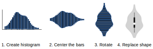
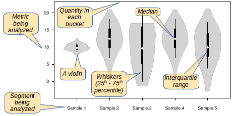
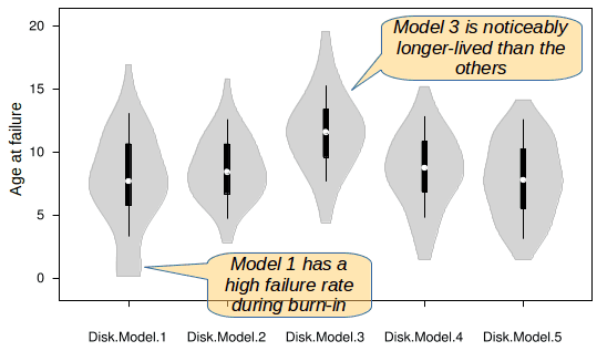
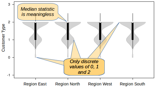
    […] at some length about violin plots as they may be used for services and kanban. See my article Violin plots for services & kanban. I provide here an example of such a plot (Fig. 7). The sizes and the shapes of the violins give a […]

    Reply

Leave a Reply Cancel reply

Your email address will not be published. Required fields are marked *

This site uses Akismet to reduce spam. Learn how your comment data is processed.

Primary Sidebar

Kanban eLearning

Kanban training online

Recent Posts

  • Verbs, nouns and kanban board structure
  • The role of the problem manager
  • The Three Indicators

Tag Cloud

manifesto Incident Management process risk lean management kanban leadership flow efficiency impact lean kanban board Cost of Delay cause change management knowledge management incident management tools bias ITIL problem context switching service manager kanban training ITSM service management tools service request flow priority process metrics agile manifesto for software development waste tools resource liquidity value stream process definition incident histogram automation knowledge work rigidity
  • Kanban Software
  • Services
  • Posts
  • Events
  • Publications
  • Subscribe
  • Rights & Duties
  • Personal Data

© 2014–2023 Concentric Circle Consulting · All Rights Reserved.
Concentric Circle Consulting Address
Log in

Manage Cookie Consent
We use technologies like cookies to store and/or access device information. Consenting to these technologies will allow us to process data such as browsing behavior or unique IDs on this site. Not consenting or withdrawing consent, may adversely affect certain features and functions.
Functional Always active
The technical storage or access is strictly necessary for the legitimate purpose of enabling the use of a specific service explicitly requested by the subscriber or user, or for the sole purpose of carrying out the transmission of a communication over an electronic communications network.
Preferences
The technical storage or access is necessary for the legitimate purpose of storing preferences that are not requested by the subscriber or user.
Statistics
The technical storage or access that is used exclusively for statistical purposes. The technical storage or access that is used exclusively for anonymous statistical purposes. Without a subpoena, voluntary compliance on the part of your Internet Service Provider, or additional records from a third party, information stored or retrieved for this purpose alone cannot usually be used to identify you.
Marketing
The technical storage or access is required to create user profiles to send advertising, or to track the user on a website or across several websites for similar marketing purposes.
Manage options Manage services Manage vendors Read more about these purposes
View preferences
{title} {title} {title}