In this article, I will delve into some of the issues associated with visualizing the configurations of systems.
As with many other disciplines in service management, the use of visualizations in configuration management can be problematic. I hope to highlight some of these issues with a view toward:
- improving the functionality software developers build into configuration management
- expanding how consumers of configuration information make use of visualizations.
Many IT organizations have a high opinion of tools providing visualizations of configuration information. One organization with which I worked 15 years ago used this capability to justify choosing a particular ITSM tool. I was not surprised, however, when they never used that capability as part of their configuration management work. It was a good example of an excitement factor in a product or even a reverse quality. But why was this so? What qualities should visualizations have for them to become performance factors in managing configurations?
Scope of this discussion
- the system being visualized
- the scope of the particular elements in the system being visualized
- the dimensions of relationships among elements being visualized.
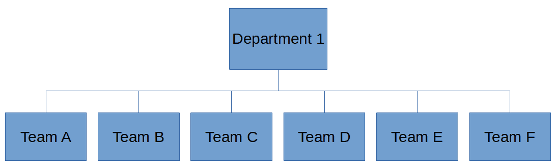
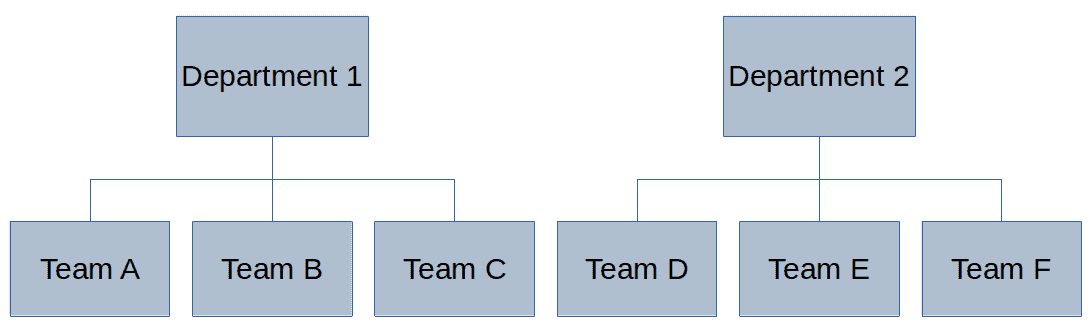
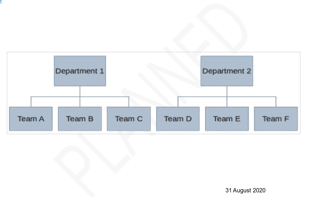
In sum, the configuration visualizations I will discuss here document only the structure of a system. They do not document the activities of managing that system or even the activities of managing the system’s structure. However, configuration visualizations generally document structures from the perspective of only one, or perhaps a few, functions of the system.
Configuration Visualization Tense, Aspect & Mood
- tenses—when the depicted configuration exists (past, present, future)
- aspects—does the visualization represent a single moment, an extended period, a series of repetitions; and
- moods—the attitude of the visualization designer to the documented structure, or how the designer intends the viewer to relate to the visualization.
Configuration Tenses and Aspects
Often, we wish to know the configuration of a system in the current tense. How is the system configured now? People changing systems also want to know the future tense of the configuration. After a change will be made, what will the configuration look like? (Such configurations might be understood as imperatives rather than futures since changes often have unexpected or undesired results.) Part of the diagnosis of a problem involves understanding how a system was configured in the past. Sometimes the diagnostician wishes to know the past perfect (aspect) configuration. This aspect might show how the system was configured at an instant in the past (perhaps as part of an incident). Other times the configuration stakeholder needs to know the past imperfect configuration—the configuration during a continuous period in the past. One might also consider intentionally temporary configurations, often as part of a transitional phase in a series of changes.
Configuration Moods
The above examples mainly concern the indicative mood. Planners of potential changes also take interest in the conditional mood. “If we make such and such a change, what would the resulting configuration look like.” Configuration controllers need to distinguish between the indicative—what is the current configuration—and what the current configuration should be. Architects might establish jussive principles—principles that the organization expects every configuration to follow. Finally, strategists and high-level architects concern themselves with the subjunctive, presumptive or optative moods. “If we were to adopt the following principles or strategies, what might the resulting configuration look like?” As often as not, such hypotheses serve to discredit a certain approach
Conventions for Visualizing Moods and Tenses
Intelligent Visualization Tools
I suggest here how intelligent visualization tools might express the various tenses and moods described above.
Animation
Analysts often wish to compare two configurations of the same system, differing by tense or mood. Animation provides an intuitive way to achieve this by highlighting the transitions between states. For example, a visualization might have a timeline with a draggable pointer. The viewer drags the pointer to the desired date (past, present or future) and the tool updates the configuration accordingly.
If the visualization depicts a small number of changes to a system, animating each change separately makes the nature of the change more visible (see Fig. 3).
Fig. 3: An example of an animated change to a server cluster. Animation makes visible each change (namely, the new servers and their connection to the load balancer).
Animation may be useful but only under various conditions. First, the elements that change must be visually distinct. For example, visualization viewers might have great difficulty perceiving the change from IP address 2001:171b:226b:19c0:740a:b0c7:faee:4fae to 2001:171b:226b:19c0:740a:b0c7:faee:4fee. The tool might mitigate this issue by highlighting changes For example, the visualization designer might depict the background of changed elements using a contrasting color.
Second, a stable, unchanging visual context should surround the elements that do change. Lacking this stability, the viewer might have great difficulty visualizing what has changed.
Third, the layout of the elements should be stable (excepting those that change, of course). For example, if two new elements replace a single element in the upper right corner of a visualization, those new elements should also be in the upper right corner. Tools automating the layout of elements using a force-directed placement algorithm might not respect this constraint. Such algorithms intend to position the elements and their links in the most legible way.
For example, they might attempt to make all nodes equidistant and minimize the number of crossed links. However, if the change involves a significant increase or decrease in the number or size of elements, such algorithms might radically change the layout. The change in layout makes it difficult to perceive the change. Allowing for very slow animation might mitigate this issue.
See also Fig. 8.
Color Saturation
Visualization viewers can easily detect the saturation, or vividness, of color (although certain people might have difficulty seeing colors). We might assign different levels of saturation to different tenses or moods (see Figs. 5–7). Of course, such a convention would require training to be correctly understood.
Used in conjunction with animation, though, the change in saturation would both highlight the change and be intuitively obvious (Fig. 8).
Fig. 8: An example of combining animation and color saturation to indicate a change in configuration tense. The unsaturated color indicates a future configuration. Of course, the animation could be more sophisticated but would be labor-intensive and its creation very hard to automate.
Designers might use many other attributes of color to indicate different moods or tenses. However, we already use most of these attributes for various other purposes. Using such attributes as hue, which often indicates element type or location, to reflect mood or tense risks creating confusion.
Watermarks
Watermarks might be an excellent means for indicating the tense or mood of a configuration visualization. Authors often use them to distinguish between a draft version of a document and a final version. A simple text watermark highlights in an unobtrusive way precisely which configuration the visualization depicts.
One might imagine that a visualization without any watermark would represent the present. Any other tense or mood would have the pertinent watermark. To correctly interpret older visualizations, they should display the date at which the visualization was last known to be valid.
Multi-dimensional configuration visualizations
As with the analysis of any data sets, visualization designers often find it very useful to reduce the number of dimensions being analyzed.
When I speak of “multi-dimensional” visualizations, I am referring to more attributes than just the positioning in Cartesian space. In addition to “2D” or “3D” dimensions, I refer to any other attributes of a system’s elements or relationships useful for depiction and analysis.
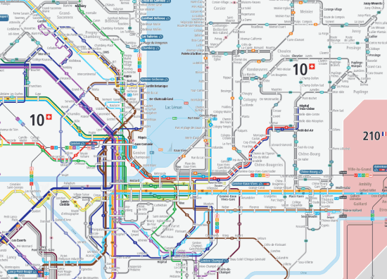
As I mentioned above, a visualization takes the perspective of one or a few functions of the system being documented. Let’s take the example of the map of a transportation network (see Fig. 10) to illustrate this point.
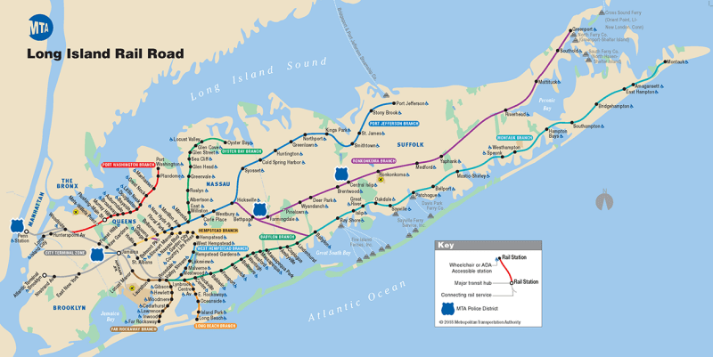
The network functions to transport people or goods from place to place. Therefore, the map must give an idea of the relative positions of those places and, often, their surroundings. Often, the map depicts these positions schematically, but close enough to “reality” to be useful. A second dimension of the map illustrates the possible interconnections among routes. A third dimension might indicate the types of vehicles used on the line, such as train, boat, bus, etc.
The map depicts each dimension using a different convention. It might indicate stations with a circle or a line perpendicular to the route, together with the stations’ names. Different colors might indicate the various possible routes. Solid or dashed lines might indicate the type of vehicle. Other symbols might indicate the types of interchanges.
Only the designer’s imagination and the visualization’s messages limit the types of dimensions that a configuration visualization might display. The classical dimensions include:
- position—the coordinates or relative location of an element in two- or three-dimensional space
- ontological classification of element type—the classification of the esvsential nature of the element, such as “computer”, “printer”, “modem”, etc.
- ontological classification of relationship type—if the visualization depicts relationships among elements, what are the types of relationships, such as “is part of”, “is connected to”, “depends on”, etc.
Other dimensions might include, for example, the age of the element, its manufacturer, its model, its vendor, its guarantee status, its maintenance contract status, etc., etc. and so forth.
Visualization idioms
- node-link diagrams (graphs or directed graphs)
- enclosure diagrams
- treemaps
- adjacency matrixes
- labeled illustrations.
Directed Graphs
Components of directed graphs
A graph consists of a set of nodes some of which are connected by lines, called “edges”. A directed graph is a graph whose edges have directions. Configuration managers commonly use directed graphs to represent a network of components, such as computers and other active network devices. Node-link diagram is a synonym for directed graph in this context.
Handling the complexity of directed graphs
Unless the system documented by the visualization is trivially small, a directed graph quickly becomes unwieldy. The tool creating the visualization may handle the complexity of such systems in four ways:
- it uses an algorithm, such as force-directed placement, to position nodes in as pleasing a way as possible
- it can collapse collections of nodes into individual symbols
- it can filter the diagram based on any dimensions of the nodes and/or edges
- it can limit the scope of the diagram, generally by showing a limited number of edges
Collapsing nodes uses such principles as physical location or logical function. For example, all nodes located in a building, a floor, a room, a city, etc. may be collapsed into a single symbol. Thus, a cluster of computers each with the same function may be collapsed into a single node. Interactivity with the viewer makes such diagrams most useful. The visualization user should be able to collapse and expand nodes at will or filter on node and link attributes.
Managing link ambiguity
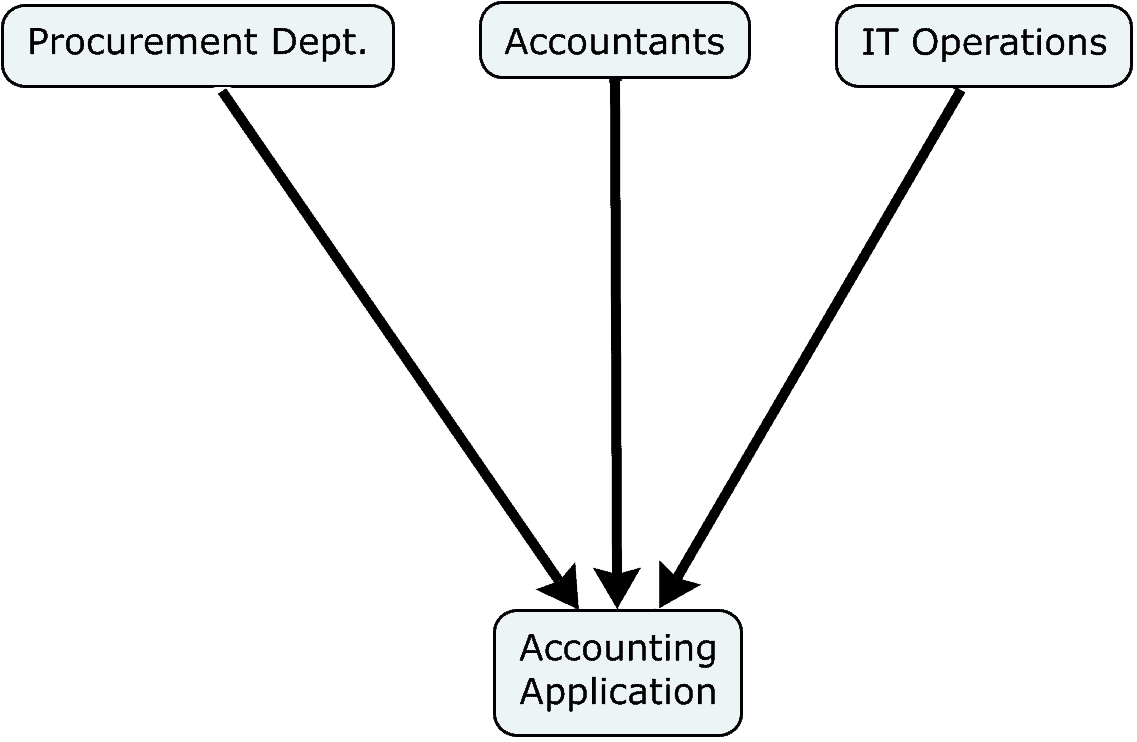
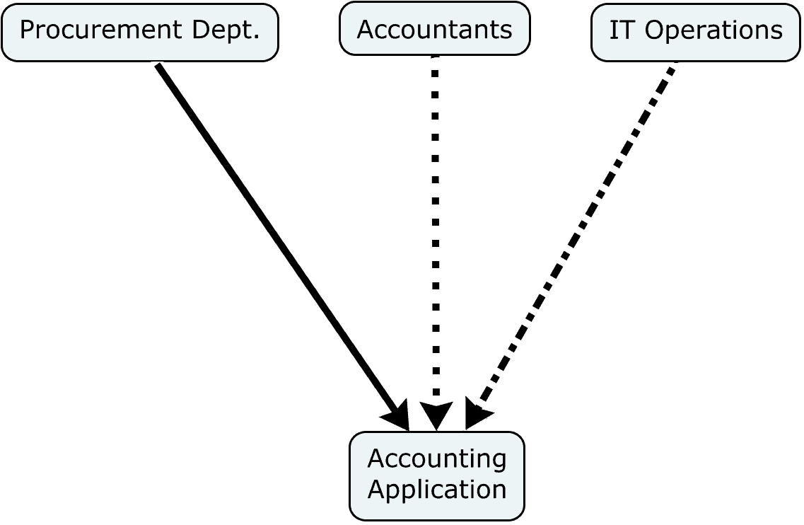
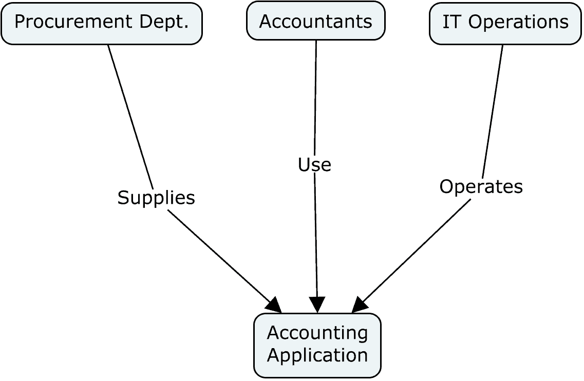
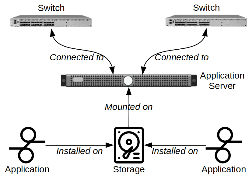
Any two nodes in a socio-technical system may interact in a variety of ways. Consider the relationships between a set of devices used in an organization and its various teams or personnel. In a graph, what does an edge between a certain machine and a certain team or other entity signify (see Figs. 12-14)? It might indicate many different types of interactions, such as:
- the team uses the machine to achieve its business purpose
- the team operates the machine so that others might use it
- the team supplies the machine, being either a vendor or procurer
- the team repairs the machine
- the entity manufactures the machine
- etc.
Thus, each edge or link should characterize a relationship between two nodes expressible as a verb (see Fig. 14). Unfortunately, many configuration managers—as well as the tools they use—use verbs so ambiguous that they add little value to the management of configurations. “Depends on” and “relates to” offend the most. These catch-all terms mean “a relationship exists, but one unlike any type of relationship that we have already defined.”
Of course, a single entity or team might have multiple types of relationships with a single element. A semantically unambiguous visualization would require a separate link type for each type of relationship between any two nodes. But this approach quickly clutters the diagram, rendering it less legible. The visualization becomes a poorer communication vehicle (unless the vivsualization purports to describe that complication). As a result, some visualization designers collapse multiple relationship types into a single type of edge or link. The resulting visualizations might be simpler to view, but their ambiguity makes them much more difficult to interpret. Thus, they would be much less useful for any particular purpose.
Links and modes of visualization
Recall the discussion above about visualization modes. Designers of directed graphs often ignore this concept and mix different modes. A precise visualization would depict only a single mode at a time. The same issue applies to any configuration visualization idiom. I address it here given the popularity of using directed graphs for documenting configurations.
As an example, let us consider a visualization of nodes and the communication of data packets among them. We might be interested in the imperfect indicative aspect of such a system. In other words, between which pairs of nodes are packets being sent. Or, we might be interested in the pairs that could transmit data to each other, whether they do or not. Or, we might want to see the pairs that should be sending packets to each other, again, whether they do or not. Capacity management can make good use of all these modes. Others are particularly interesting for problem or incident management. And yet others are useful for system design, availability, release and change management.
Tools may draw graphs of a particular by gathering data from various management tools. Network sniffers can gather the data about which pairs of nodes are communicating with each other. An appropriate lapse of time must be selected for performing this analysis.
Describing which nodes could communicate with each other requires knowledge of both the physical connection layer and the network layer. Intelligent switches could report which nodes have physical connections. Routers and firewalls could report the rules allowing for or forbidding the routing of data. The visualization tool could then draw a diagram based on this data. But however could a tool automate the creation of a diagram depicting the lack of communication between nodes? Tools can hardly detect physical connections that do not exist.
Such visualization automation might suffer from several constraints. Firstly, a communication defect might prevent the collection of the very data useful for managing an incident. Secondly, while the tool could collect current and historical data, collecting data for a planned, future configuration would additionally require some simulation capability.
Link density is a key metric for managing graphs. This metric measures the ratio of edges to nodes in the graph. If the link density is greater than three or four, it becomes very difficult to interpret the graph. The drawing tool should be able to detect link density and propose a collapsed, initial view of the system with a lower link density. The view should then have the chance to interactively filter the data displayed and expand collapsed nodes.
Strengths
- Ease of tracing node to node paths
- Interactive features permit scaling over a very wide range
Weaknesses
- Easy to confuse the functional purposes and directions of edges
- High link density renders the diagram illegible
- In large diagrams, it may be difficult to find nodes by visual scanning of the diagram
- Non-deterministic positioning of nodes
Treemaps
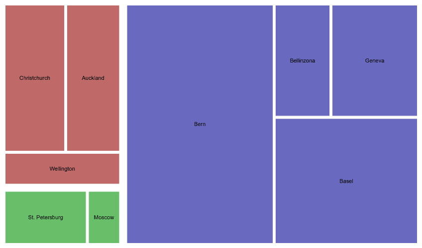
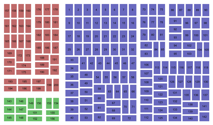
Most systems consist of elements whose attributes may be organized in a hierarchic taxonomy. The physical locations of the nodes in a system provide a simple example of this. Consider the hierarchy Country→City→Site→Building→Floor→Room. Suppose you wish to analyze the numbers of end nodes of a data network, by location. A treemap gives an immediate view of the site or building or room that has any number of such nodes.
If the visualization tool allows for searching based on node identifiers, a treemap also gives a quick means for visualizing the value of the attribute for a given node. For example, suppose you seek the node “ABC123”. If the tool shows it in a contrasting hue, you can see immediately its position in the hierarchy.

This feature may be expanded to include queries on attributes outside of the taxonomy (see Fig. 17). For example, suppose you have a treemap showing the locations of the desktop computers. You do a query to display the computers of a certain model. You see immediately the location and the clustering of those computers.
In theory, a treemap might document different node attributes at different levels of the hierarchy. However, viewers are likely to have difficulty interpreting such maps.
Strengths
- Easy to document a very high number of leaf nodes
- Fast querying of the attributes of leaf nodes
- Easy to judge relative quantities of leaf nodes at a given level of the hierarchy
Weaknesses
- Only useful for single attributes in a hierarchic taxonomy
- Groupings are completely abstract, bearing no relationship to the real layout of the nodes
Adjacency Matrixes
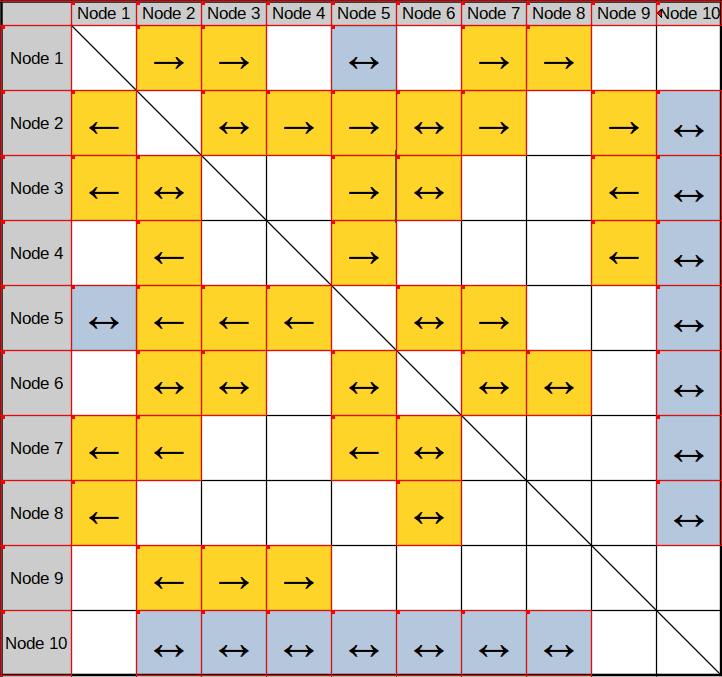
An adjacency matrix has all the nodes to be documented laid out on both the vertical and horizontal axes. The information in the cells at the intersection of the columns and rows documents the relationships between the corresponding two nodes.
Depending on the link attributes being documented, the matrix might contain redundant information. For example, in Fig. 18 the color of cells 1:2 and 2:1 must be identical. On the other hand, the arrows may be different.
Fig. 18 shows a very simple adjacency matrix. A more sophisticated matrix might add rows and columns to document other attributes of the nodes. An analyst might use the values in these additional cells to interactively sort and filter the matrix. Thus, adjacency matrixes can be powerful analytical tools.
Strengths
- Scalability even with high link density systems
- Fast lookup of nodes (if listed in a structured order, such as alphabetically)
Weaknesses
- May require training to make good use of the diagrams
- Difficult to analyze topologies
Enclosure Diagrams
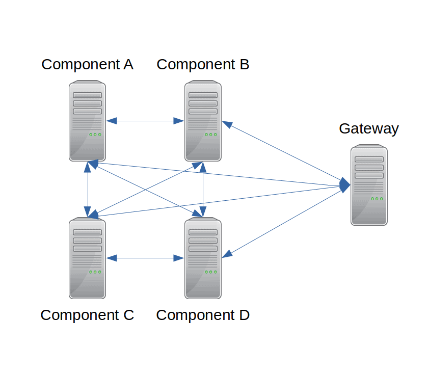
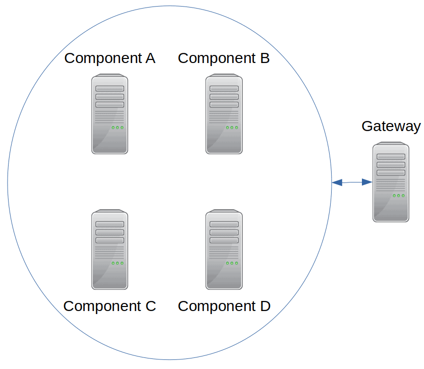
An enclosure diagram displays one or more collections of nodes around which a line is drawn. Visualization designers commonly use enclosure diagrams to display clusters of nodes with similar functions. An example might be a set of IT servers that can fail over to each other. Figs. 17 & 20 provide examples, wherein nodes are enclosed by a set of circles.
An enclosure diagram is thus visually cleaner and simpler than a directed graph. Suppose a cluster contains four servers that can fail over to each other. A directed graph would require ten edges to display the cluster (see Fig. 19). An enclosure diagram would require only two lines (see Fig. 20).
Strengths
- Visual simplification, as compared to a directed graph
Weaknesses
- The layout of multiple enclosures within a complex system may be very difficult to compute
Labeled Illustrations
Product managers or manufacturers often use labeled illustrations to help device managers to understand what they see. For example, a technician might enter a machine room to remove a device from a rack. A labeled illustration of that rack could indicate the slots and the locations of the installed devices. Technicians find such illustrations especially useful if the devices themselves are poorly labeled. Examples include labels being damaged, lost, too small to read, or in inaccessible positions.
Service agents might also use such illustrations for identifying the type of system before their eyes. This is especially true if the organization describes the attributes of the system using a highly standardized taxonomy. Anyone having used a guide book to identify birds or plants understands this.
Thus, the illustration designer makes a trade between the level of detail shown and the details helping to identify the object. In other words, the designer should abstract the gestalt of the object in question. For example, a data switch model might be readily identifiable by its overall shape, the number and the layout of its ports and other significant details.
Strengths
- Easy identification of the components of a system
Weaknesses
- May require a library of component images
- May require specialized functionality in the drawing tool to correctly place components within the system
- Not useful for physically large systems (like a data network) or abstract components (like a database or an application)
Hybrid visualizations
We have seen that many different visualization idioms have the capability of documenting configurations, especially networks of elements. Each has its strengths and weaknesses. Why not make hybrid visualizations, combining the strengths and palliating the weaknesses?
Containers work well at the highest level of a visualization. They effectively portray completely separate domains and parent-child relationships within a domain. Although they can also overlap, as in a Euler diagram, such visualizations provide little information about the nature of the shared area.
Graphs or trees may effectively document the higher-level details within a container. If the number of nodes is not too great, they could go to the leaf level. In particularly complex structures or hierarchies with many levels, containers might indicate sub-graphs. A drill-down function would allow viewers to visualize the details within those containers.
A network of great depth may be too confusing or too computationally intensive to display a graph’s full level of detail. Illustration designers may resolve this problem by replacing rooted sub-graphs by adjacency matrixes, trees, treemaps or, as we saw above, containers.
Failure to benefit from configuration visualizations
It would seem that configuration data has everything to gain from visualizations. System stakeholders have difficulty in grasping the connectivity of IT components using words alone. And yet, so few organizations really benefit from creating diagrams. Why is this so?
In include among the reasons:
- Inaccurate and incomplete underpinning data
- Not following Shneiderman’s mantra
- No direct relationship between higher-level architecture diagrams and physical layer diagrams
- System component relationships too complex for easy diagnosis via visualizations
Inaccurate and incomplete data
The problem of inaccurate or incomplete configuration data is not, strictly speaking, a visualization issue. Nonetheless, I will briefly summarize some of the reasons for this issue.
Consider, though, that a visualization drawn directly from data recorded in some database can hardly depict missing information. If a cluster contains ten servers but the configuration management system records only seven of them, do not imagine that the visualization will show the ghosts of those three missing machines.
Maintaining configuration data as an afterthought
Service personnel often consider maintaining configuration data as non-essential administrative overhead. Updating the data is a low priority step distinct from performing the corresponding changes. As a result, that personnel sometimes do not update data at all. Or, they might update data long enough after the fact that the details are no longer fresh in mind.
Configuration discovery as an afterthought
Some organizations attempt to address the poor integration of data management into change activities by automating the discovery of new or changed configurations in a system. Indeed, recording of configuration data often not established at the very start of a system’s creation. In such cases, automated configuration discovery is often adopted as the means to address the daunting task of documenting existing configurations. And yet, such automated discovery is often blocked in its attempts to discover. Furthermore, it often reports unmanaged elements and attributes, needlessly complicating the data. And automated discovery can circumvent the intellectual process of struggling with understanding how a system is pieced together. It can thereby yield large quantities of data without much understanding of how to use those data.
Unmanageable quantities of data
How do organizations measure the “quality” of the configuration management? I have often seen them use the percentage of configuration elements registered in a database. They struggle to move incrementally upwards from a very poor 10%. By the time they reach 70%, their progress thrills them and the effort exhausts them so much that they reach a barrier beyond which they hardly advance. They trot out a cost-benefit analysis to justify why it is OK to make only a symbolic effort to maintain or enlarge these data.
Shneiderman's mantra
Ben Shneiderman described the process of finding information from a visualization as:
- overview first
- zoom and filter
- details on demand
So common is this organizational principle, visualization tool designers have come to view it as a mantra.
Most ITSM tools with configuration diagramming capability do indeed provide zooming and filtering capability. Many allow the viewer to see the details of a component via a simple mouse-over or other simple technique. The problem is in how an overview is defined and how users implement the concept of an overview.
In the worst case, an “overview” is implemented without any aggregation of detail. In other words, For example, suppose you document a data center with 500 physical servers. A graph overview might attempt to display those 500 servers with their various network connections. The processing power of the computers used to do this is probably inadequate for the task. Even a high-resolution screen could only allocate a few pixels to each server, making the entire diagram useless. The network connectivity of the servers would probably be so complicated that the screen would be filled with black pixels.
Showing more components is not a useful way to provide an overview. There must be some aggregation principle applied, one that allows for the simplification of the visualization. Systems with very few components are the exception to this principle. In the latter case, visualization would have relatively little benefit.
The nature of the aggregation depends entirely on the purpose of the visualization. There is no single “right” aggregation principle. Components could be aggregated based on the business functions they support. Another form of aggregation could be the models or versions of components. Physical location at various levels would be another example. Thus, an overview might show first the racks in the data center. With an average of twenty servers per rack, a much more manageable twenty-five nodes would appear in the initial overview.
Remember that this aggregation is not a form of filtering. Instead, the visualization needs to display an aggregate as a single glyph or shape. Suppose you wish to depict the set of components supporting a given business function, such as all financial applications. You might achieve this using a rectangular box with three overlapping computer icons. An overview visualization might show as many such rectangular boxes as there are supported business functions. It would then be possible to zoom in to a single rectangle and filter the visualization according to other principles.
Such an approach would adequately implement Shneiderman’s mantra, but most ITSM tools do not implement the required logic. After all, the business function is an attribute of the application running on the server, not of the server itself. Most users of these tools do not structure configuration data in a way that would support this approach. I cite various reasons for this:
- Configuration managers make illogical shortcuts in the configuration data model. As per the example above, they assign a business function to a computer, rather than to the application processes running on that computer.
- Some organizations have decided to treat architectural data, where potential aggregation principles are defined, separately from service management configuration data. Never the ‘twain shall meet.
- Even when configuration management tools reflect architectural principles, how should such data relationships be modeled? Should managers use a framework like TOGAF? Would organizations without architectural expertise give in to unwarranted simplifications? By what means would one know that a physical server supported a finance function: via an attribute of the server itself? via an attribute of the applications installed on the virtual servers realized on the physical server? via an attribute of a functional component of an application?
- Functional aggregation would require both knowledge of the static structure of the components and their dynamic use. For example, knowing which functions a message bus channel support depends on knowing the functional domains of the messages using that channel. A similar problem exists for levels 1, 2 and 3 network components. Short-circuiting these issues by hard-coding attributes of the components leads to documentation that is exceedingly difficult to maintain.
- Many configuration management tools lack the simple functionality that proper diagramming might require. For example, many of the edges in a graph representing a network of components should be bi-directional. And yet, how many tools can simply model this physical reality?
Segregated architectural drawings
Architectural drawings are a subset of configuration visualizations. They are subject to the same constraints as other visualizations. In many fields, there is a direct relationship between an architect’s drawing and the physical objects to be created based on that drawing. In some fields and organizations, however, there appears to be a barrier between the visualizations created by architects and the visualizations of the corresponding physical layer. Many IT departments are a case in point.
There are various reasons for this segregation, which may be organizational, procedural or technical in nature. This is not the right place to investigate these reasons in more detail. But the result is often that IT architectural drawings are generally created from tools specific to the architecture role. These tools may be of two types. Some draw diagrams based on the data in an underpinning database managed by the tool. Others are dedicated to the production of IT architectural diagrams, without an underpinning database. On the other hand, the configuration diagrams are created either from service management tools or from dedicated drawing tools.
In theory, organizations should have some policies, procedures and techniques for ensuring the coherence between architectural data and configuration management data. While good coherence probably exists in some organizations, I have never seen it myself. At most, I have seen one-off attempts to co-ordinate, for example, a list of IT services as defined in the service management tool with the list defined in the architecture tool. The result has been two lists with two different owners and no practice of keeping the lists synchronized. In time, however, there will probably be increasing convergence between architecture and service management tools.
Why is this important? We have already seen, according to Shneiderman’s mantra, that it is useful for tools to first provide a collapsed overview of configurations and later allowing users to drill down or expand to the details. Architectural drawings at the business, application or technology levels provide an excellent set of principles for depicting a collapsed, high-level view. One might even imagine a three-level hierarchy: a top, business layer; a middle physical element layer and a detailed physical element layer.
Most service management tools capable of generating configuration visualizations rely on relationships to decide how to collapse and expand details. Often, only the anodyne parent-child relationship is the basis for this feature.
As a result, configuration managers sometimes end up having the tail wag the dog. They create artificial or incomplete relationships in a CMDB just to enable the tool to draw a certain diagram. In the worst case, the distinction between a “service” and an “application” is lost.
Relationship too complex to diagnose via visualizations
Suppose you wish to use a configuration visualization to help diagnose an incident or problem detected on a certain component. Given the pressure, especially in the case of an incident, such an approach would be practical only in trivial cases. Suppose the component being investigated had only a handful of first and second degree relationships with other components. In this trivial case, a configuration visualization is not likely to be useful. But cases with so few relationships are rare, even in simple infrastructures. Or, it might be true if only a tiny fraction of the relations were documented.
Otherwise, the tediousness of clicking on connected components and checking their status would far outweigh the possible benefits. In short, which approach to diagnosis would be better: using an application that simply delivers an answer or the trial-and-error use of a visualization?
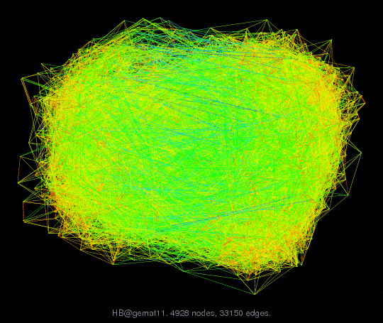
A rule of thumb for graphs is to limit the number of links to four times the number of nodes. Too many links result in occlusion of elements or the inability to discriminate elements (see Fig. 25). Alas, modern technology brings us well beyond that rule of thumb. Servers contain many more than four managed components. Data switches are typically linked to 16 or even 32 nodes. Racks might contain 40 1U computers. This high link density is not a problem when drilling down to a single node and its connections. But, at the overview level, such a high density makes visualizations difficult to draw and harder to use.
Conclusion
 The article Visualization of Configurations by Robert S. Falkowitz, including all its contents, is licensed under a Creative Commons Attribution-NonCommercial-ShareAlike 4.0 International License.
Bibliography
[a] Johnson, Brian, and Ben Shneiderman. “Tree-maps: A space-filling approach to the visualization of hierarchical information structures.” Visualization, 1991. Visualization’91, Proceedings., IEEE Conference on. IEEE, 1991.
[b] Shneiderman, Ben. “Tree visualization with tree-maps: 2-d space-filling approach.” ACM Transactions on Graphics 11.1 (1992): 92–99.
[c] Shneiderman, Ben. “The Eyes Have It: A Task by Data Type Taxonomy for Information Visualizations.” In Proceedings of the IEEE Conference on Visual Languages, pp. 336–343. IEEE Computer Society, 1996
Credits
Unless otherwise indicated here, the diagrams are the work of the author.
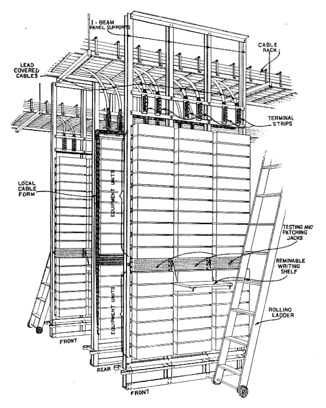
Fig. 21: By Charles S. Demarest – Demarest, Charles S. (July 1923). “Telephone Equipment for Long Cable Circuits”. Bell System Technical Journal. Vol. 2 no. 3. New York: American Telephone and Telegraph Company. p. 138. Public Domain, https://commons.wikimedia.org/w/index.php?curid=84764475
Fig. 25: AT&T Labs, Visual Information Group. Downloaded from http://yifanhu.net/GALLERY/GRAPHS/GIF_SMALL/HB@gemat11.html
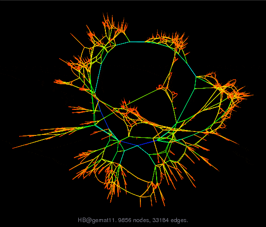
Fig. 26: AT&T Labs, Visual Information Group. Downloaded from http://yifanhu.net/GALLERY/GRAPHS/GIF_SMALL/HB@gemat11.html
Leave a Reply