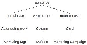
• Skip to main content
  • Skip to primary sidebar

This view of service management...

On the origin and the descent of managing services. We put meat on the bones.

  • Kanban eLearning
  • Services
    • Kanban Software Solutions
    • Consulting & Coaching
    • Training & Seminars
  • Posts
  • Events
    • Events – Agenda View
    • Events – Calendar View
    • International Service Management Calendar
  • Publications
    • Our Publications
    • Notable Publications
    • Quotes
  • Subscribe

Posts

The Three Indicators

28 September 2020 by Robert Falkowitz Leave a Comment

dangerous curve ahead sign

When managing work in an agile manner, we should consider three types of indicators: lead, lag and along.

Filed Under: Continual improvement, Kanban Tagged With: along indicator, indicator, lag indicator, lead indicator

Visualization of Configurations

16 September 2020 by Robert Falkowitz Leave a Comment

adjacency matrix

In this article, I will delve into some of the issues associated with vi­su­a­liz­ing the con­fig­u­ra­tions of systems.As with many other dis­ci­plines in ser­vice ma­nage­ment, the use of vi­­s­u­a­l­i­­za­­tions in con­fig­u­ra­tion ma­nage­ment can be prob­lem­atic. I hope to highlight some of these issues with a view toward: improving the func­tionality soft­ware de­ve­lop­ers build into configuration ma­nage­ment; and expand­ing how con­sumers of con­fig­u­ra­tion in­for­ma­tion make use of vi­­su­­a­l­i­­za­­tions.

Filed Under: Visualization Tagged With: adjacency matrixes, configuration, configuration management, containers, graphs, labeled illustrations, treemaps

How to increase visualization maturity

10 August 2020 by Robert Falkowitz 2 Comments

streamgraph time series

We communicate information visually via a two-way street. BOth visualization de­signers and viewers must have similar levels of maturity to benefit from visualizations. This article suggest techniques for increasing the overall maturity of visualization techniques in an organizations.

Filed Under: Visualization Tagged With: annotations, before-after, testimonials, training

Measuring Flow Efficiency

6 August 2020 by Robert Falkowitz

Flow efficiency metric

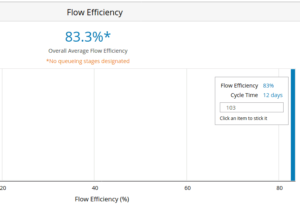
A very low overhead method is proposed for accurately measuring flow efficiency with flow management software.

Filed Under: Kanban Tagged With: flow efficiency

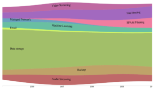
Automated Value Stream Maps

9 May 2020 by Robert Falkowitz Leave a Comment

capturing defects

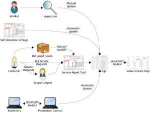
An automated value stream map is an advanced example of how information visualizations may be integrated into service system management tools.

Filed Under: Visualization Tagged With: automated value stream map, availability, batch size, capacity use, changeover time, cycle time, defect rate, information flow, inventory size, lean management, maintenance time, materials flow, queue size, value added work, value stream, value stream map, value stream phase, waste

Information Visualizations for Service Management

24 April 2020 by Robert Falkowitz 1 Comment

contour map

Service management tools include only rarely the visualizations that provide a high level of information to support the management of services. The reasons for this and many examples of high-level visualizations are provided.

Filed Under: Service Management, Visualization Tagged With: bee swarms, bump charts, clustered scatter plots, contour maps, cumulative flow diagrams, customer journey maps, directed graphs, heat maps, histogram, Marey charts, parallel coordinates, perceptual maps, sankey charts, statistical control chart, stream graphs, tile maps, value stream maps, violin plots, Wardley maps

Kanban in the Time of Corona

23 March 2020 by Robert Falkowitz

corona virus

I went to the supermarket yesterday and was delighted to see a standard kanban practice was implemented there. Attempting to limit the density of the shoppers in the store, you had to wait at the entry for a card—in fact, a kanban card—before entering. At the exit, you returned the card, enabling another entry to […]

Filed Under: Kanban Tagged With: kanban card, queue management, WIP limit

Visualizing uncertainty

15 January 2020 by Robert Falkowitz 1 Comment

gradient chart of expected disk model life

In this age of visual management, Bayesian reasoning, machine learning and other statistical methods, it is increasingly important to understand how certain we are about the “facts” and how to visualize that uncertainty.

Filed Under: Visualization Tagged With: bias, box plot, buckets, complex adaptive system, continuous visual encoding, error bar, gradient chart, histogram, Hubbard, hypothetical outcome plot, Kahneman, probability density function, saturation, statistical control chart, systematic error, Value suppressing uncertainty palette, violin plot

Next Page »

Primary Sidebar

Kanban eLearning

Kanban training online

Recent Posts

  • The Three Indicators
  • Visualization of Configurations
  • How to increase visualization maturity

Tag Cloud

agility Service Management flow ITIL flow efficiency kanban board value stream incident management tools risk manifesto for software development problem automation knowledge work urgency manifesto lean agile cause knowledge management process Cost of Delay process definition change control adaptive case management lead time service request change management Incident Management process metrics impact bias waste value kanban resource liquidity rigidity context switching service management tools incident kanban training
  • Kanban eLearning
  • Services
  • Posts
  • Events
  • Publications
  • Subscribe
  • Rights & Duties
  • Personal Data

© 2014–2021 Concentric Circle Consulting · All Rights Reserved.
Concentric Circle Consulting Address
Log in

This site uses cookies . You accept those cookies when you continue to use this site. Cookie policyAllow cookiesNo 3rd party non-functional cookiesCookie policy
You can revoke your consent any time using the Revoke consent button.Change cookie settings