In the early days of digital computing and personal computing, our tools were largely monotone: screens with green or orange characters against a black field and dot-matrix printers whose ribbons had but a single color. As color screens and printers became common, so did the color capabilities of the software applications we use. I think it is fair to say that the color capabilities of many users of those applications lagged. And nowhere is the unfortunate use of color more flagrant than in information visualizations. The irony of the situation is that color is much less important than other factors, such as position or angle, in visualizations.
In this article, I will provide some recommendations for the use of color and the use of the tools by which we select colors.
Choosing individual colors
You have decided to use color, for example, to distinguish different categories of data. The typical human eye can distinguish up to 7 million different colors. So which colors should you choose?
There are issues concerning the choices of individual colors and issues concerning the combinations of colors. I will address the former in this section and the latter in the following section.
Many colors have significations beyond the control of the visualization creator. So be aware of the particularities of your audience when choosing colors.
Perception of color luminosity


The eye perceives colors with three different types of cones, but the cones do not perceive those colors with the same luminosity. Each color has a green, a blue and a red component. But the luminosity of the color depends 59% on the green component, 31% on the red component and only 10% on the blue component. Beware, for example, of including blue text in your visualization, which might make it difficult to read. Adding a bit of red to the color of the text is said to make its edges significantly more visible and thus more readable. I find outlining or shadowing the text to be more effective.
The lens in the eye refracts different colors differently (see my article on the biology of visualization). As a result, the focal points of different colors might be far enough apart that it is difficult to focus on those colors at the same time. As information visualizations are generally in a single plane, putting short wavelength colors next to long wavelength colors can make the visualization difficult to see with good acuity.
Cultural significance of colors
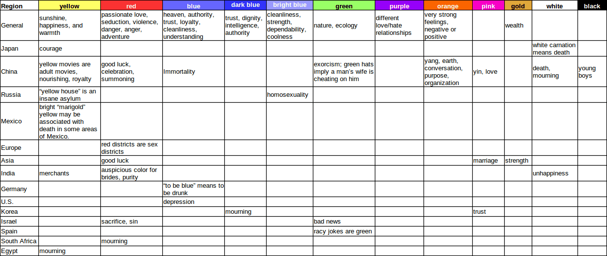
The table in Fig. 1 gives some examples of color connotations by region. These are vast over-generalizations and should not be taken as “facts”. The triggering of a given connotation depends largely on the context of the color’s use and the cultural background of the viewer. The important message is that you should not take for granted the signification of any color and be aware that for some viewers, it might have unexpected significations.
Emotional significance of colors
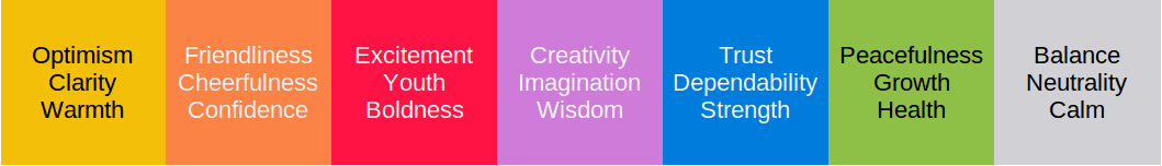
In addition to the cultural significations of color, they also have emotional signification. There is no single list of emotions that can be related to individual colors, given the complexity of visualizations and the contexts in which they are viewed. That being said, you should nonetheless keep in mind that your choice of colors is very likely to trigger emotions.
Note, too, that some people have strong feelings about certain colors. These feelings might seem irrational to you, but they are nevertheless real and can get in the way of communicating your messages.
Use A/B testing to try different colors and to confirm which ones appear to achieve the best results.
When related to the message the visualization intends to present, the choice of color can strengthen or weaken that message. Below we see how changes in the brightness and the saturation of colors can directly impact the feeling imparted. A well-known logo that resembles Fig. 4 uses mostly very bright and highly saturated colors. It should bring to mind play or playfulness. When the brightness of the colors is lowered while maintaining the same hues and saturation (Fig. 3), the playfulness is completely lost, thereby working against the underpinning purpose of the logo and the business. On the other hand, desaturating the colors makes the logo seem calmer, the opposite of a feeling of excitement that it should engender.
See the section below regarding the use of the HSB color space to tune emotional content.
Organizational palettes
Some organizations have a strongly defined identity closely associated with a color. That color might be the dominant color in a logo, for example. In such cases, the use of the main corporate color will always be closely associated with the corporate identity.
Some organizations may have policies for the use of that color in internal and external communications. Those policies might be realized in templates or style sheets whose use is obligatory for company collaborators. Deviating from those colors might provoke the wrath of the corporate communications khan.
See below for a discussion of using a dominant color as the basis for selecting compatible colors.
Combining colors

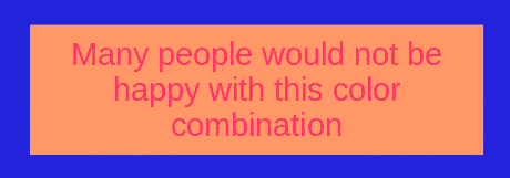
Not all colors go well together. In fact, most colors do not go well together. Choosing a good palette of colors depends both on æsthetic judgements and on understanding the physiology of the eye.
If you lack the æsthetic sensitivity to choose color combinations, there are various tools available and web sites designed to help you choose reasonable combinations.1 Make use of these tools when you are first learning about colors. Also, use A/B testing to identify with your target audience which combinations work best.
There are various methods available for choosing a set of colors that work effectively with each other in a visualization. These methods are based on selecting colors from a color wheel. The following section discusses these methods.
Color schemes
Various rules may be used to select a scheme of harmonious colors. They are all based on a color wheel (Fig. 6). A single base color is selected, from which the other colors in the scheme are calculated. The base color might be, for example, the main color of a logo. If the visualization includes a photographic image, the base color could be the dominant color in that image. Various tools are available on-line both to detect dominant colors in an image and to calculate the colors for a given scheme and a given base color.
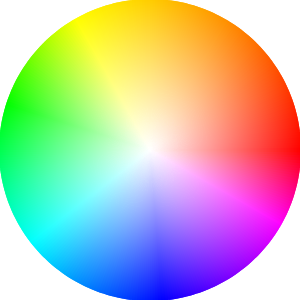
Here are descriptions of the rules with examples. For more information, consult any standard work on color theory.
Analogous

Analogous colors are near each other on the color wheel. They are generally a very harmonious, calming combination. However, there is a danger of insufficient contrast among the colors.

Monochromatic

Monochromatic colors are from a single ray in the color wheel. The hue is identical for each color, but the saturation and brightness vary. Color blindness issues are avoided when using this scheme.
Triad

Triad colors have hues that are approximately 120° apart on the color wheel. Visualizations using a triad scheme tend to have good contrast and a vivid, well-balanced aspect.
Complementary

Complementary colors are selected from opposite sides of the color wheel. Obviously, they contrast well—sometimes too well. A single object in a color complementing the dominant color of the visualization will immediately stand out. When complementary colors touch, the edge is accentuated and appears brighter. Be aware of color blindness issues.

Compound

Compound colors are mixtures of pairs of complementary, analogous colors. This scheme offers the features of both, enlarging the number of colors available for use.
Shades

Color shades are variations on the brightness of a single hue and saturation. As with the monochromatic scheme, color blindness issues are avoided.
These schemes provide guidance, but a very large number of other combinations are both possible and potentially suitable for the communication of various messages.
Contrasting luminosity
I have seen various sites that appear to believe that light grey text against a black background is the height of chic. Maybe. I find them almost impossible to read.

Color blindness


Remember that about 10% of the XY chromosome population has some form of color blindness. If you count on the distinction between red and green to make a point in your visualization, well, many people are unlikely to perceive that point. Consider combining colors other than red and green, or with different shading or line styles, to make your visualization understandable by a broader population. Note, too, that color is not as strong a visual indicator as other factors, such as position.
Some experts recommend replacing red-green with magenta-turquoise. While this combination is certainly more legible (to my eyes, at least), many people might object to the mixture of hues.
If you do not intend any emotional or cultural content in the colors, try replacing them with either shades of grey or distinct shading or textures.
Using color selection tools
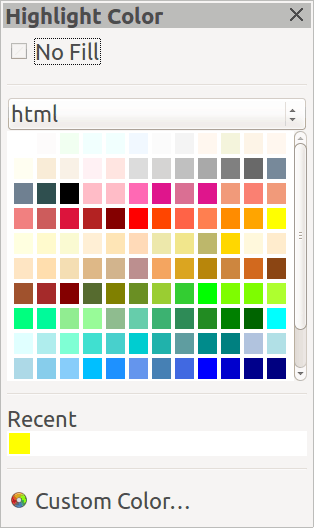
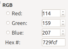
Many visualization creators lacking a background in design are likely to select colors either directly from a default palette (Fig. 10) or using a red/green/blue color selector. (Fig. 11). While almost all cultures understand and name the colors red, green and blue, the values associated with those colors are not intuitively obvious. Can you guess what color is associated with the settings in Fig. 11?2 When it comes to choosing good colors for an information visualization, these numbers offer almost no help in resolving many common issues.
The HSB Color Selector
Many of the issues we have in using color in visualizations are readily addressed by selecting colors from the Hue/Saturation/Brightness color space.
Hue is what we generally think of as “color”. It indicates what we perceive in the range of visible colors from red to violet. Hue is measured on a scale of 0° to 360°, referring to the hue on a color wheel.
Each of those colors may be more or less “pure” or seem “washed out”. This is the saturation of the color. It is measured as a percentage, ranging from 0% (completely washed out) to 100% (pure).
Finally, a patch of color may be perceived as more or less luminous, generally called the brightness or the intensity of the color. Brightness, too, is measured as a percentage. At 0%, a patch of color has no brightness; it is black. At 100%, though, the patch is not white. Rather, it is the most luminous version of the patch of the particular hue and saturation.


Defining colors using the HSB color space has various practical applications that are not readily performed within the RGB color space. Here are some examples:
- Defining a range of colors representing ordinal values
- Tuning the color of text labels
- Tuning the emotional content represented by colors
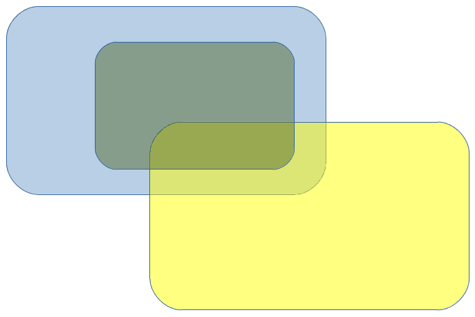
Using transparency
Transparency is selectable independently from hue, saturation and brightness. It is applicable to the use of texture as well as color.
I have found transparency to be useful for the background of text labels and for the intersections of containers. However, if it is important to discriminate such intersections, the use of different hatchings might be more effective, if color does not otherwise add value. On the other hand, hatching introduces many lines without added value and might make labels difficult to read.

Selecting colors for ordinal values

Colors of overlaid text
Visualization creators often label the elements of their creations either with text or with some other symbols. Have you seen cases where those labels are difficult to read because the color of the text is not very legible against the color of the background? Of course, black or white text will almost always be legible (depending on the background), but you may wish to make better use of the symbolic or emotional value of colors.
The HSB color space provides useful rules for tuning the colors of either the labels or their backgrounds. If the brightness of the labels is low (that is, black or some other dark color), the background should use bright colors. If you find the contrast of luminosity is not great enough to make the labels easily legible, check and tune the brightness values for each color. Similarly, if the labels are colored, the saturation of the background should be low. Of course, these principles are probably obvious. Adjusting the colors to improve legibility using the RGB color space is much less obvious.

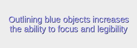
There are other methods useful for improving legibility. Outlining the foreground object in white or black improves its legibility, especially when the background is variable or is not known in advance. Video subtitling commonly uses this practice, given that the backgrounds change constantly.
Tuning emotional content
Using brightness and saturation in your visualizations can help highlight components and make the overall image more compelling, according to whatever messages you wish to communicate. As we discussed above, these color attributes may be used in combination with the choice of hues, themselves having cultural and emotional significance. However, only the HSB color space makes these color choices easy.
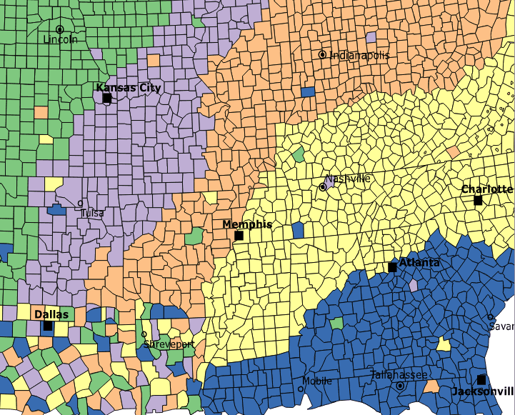
Choosing colors for maps
Many visualizations are based on maps. Sometimes, the creator wishes to show each region in the map with a color that is distinct from its neighboring regions. The data type displayed would be nominal, not ordinal or continuous. How many colors do you need? What combination of colors looks good? Rather than attempting to figure this out by trial and error or by applying topological algorithms, it is much simpler to use an online service that calculates the colors for you. This sort of visualization might otherwise use a different element, such as size, to indicate the value concerned.
Think, for example, of a map wherein the regions are distorted to indicate the number of customers for a given service (regions with many customers are made proportionately larger than their geographical area might indicate).
Note that this issue is distinct from a heat map visualization of a continuous value displayed by region. In this case, a color scale is mapped to the continuous value. An example of this sort of visualization might be an analysis of a service’s revenue by region, when there are many regions. If the edges of those regions need to be shown, they would be indicated by lines.
When to use color
We have seen that color can be a powerful bearer of messages, but is sometimes apt to bring undesired significations. Furthermore, color is easy to misuse and sometimes viewers cannot perceive its distinctions. Let me summarize some uses of color:
- to evoke an emotion
- to evoke a cultural connotation
- to distinguish categorical (nominal) values using hue (but not brightness or saturation) when a small number of categories (certainly fewer than about 12) need to be displayed
- to distinguish ordinal values, especially using brightness but less so with saturation or hue
- to distinguish continuous values, as in heat maps, where the precise measurements at data points are not needed
- to entice the visualization recipient to pay attention
Beware, however, of situations where color might be inappropriate:
- key recipients of messages are colorblind
- the selected color has undesirable cultural or emotional connotations
- too many colors, difficult to distinguish, would be required to represent a large number of categories
- color is generally a poor indicator of continuous values
- hue is of little use for ordinal values
![]() The article Information Visualization and Color, by Robert S. Falkowitz, including all its contents, is licensed under a Creative Commons Attribution-NonCommercial-ShareAlike 4.0 International License.
The article Information Visualization and Color, by Robert S. Falkowitz, including all its contents, is licensed under a Creative Commons Attribution-NonCommercial-ShareAlike 4.0 International License.
Bibliography
[a] Stone, Maureen. “Choosing Colors for Data Visualization”, 2006.
[b] Berinato, Scott. Good Charts: The HBR Guide to Making Smarter, More Persuasive Data Visualizations. Harvard Business Review. 2016.
[c] https://en.wikipedia.org/wiki/Information_design
[d] Nacache, Jaime. Why, How and Where to Use Infographics. https://web.archive.org/web/20201210004612/https://www.business2community.com/infographics/why-how-and-where-to-use-infographics-01407374
[e] Taei, Payman. What Is an Infographic? And How Is it Different from a Data Visualization? https://towardsdatascience.com/what-is-an-infographic-and-how-is-it-different-from-a-data-visualization-a92c23b35197
[f] Frich, Arnaud. Color Management Guide. https://www.color-management-guide.com/
[g] Munzner, Tamara. Visualization Analysis and Design. CRC Press, 2015.
Notes
Credits
Unless otherwise indicated here, the diagrams are the work of the author.
Fig. 5: Downloaded from https://color.adobe.com/create
Figs. 7-11: Copied from LibreOffice.
Leave a Reply