With this article, I start a series about information visualization as it pertains to managing services. I will start with some general remarks about how I understand information visualization and how it differs from data visualization. In future articles, I will discuss types of useful visualizations that service managers rarely use; issues with how they use visualization tools; and hints for making better information visualizations and getting more out of those visualizations.
Information visualization and data visualization
Taking a cue from the knowledge management discipline, I distinguish between data visualization and information visualization. Many authors use these terms interchangeably, so I need to explain why I make the distinction.
What is a data visualization?
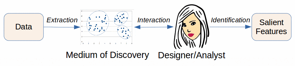
Data visualization may be thought of as a communication between a data set and an analyst or visualization designer, mediated by a visualization. It results from a process wherein the designer attempts to identify and to illustrate certain salient features of the data set. The resulting visualization could be static or interactive. Interaction may take many forms, including among others zooming, filtering, changes of viewpoint, changes of the glyphs used and the encoding of the data and its aggregates in visual form.
Data visualization has a strong heuristic component. Often, the designer/analyst looks to various data visualizations as a means of generating questions. It is often the case that the analyst does not even know what it is that she or he does not know about the data.
What is an information visualization?
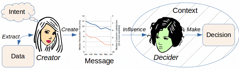
Information visualization may be thought of as a communication between a designer and an audience of decision-makers. It expresses an intent by the designer to influence the decision-makers via the visualization.
Information visualization and data visualization are related
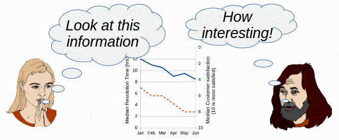
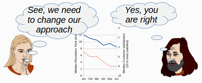
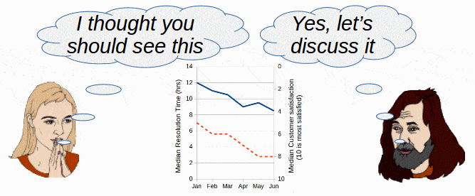
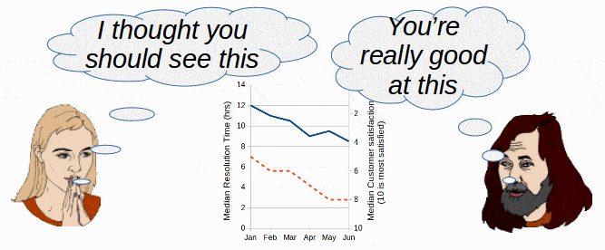
Data visualization and information visualization are related in various ways. Often, the creation of a data visualization is a precursor to the creation of an information visualization. An analyst might first use visual methods to identify the salient points to be communicated. Once the creator defines that message, the data visualization might be reused, as is, for information visualization purposes. However, deciders often find visualizations more effective when reworked to express the designer’s intent more succinctly. Furthermore, taking into account the decision-makers’ needs, contexts and biases might increase their receptiveness and understanding of a visualization.
Thus, while a data visualization allows the viewer to investigate, modify, analyze and try what-if scenarios, an information visualization is the result of such analysis. If the decider trusts the analyst/creator, the information visualization may be sufficient for making useful decisions. However, if the decider is the sort of person who prefers doing the analytical work, then the decider plays the role of the analyst and may rely on the data visualization as the basis for decisions. In practice, there is a gradient from data visualization to information visualization, depending on how much the deciders want to analyze for themselves.
Complementary skill sets
Creating a data visualization and creating an information visualization require complementary skills. A statistician or data scientist, skilled at creating a data visualization, might lack the skills needed to create an effective information visualization, once the salient features of the data have been identified. Conversely, a skilled producer of information visualizations might lack the skills required to handle large data sets, extract the data samples, perform statistical analyses and determine the data set’s important characteristics and patterns.
An analogy might illustrate the distinction. An analyst might use a high-resolution photograph as the basis for analyzing an object. But, for communicating important aspects of that object to third parties, a line drawing, a wire-frame or even a caricature might be more effective and efficient.
The rhetoric of information visualization
Data visualizations may be thought to have a grammar, a syntax and semantics. Information visualizations have all those, but also should take into account the rhetoric of visual communication. Note that the term “rhetoric” refers to the social context of communication and describes the means by which communication informs, persuades and situates communicators within a social context. I do not use “rhetoric” in the sense of the artistic ornamentation of speech. This latter meaning is but a small subset of the former meaning.
The use of color in a visualization illustrates the difference between data and information visualization. Suppose a data visualization shows various discrete categories of objects by their color. So long as the palette uses distinct colors, the visual realization of category is objectively correct and detectable by the viewer (assuming the viewer hasn’t any pathology that prevents distinguishing those colors). No specific meanings are assigned to each color. This is often the case when a visualization creator selects a tool’s default palette of colors, assigned automatically to each data series.
An information visualization showing the same categories and the same underpinning data might deliberately choose the categories’ colors based on their emotional and cultural associations. The visualization creator might intend that the audience favor a certain category in making decisions and use the color of that category to influence in that direction. I will return to this issue in a future article.
In a world where decisions, even decisions of great economic or social importance, are often made based on “fast” thinking, we should not underestimate the power of visualization tools like color, shape, scale and all the other tools at the disposal of the information visualization creator. Most of the subsequent articles in this article are contributions to describing the rhetoric of information visualization.
The ethics of information visualization
If information visualization has a rhetoric—a set of rules for how to communicate intent and identity, how to persuade as well as to inform—the ethics of visualization are equally important.
The apothegm “figures never lie, but liars figure” has its analogy in visualizations. As powerful as visualization might be for describing large or complicated data sets, no single visualization can display everything. Therefore, creators must make many choices about what to show in a visualization and what, in effect, to hide.
Compare Figs. 3 & 4, both of which are based on the same data. The creator of Fig. 3 intended to send the message that the CIO has done a great job of cutting costs in 2017 and 2018. But Fig. 4 tells a very different story. IT service costs have steadily increased, independently of the revenue. Windfall revenue, not good cost management, accounts for the low percentage in 2018.
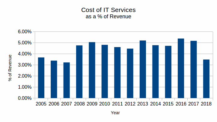
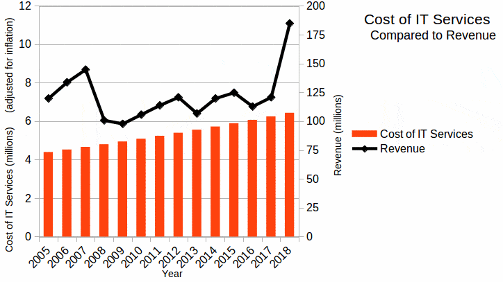
Other opportunities exist in Fig. 3 for misleading the viewer, such as comparing inflation-adjusted service costs to non-inflation adjusted revenue. The viewer must carefully read the diagram and have confidence in the integrity of the visualization’s creator to properly understand the communicated message. The critical decider needs to consider what is not shown in a visualization as well as what is shown.
The visualization creator should be honest and transparent in the choices made for displaying data. That creator may easily hide data that controverts the intended message. He or she may hide significant information by scaling or scoping the data inappropriately. In short, the creator of an information visualization can easily lie. The recipient of the visualization might have equal difficulty in detecting that lie.
Perhaps the most insidious case of misleading visualization is the most common. The creator designs in good faith, but fails to master the statistical and rhetorical rules that govern good visualizations. Such visualizations may mislead as a result of ignorance, rather than as a result of mischief. I hope that the current series of articles on information visualization will provide a little help to remedy such deficiencies.
There are many other misleading types of visualizations, whether intentional or not. For example, a nominal data attribute might be visually encoded in a way that implies an ordinal data type. A single visual encoding appropriate for an ordinal or continuous attribute, such as length, area or position, might encode two (or more!) different attributes. The possibilities for misleading the viewer are endless.1
Purposes of Information Visualization
Information visualization can have as many purposes as any other form of communication. Principally, though, it serves to inform recipients, to persuade or convince recipients, to engage recipients in a conversation and to position the visualization creator in the eyes of the recipients.
Informing
The creator of an information visualization may attempt to create a neutral message. The creator does not intend the recipient to react in a particular way. However, such an attempt will generally fail because the content and structure of the visualization inevitably reflect the creator’s biases and how the creator presents the visualization.
Often, such visualizations include more data than in a persuasion visualization. This added complexity allows the recipient to identify significant patterns and relationships using the visualization. Thus, issues of which the creator was not aware could be supported by the visualization.
Persuading
The creator of an information visualization selects the data to portray, displays it and presents it to evoke a specific response. The response might be a decision to proceed in a certain way, such as a change in the allocation of resources or the confirmation and continuation of existing activities. The visualization might have a purely commercial purpose, designed to sell a product.
When the purpose of a visualization is explicit, extra care should be taken regarding its inherent biases. If the creator intends to dupe the recipient, nothing should be done to highlight the existence of biases (NB: I am not recommending this unethical practice). The visualization should appear to be logical or scientific, even if the reality is wholly different from what is presented.
If the creator intends to ensure that the recipient chooses wisely, then the visualization should be transparent regarding how it was created. The sources of data should be clear. The reasoning behind the data sampling might require explanations. The labeling is unambiguous.
Engaging
Sometimes, a visualization might have long-term intentions rather than to support an immediate decision. For example, a service organization might market itself as an expert, trusted and unbiased partner of the customer. By engaging the customer on broader topics, the provider positions itself for future and growing use of its services.
Positioning
The rhetoric of any communication serves to position its author in social and cultural terms. In verbal communication, the choice of vocabulary, or grammar, or inflection and accent immediately creates an association between the speaker and any number of social, economic or cultural groupings. Since information visualizations are also forms of communication, they are subject to the same types of associations. The creator of a visualization might leverage its rhetoric to position himself or herself vis-à-vis the intended recipients.
Upcoming discussions
In the next articles in this series I will discuss such topics as the dashboards commonly used in service management software, the neurology of visualization and why it is important for designing visualizations, tips for improving the information visualizations in your organization and discussions of various visualizations of use to service managers by rarely exploited.
![]() The article Information Visualization or Data Visualization? by Robert S. Falkowitz, including all its contents, is licensed under a Creative Commons Attribution-NonCommercial-ShareAlike 4.0 International License.
The article Information Visualization or Data Visualization? by Robert S. Falkowitz, including all its contents, is licensed under a Creative Commons Attribution-NonCommercial-ShareAlike 4.0 International License.
Bibliography
[a] Correl, Michael. What Does “Visualization Literacy” Mean, Anyway? Downloaded 2019.10.19.
[b] Berinato, Scott. Good Charts: The HBR Guide to Making Smarter, More Persuasive Data Visualizations. Harvard Business Review. 2016.
[c] https://en.wikipedia.org/wiki/Information_design
[d] Nacache, Jaime. Why, How and Where to Use Infographics. https://web.archive.org/web/20201210004612/https://www.business2community.com/infographics/why-how-and-where-to-use-infographics-01407374
[e] Taei, Payman. What Is an Infographic? And How Is it Different from a Data Visualization? https://towardsdatascience.com/what-is-an-infographic-and-how-is-it-different-from-a-data-visualization-a92c23b35197
[f] Frich, Arnaud. Color Management Guide. https://www.color-management-guide.com/
[g] Perrow, Charles. Normal Accidents. Princeton University Press, 1999 (1st ed. 1984).
[h] Tufte, Edward R. The Visual Display of Quantitative Information. 2nd ed. Graphics Press, 2001.
Notes
Credits
All the diagrams are the work of the author.
[…] of no interaction between the designer and the recipients (see the model in my earlier article Information Visualization or Data Visualization?). Briefly, the viewer cannot get immediate responses from the designer to any questions. This […]