In this installment of my series on information visualizations, I will describe a variety of visualization types that could be very useful for managing services but are rarely seen. There are many reasons for this rarity:
- visualization creators are not aware of the chart types and their usefulness
- the tool developers reuse charting libraries that do not include those types
- the recipients of those chart types might not understand them at first sight
- organizational inertia drags down the desire to improve or innovate
- the tool developers do not perceive there to be a demand for chart types other than the ones they offer.
I do not include in this article the types of charts that are commonly available in the tools service managers tend to use: integrated ticketing tools and spreadsheet tools. These charts—bar charts, dot plots, area charts, radar charts, pie charts, bubble charts, diverse gauges, combinations of these types and yet several other types—tend to be designed for data visualizations rather than information visualizations. They are a form of baby talk in the realm of visualization. Let’s try to use a more mature language to communicate our messages.
About service management tools
My purpose here is not to review and compare products available in the marketplace. That being said, a few remarks about the existing products may be helpful to service managers seeking support for more sophisticated information visualization.
In preparation for this article, I reviewed more than 20 different service management tools, selected based on their longevity, sophistication and popularity. For many of these tools, I benefited from the advice and support of their sales and support personnel, for which I am very grateful.
I do not intend to publish the accumulated data about chart types availability here, as the focus of this article is precisely on what these tools do not provide as visualizations. However, if there is sufficient demand for this information, I might consider publishing it elsewhere.
Linking to third-party visualization tools
Many tools make it possible to create visualizations using external tools, either by batch exporting data, real-time query of their databases or by using protocols, such as REST, to feed data into other tools. This capability leads us to ask what the added value of internal visualization functionality might be. In other words, if it is possible to create visualizations via third-party tools, why bother including this functionality within service management tools at all?
What is the added value of information visualization within a service management tool?
There are two ways to answer this question. The first answer is based on the eternal best of breed versus best overall integrated functionality debate. I do not intend to step into that basket of crabs here.
The second answer is based on the value of increasing levels of functionality. As a tool adds functionality, it generally reduces the time needed to create visualizations. At the higher levels of functionality, it may also help visualization creators to avoid errors, especially when the visualization depends on a good knowledge of statistical analysis.
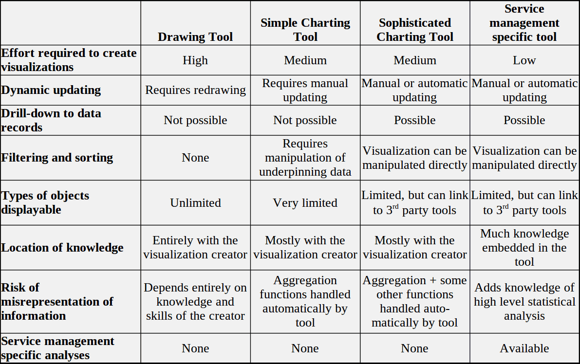
Drawing tools
At the low end of that gradient is the tool that allows you to draw straight lines, circles, polygons and splines and fill in spaces. You can make any visualization at all with such tools, but:
- their creation and maintenance is very labor-intensive
- they do not allow for dynamic updating of the visualization
- there is no drill-down, filtering or sorting capability
Simple charting tools
At the next level is the tool that automatically creates the coordinate system and places the data objects of the visualization, based on the underlying data. This saves a huge amount of time, compared to the first level, but at the cost of limited freedom in what objects can be displayed. Such tools might be able to update the visualization (semi-)dynamically, but they do not offer any drill-down capability. Any sorting and filtering capability depends on sorting or filtering the underpinning data, rather than the visualization itself.
Sophisticated charting tools
Those capabilities are added in the next level of functionality. The more sophisticated service management tools are at this level. But there remains one higher level that most of these tools lack.
Service management-specific tools
A few (very few) service management tools take visualizations to a higher level, providing (mostly) out-of-the-box charts that address issues specific to doing the work of managing services. The characteristics of such visualizations are best described using a few examples.
I call these visualizations “service management-specific” for lack of a better title. Of course, most of them may be useful for communications about fields other than service management. The mere fact that a type of visualization is available in a service management tool does not mean that the tool is producing service management-specific visualizations.
Example: the lead time histogram
Let’s take the example of a histogram displaying the distribution of lead times for a certain service. Creating a good histogram requires the following capabilities:
- a useful number of buckets, and their size, must be defined
- there should be a visual indication of the median and perhaps the mean values
- there should be a visual indication of thresholds significant to the needs of the service customers, such as the lead time required to fulfill 90% of the service acts within the needed time
- if the histogram is intended to be mono-modal, there should be an indication if there is a significant possibility of multi-modal underpinning data

- the overall effort required
- whether the knowledge required is embedded in the tool or in the tool creator
- and, if the latter, the tool creator even has the requisite knowledge
Example: the statistical control chart
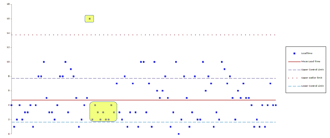
Do not think that I am criticizing service management tool developers. They are all positioning themselves according to their perceptions of the marketspace and the niches in which they hope to deliver their products. The service management eco-system also includes the tool customers and the authors of service management frameworks. They have accorded relatively little importance to the sorts of analysis and communication that the visualizations described below are intended to support.
Higher-level visualizations for service management
In this section, I list a variety of visualizations that are particularly useful for managing services but are generally not available within service management tools. Indeed, many of them are available in only a few sophisticated charting tools.
Where possible, I have used a nomenclature based on the idioms defined by Tamara Munzner in Visualization Analysis & Design. That being said, there is little standardization of the names of visualizations.
The examples I provide below are more the raw visualization idioms (using Munzner’s terminology) than complete information visualizations. I would expect them to be embedded and adapted for the communication purposes, as described in my previous discussion of visualizations.
Control Charts
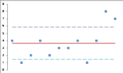
The control chart, also called a Shewhart chart or a statistical control chart, is the classic example of visualizing whether a process is under control. The chart is a scatter plot indicating the mean value and upper and lower control limits based on the standard deviation of the sample. It provides a simple means for identifying process instances that are apt to be the result of non-random effects.
Parallel coordinates
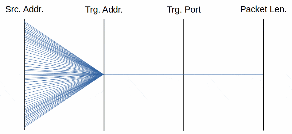
A parallel coordinate chart addresses the problem of not being able to visualize more than three dimensions projected onto a two-dimensional plane. Instead of trying to emulate Cartesian coordinates with axes at right angles to each other, it makes them parallel. Lines connect the values of each item on each axis.
An example of the power of visualizing with parallel coordinates would be the analysis of DDOS attacks by tracking the source IP, target IP, target port and packet size for the attacking packets. An attack has a characteristic visual pattern.
Sankey charts
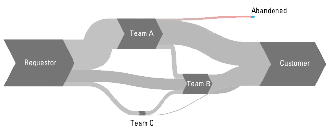
The chart par excellence for visualizing flow. In addition to displaying the nodes of a network and their connections, it represents the volume of flow between nodes by the width of the connector.
Typical applications include the analysis of the flow of work from node to node; the analysis of the delivery of services from providers to consumers; and the analysis of transitions or transformations from one set of states to a new set of states.
See a further discussion here.
Marey charts
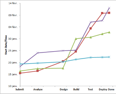
Originally designed to visualize the relative speeds in a transportation network, a Marey chart may also be used to show the speeds with which the phases of a value stream are executed. Multiple lines allow for comparisons of different teams, different periods, different processes, etc. See a further discussion here.
Cumulative Flow Diagrams
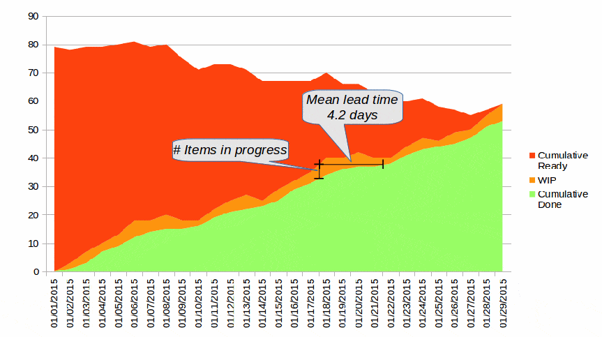
The cumulative flow diagram is a form of stacked area chart that quickly shows the evolution of the work backlog, work in progress and work completed over a period, such as the duration to date of a project. It also easily shows the changes in the mean lead time at a given moment.
Bump charts
A bump chart encodes a time series, showing the evolution of a continuous value for each nominal category of data. You can easily see the changes in relative importance of those categories over time.
Some people use “bump chart” as a synonym for “slope graph” which, however, is a different type of chart.
Violin Plots
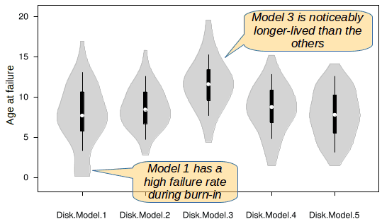
A violin plot allows for easy comparison of various categories of data, showing the distribution over time and, typically, such statistics as the high, low, mean and quartiles. As such, it resembles the simpler box plot.
See also bee swarms.
Bee swarms
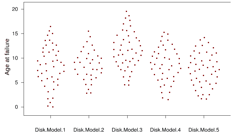
A bee swarm is a form of dot plot where the individual data points are shown as dots but grouped according to categories. A bee swarm is like a violin plot with the detailed data points displayed, rather than the aggregated distribution statistics and the outline of the distribution. Thus, a bee swarm would be a good way of drilling down from a violin plot to the details.
See also Violin plots and Clustered scatter plots.
Clustered scatter plots
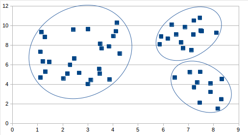
Virtually all visualization tools allow for the creation of scatter (X-Y or dot) plots. Often, these data points are clustered. Considerable value is added if the tool can identify those clusters and automatically visualize them, such as with circles or shading. Such visualizations are extremely useful in AI applications. See also Contour Maps.
Tile Maps

When data can be related to geographical categories, such as countries or regions, a tile map is a useful way of visualizing that data. Not only can the data be plotted against many different types of projections; the projections themselves may be altered (distorted) to visualize the data. About 30% of the tools I analyzed provide some map-based visualizations, but only with the simplest, Mercator-style projections.
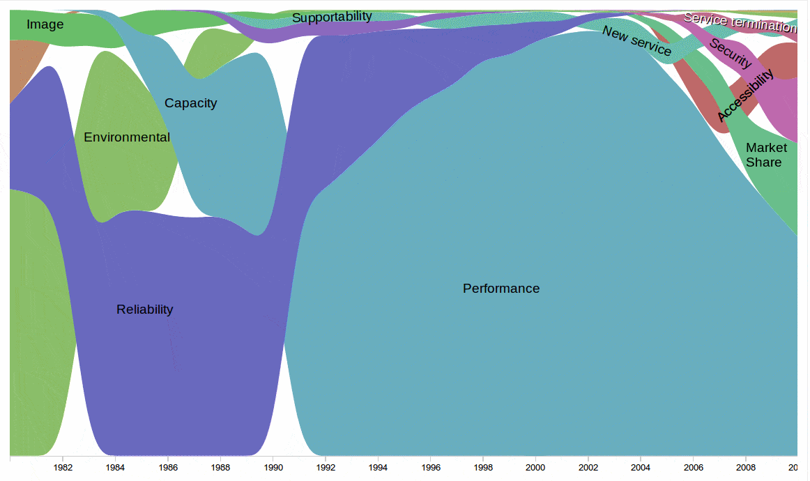
Stream Graphs
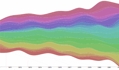
A stream graph provides an extremely dense, impressionistic visualization of the evolution over time of the counts of a series of categories of data. For example, one might display how types of incidents or categories of changes gain and lose popularity over time. Care must be given when viewers might be color blind. Good labeling and annotations greatly enhance this type of visualization.
A stream graph is an interesting example of how our perceptions can adapt to new visualizations. A moving horizontal axis characterizes this type of graph. This feature minimizes distortion of stacked shapes, but is unexpected by viewers accustomed to a Cartesian coordinate system.
Contour Maps
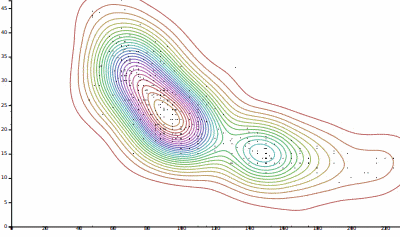
A contour map takes the clustered dot plot one step farther. It not only visually groups correlated data values, it also displays the degree of correlation via concentric contour lines.
Perceptual Maps
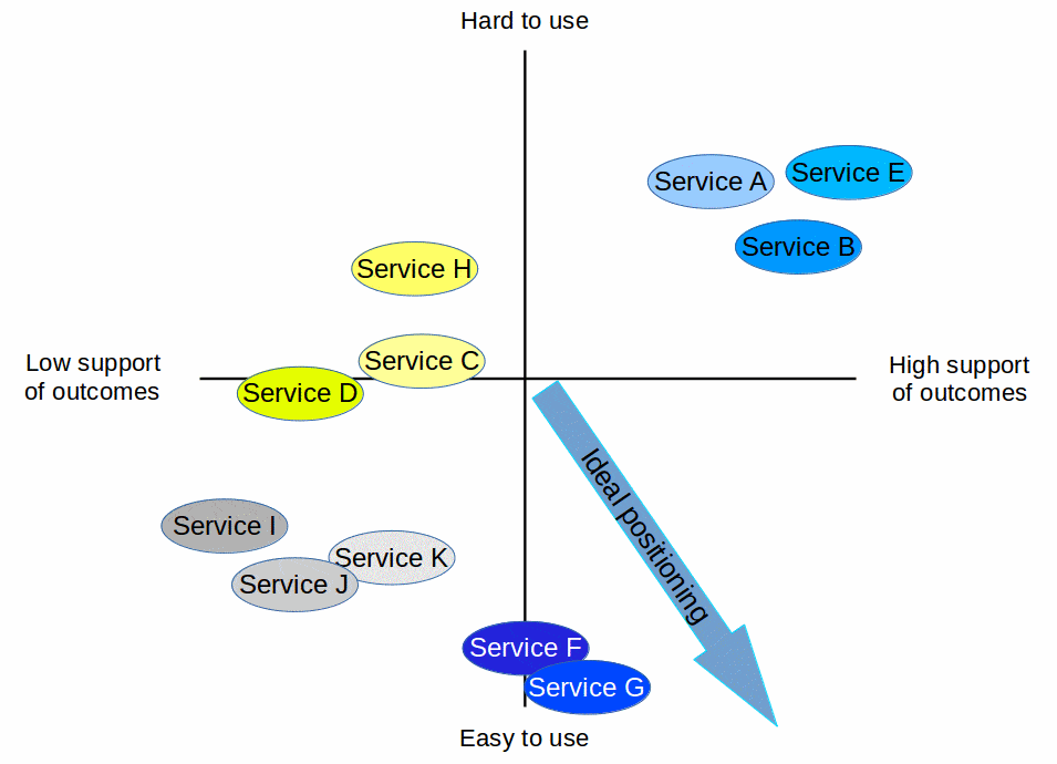
A perceptual map is useful for plotting the market’s perceptions of competing services. Multi-dimensional scaling may be used to reduce the plotted dimensions to the most significant ones. The services may be clustered in the resulting map and opportunities for (re-)positioning services identified.
Heat Maps
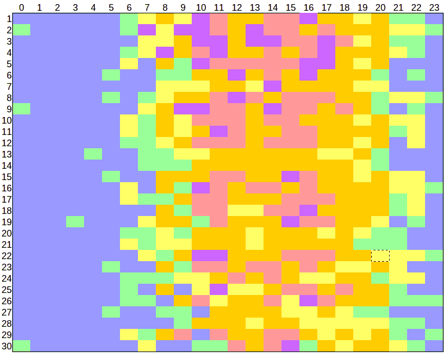
A heat map is a useful way of showing the evolution of cyclic patterns. A row corresponds to one cycle. It consists of as many tiles as there are subdivisions in the cycle. A cycle of 1 day might have 24 tiles; 1 year might have 12 tiles or 365 tiles, etc. Each tile could be color-coded to indicate a category or an ordinal value. Show as many rows as needed for additional cycles. For example, you might display the evolution of mean support calls per hour per day during a month.
A variant form, the cluster heat map, leverages the functionality of the re-orderable matrix, a particularly powerful analytical approach.
Note that some people call geographical maps colored to indicate some statistic as “heat maps”. We will live with the ambiguity. Adding to the confusion, both types of visualizations are also called “tile maps” by some.
Directed Graphs
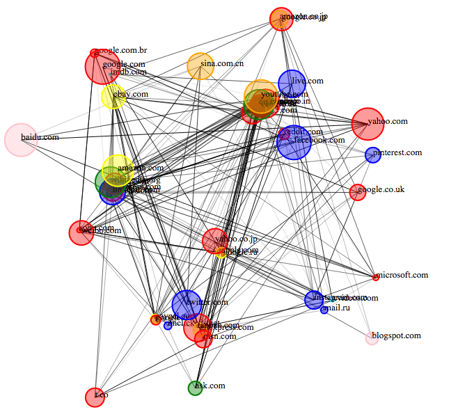
The directed graph (as well as the undirected graph) has become a very popular way of presenting and analyzing social networks. Insofar as some service providers have adopted the social network framework for organizing their work, especially support work, the directed graph can be applied directly to such activities. Some applications might include the analysis and presentation of the flow of information (although Sankey charts do a better job of showing the volume of flow); the identification of bottlenecks; the reorganization of personnel to reduce inter-team communication and thereby increase overall performance
Of course, the images used in configuration management tools to visualize configuration item relationships are essentially directed graphs (or just simple graphs). I will discuss such tools in detail in a separate article.
Value Stream Maps
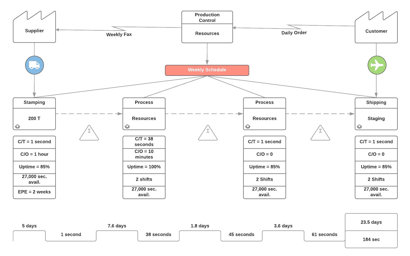
Value stream maps provide a comprehensive overview of the activities in a value stream, the resources used, the availability of activities, the mean execution and waiting times, and so forth. They are particularly useful for identifying waste and bottlenecks.
Wardley Maps
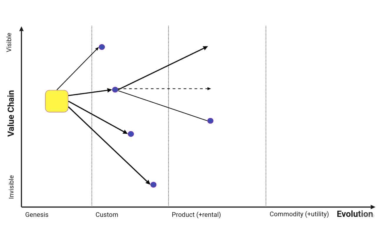
Wardley Maps are designed to help visualize strategic choices regarding the possible evolutions of products.
Customer Journey Maps
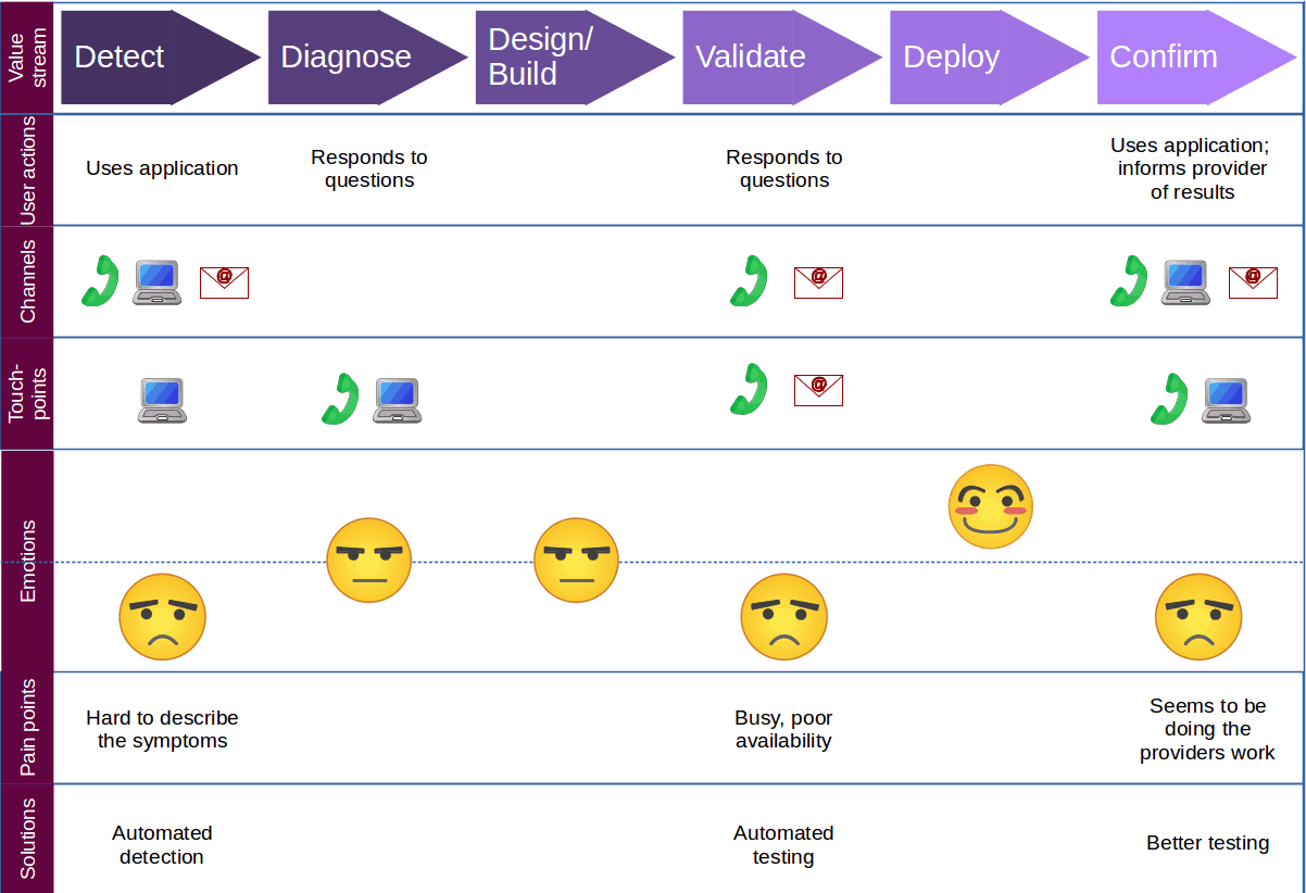
Customer journey maps may take many forms. They are particularly useful for helping a service provider to understand how its services appear to the service consumers. As such, the consumers’ touchpoints are visualized, often relating them chronologically to each other, to the value stream, to the channels through which consumers interact and to performance measurements.
There are, of course, many other types of visualizations in addition to the ones illustrated above and the common “baby-talk” visualizations. This list is meant to be indicative rather than exclusive. Information communication is, by nature, open-ended and creative.
I have not included any of the visualizations that are just visually structured text. Many of the models for defining enterprise strategy, such as business model canvases, fall into this category. Similarly, I have not included the tabular organization of text and the ever-popular word cloud, although the latter treats words more like images than like strings of letters.
I expect to continue this series, looking at such issues as interactivity and the depiction of configurations.
 The article Information Visualizations for Service Management, by Robert S. Falkowitz, including all its contents, is licensed under a Creative Commons Attribution-NonCommercial-ShareAlike 4.0 International License.
Bibliography
[a] H. Choi, H. Lee, and H. Kim, “Fast detection and visualization of network attacks on parallel coordinates,” Computers & Security, vol. 28, no. 5, pp. 276–288, 2009.
[b] Tamara Munzner, Visualization Analysis & Design. CRC Press (Taylor & Francis Group, LLC). Boca Raton, 2015. ISBN 978-1-4987-0776-3.
[c] Jacques Bertin, Sémiologie graphique. École des hautes études en sciences sociales, 2011 (original edition 1967). English version: Semiology of Graphics, Esri Press, 2010.
Notes
Credits
Unless otherwise indicated here, the diagrams are the work of the author.
Fig. 17: Deepthiyathiender – Own work, CC BY-SA 4.0, https://commons.wikimedia.org/w/index.php?curid=45541728

[…] last article in this series gave an overview of visualization types useful for managing services but […]