This series of articles on information visualization would not be complete unless we looked at the reasons for using visualizations to communicate. Since visualizations are but one channel among many for communicating messages, what are its particular advantages? In addition to describing many of the benefits of information visualizations, I end this article with a few caveats regarding their difficulties or misuse.
In the past, it was common to justify the use of visualizations by saying that some people think with the left side of the brain, others with the right side. In other words, some people are happier to see a table of numbers; others prefer a graphic. This subjective difference in preference might exist, but we should not ignore the fact that cognitive processing of messages transmitted via visualizations may involve the same parts of the brain as the processing of data tables and formulæ. So it is not simply a left versus right issue.
Some researchers have investigated whether cognition can occur purely via images, without the benefit of words. They have used such techniques as functional magnetic resonance imaging (fMRI) to determine which parts of the brain are invoked by which type of neurological activity. As far as I know, this research has not conclusively demonstrated that thinking can occur via images alone.
So, in this article, I will dig down a little more, rather than depend on facile generalizations about the benefits of information visualizations.
High bandwidth
The visual system is a very high bandwidth means for introducing data to our cognitive processors. Consider the image in Fig. 1. There are nearly 1’000 elements in this image, yet the single exceptional element is perceived at a glance. Imagine how much time it might take to find an exceptional value in a list of 1’000 numbers.

Suppose you received a complaint from a manager about the quality or the timeliness of your organization’s support function. You know that the mean values are not too bad, so you need a way to quickly identify the exceptions and relate them to the perceptions of that manager. If those exceptions are truly rare, you need a way to convincingly show that manager the reality of your support. An information visualization can be extremely effective for this purpose.
Multi-dimensional representation of data
As data sets become larger and more sophisticated, the number of dimensions for a given item tends to increase. It is not unusual for some of the large data sets used in machine learning applications to have 100 dimensions, or even more.
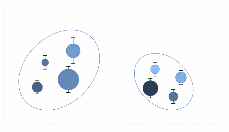
Now, any representation of a data set with 100 dimensions, whether visual or not, would be extremely difficult to perceive. But a visualization can easily represent many dimensions. It is not limited to the two or three dimensions that are most commonly used. This is because visualizations themselves multiple dimensions mappable to the data set dimensions. Here are the principal visualization dimensions:
- position
- shape
- angle
- hue
- brightness
- saturation
- texture
- connection
- containment
- length
- slope
- area
- volume
Fig. 2 provides an example of a visualization including six distinct dimensions, each represented by a different visual channel of information.
Density of information
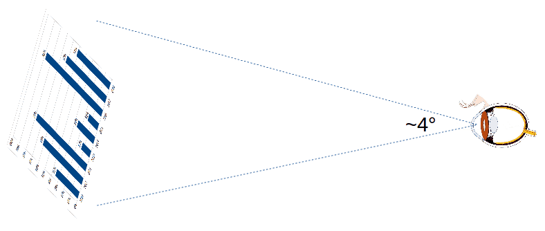
When we look at an information visualization, we are typically using only about 4° of our visual field (see Fig. 3). And yet, that very small area has the capacity to communicate a very large amount of information.
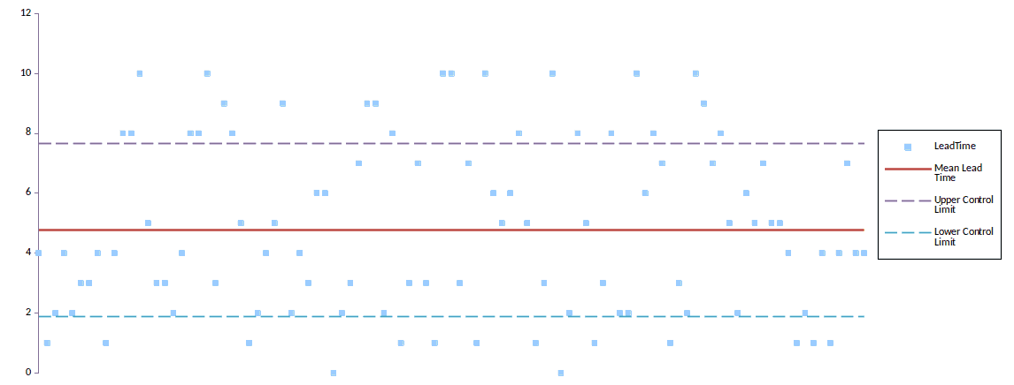
Let’s take the example of a statistical control chart, as in Fig. 4. On my computer screen, that image takes about 98 cm². It contains 100 data points. The data table on which it is based, using 11 pt type, takes about 459 cm². That table contains much less readily apprehensible information than the graphic. The latter makes it easy to see outliers as well as apply the many rules for detecting non-random events. In short, you get much more bang for the square centimeter using a visualization.
Visualizations that obey Shneiderman’s mantra, allowing a drill-down to details, can multiply the information density by many factors.
Time to decision
Information density is a useful metric for information visualizations if it reduces the time needed to make good decisions. If the purpose of such visualizations is to persuade deciders, it is perhaps more important to talk about how long it takes to be persuaded, as well as the percentage of cases where the persuasion is successful. As I have no statistics for the latter, I will depend on the other benefits described in this article as proxies for this metric.
As for the time to decision, let me compare the efficiency of three approaches, again using the statistical control chart as an example (as in Fig. 4). These approaches are:
- analysis based on a data table
- analysis based on a visualization
- analysis using an automated algorithm
Suppose our purpose is to identify cases of non-random exceptional events that should be handled via an improvement initiative.
Analysis via a simple data table would be laborious and extremely time-consuming. It would require:
- calculating the mean, the upper and the lower control limits
- identifying the data points above the upper limit and below the lower limit
- identifying the sequences of data points that are not likely to be random
- presenting the results of the analysis in some verbal forms, together with a recommendation
Analysis via a visualization would require:
- preparing the visualization based on the data table
- identifying in that visualization the exceptions to be handled
- presenting a recommendation based on the visualization
Analysis via an automated algorithm (i.e., a computer program) would require:
- defining the algorithm
- realizing the algorithm in code
- running the program
- presenting a verbal recommendation based on the output of the program
In all three cases, the recipient of the analysis would have to:
- become engaged by the analysis
- understand the analysis
- accept the recommendation (or come to a different conclusion)
- act on the conclusion
The importance of the time to decision in a service management context should be obvious. Think of the value of the visualizations of events as a way of quickly diagnosing incidents or even in predicting when components are about to fail.
Ease of remembering messages
The long-term memory of the brain is capable of durably storing a vast quantity of images. When a message is communicated via an information visualization, that message may be recalled via the image of the visualization.
If the same message were communicated via words, it might be more difficult to recall, especially if those words do not take the form of a poem, a song or a narrative. I think the key difference between remembering via an image as opposed to remembering via a list of numbers is that the image embodies both the values of those numbers as well as the relationships among them.
That being said, even though a visualization could include hundreds, or even thousands, of bits of information, we will not remember all the exact positions, shapes, colors, etc., of each element. Rather, we are likely to recall the Gestalt of the image. In particular, we can remember the proximity, similarity, symmetry and connectedness of the elements of an image.1 Only a Ramanujan could remember the same for a set of numbers.2
Have you ever worked on diagnosing a problem with the support of a visualization? If so, have you ever asked yourself, “Where have I seen that before?” Remembering the pattern of an image can quickly help identify useful paths of inquiry as part of resolving the problem.3
Simple statistics can hide what visualizations make manifest
We often use simple statistics, such as mean, correlation, variance and linear regression to describe data sets. As useful as these statistics might be, visualizations of the data set can provide striking information that these statistics, alone, cannot.
The classical example of this is Anscombe’s Quartet. It consists of four data sets whose mean, variance, correlation and linear regression line are the same (at 2 decimal places), in spite of huge differences in the character of the data. These differences are obvious when visualizing the data as dot plots (Figs. 5-8).
For all four variants:
Mean X = 9.00
Mean Y = 7.50
Variance X = 10.0
Variance Y = 3.75
Correlation coefficient = 0.816
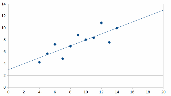
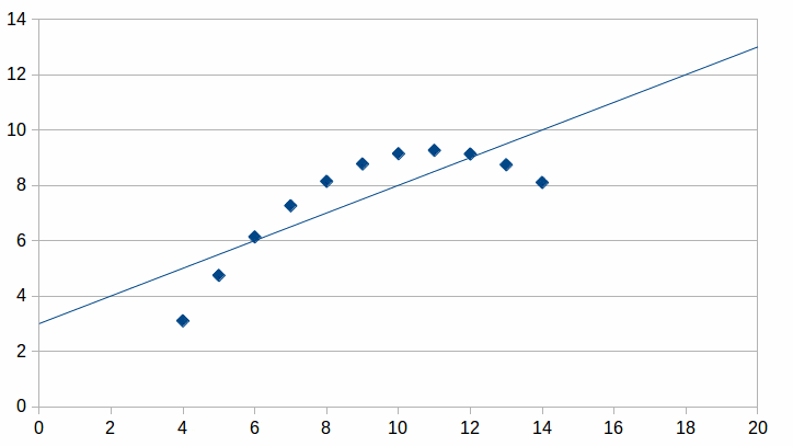
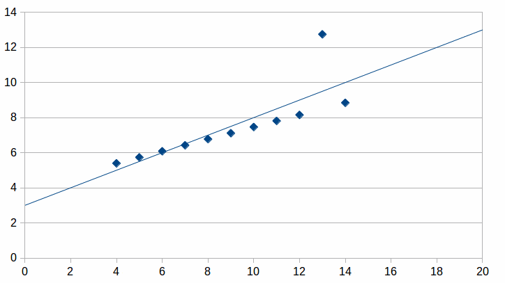
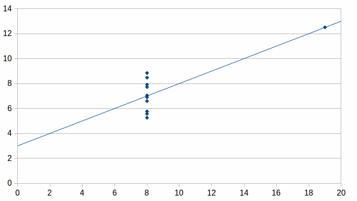
Thus, visualizations can, in many circumstances, rapidly provide a much more accurate assessment of a situation than a set of aggregate statistics. Think of the analysis of trends in lead time for resolving service requests. Is there a general trend of improvement? Has improvement peaked, but has now leveled off or is even getting worse? Is the process simply not under control, with a large number of non-random times?
Some visualization disadvantages
No interaction between designer and recipient
Visual communication shares with written documents the disadvantage of no interaction between the designer and the recipients (see the model in my earlier article Information Visualization or Data Visualization?). Briefly, the viewer cannot get immediate responses from the designer to any questions. This contrasts with verbal communication, where the possibility of exchanges between speaker and audience and even within the audience is a manifest advantage.
This disadvantage may be palliated in various ways, depending on the available technology and the culture of the communication actors. Some organizations have integrated electronic chat tools into their ways of working. If visualization designers are prepared to be interrupted at any moment, this channel allows for questions and answers almost as rapid and interactive as with a face to face encounter. Indeed, it has the added benefits of leaving a record of the exchange and does not fall prey to the problems of bad acoustics, poor enunciation and low aural comprehension (especially when listening to languages other than one’s native language).
The takeaway message is that information visualizations should include information about how to ask questions of the designer, insofar as the designer is prepared to respond to them.
Information Visualizations and Phony News
I once worked for an organization where the CIO proudly boasted that he reduced IT costs from 8% of the total revenue to only 6% while maintaining or improving quality. And the CIO had all the dashboard graphics needed to document this wonderful achievement. But he failed to say that the organization had been having brilliant years, with revenue increasing by 20% per annum. So, in fact, there were huge increases in IT expenditure. There was no significant cost-cutting, relative to revenue, at all!Learning how to read newspapers critically used to be one of the fundamental components of civic education. Unfortunately, this skill seems to be increasingly discounted, as “news” is increasingly communicated peer to peer, rather than from centralized journalists to distributed readers or viewers. Mass diffusion of self-serving lies has become a fine art, worthy of a Goebbels.
Communicating messages via information visualizations is subject to this same issue. Basing visualizations on some data gives the illusion of authority. But the visualization itself does not give the full context of how those data were selected and transformed. The viewer depends heavily on the reputation of the author or the publisher for assessing whether the visualization is well-founded. Even so, it remains important to view information visualizations critically. The rhetoric of visualizations can so easily confound the gullible, mislead the naïve and cause the simpleton to make the wrong decisions.
I will discuss the importance of improving information visualization skills in a separate article.
![]() The article Why Use Information Visualizations? by Robert S. Falkowitz, including all its contents, is licensed under a Creative Commons Attribution-NonCommercial-ShareAlike 4.0 International License.
The article Why Use Information Visualizations? by Robert S. Falkowitz, including all its contents, is licensed under a Creative Commons Attribution-NonCommercial-ShareAlike 4.0 International License.
Notes
1 Think, for example, of Hardy’s famous anecdote about his visit to Ramanujan at a hospital:
I remember once going to see him when he was ill at Putney. I had ridden in taxi cab number 1729 and remarked that the number seemed to me rather a dull one, and that I hoped it was not an unfavourable omen. “No,” he replied, “it is a very interesting number; it is the smallest number expressible as the sum of two cubes in two different ways.”
2 See, for example, Elijah Meeks contributions at https://emeeks.github.io/gestaltdataviz/section1.html through https://emeeks.github.io/gestaltdataviz/section4.html
3 Here is an anecdotal illustration of the vast capacity and usefulness of visual memory. I watch a large number of films, usually selected by the title, year and short synopsis of the plot. Sometimes, I choose a film that I had already seen but the selection criteria do not allow me to recall the previous viewing. However, after a few seconds of watching the film, I quickly realize that I had seen it before.
Credits
Leave a Reply