• Skip to main content
  • Skip to primary sidebar

This view of service management...

On the origin and the descent of managing services. We put meat on the bones.

  • Kanban eLearning
  • Services
    • Kanban Software Solutions
    • Consulting & Coaching
    • Training & Seminars
  • Posts
  • Events
    • Events – Agenda View
    • Events – Calendar View
    • International Service Management Calendar
  • Publications
    • Our Publications
    • Notable Publications
    • Quotes
  • About us

statistical control chart

Information Visualizations for Service Management

24 April 2020 by Robert Falkowitz 1 Comment

contour map

Service management tools include only rarely the visualizations that provide a high level of information to support the management of services. The reasons for this and many examples of high-level visualizations are provided.

Filed Under: Service Management, Visualization Tagged With: bee swarms, bump charts, clustered scatter plots, contour maps, cumulative flow diagrams, customer journey maps, directed graphs, heat maps, histogram, Marey charts, parallel coordinates, perceptual maps, sankey charts, statistical control chart, stream graphs, tile maps, value stream maps, violin plots, Wardley maps

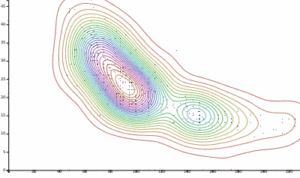
Visualizing uncertainty

15 January 2020 by Robert Falkowitz 1 Comment

gradient chart of expected disk model life

In this age of visual management, Bayesian reasoning, machine learning and other statistical methods, it is increasingly important to understand how certain we are about the “facts” and how to visualize that uncertainty.

Filed Under: Visualization Tagged With: bias, box plot, buckets, complex adaptive system, continuous visual encoding, error bar, gradient chart, histogram, Hubbard, hypothetical outcome plot, Kahneman, probability density function, saturation, statistical control chart, systematic error, Value suppressing uncertainty palette, violin plot

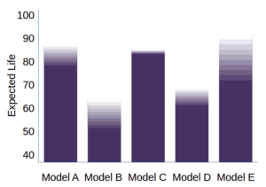
Why Use Information Visualizations?

3 January 2020 by Robert Falkowitz Leave a Comment

visualization as high bandwidth

Visualizations are but one channel among many for com­mu­ni­cat­ing messages. What are its particular advantages? In addition to describing many of the benefits of information visualizations, I end this article with a few caveats regarding their difficulties or misuse.

Filed Under: Visualization Tagged With: correlation coefficient, fMRI, statistical control chart, variance, visual bandwidth, visual channels, visual field, visual memory

Primary Sidebar

Kanban eLearning

Kanban training online

Recent Posts

  • The Three Indicators
  • Visualization of Configurations
  • How to increase visualization maturity

Tag Cloud

adaptive case management resource liquidity flow value stream incident impact cause rigidity Incident Management risk kanban board bias lead time Cost of Delay manifesto Service Management process metrics change management process automation service management tools value problem tools kanban agility statistical control chart incident management tools knowledge management lean knowledge work service request change control kanban training context switching manifesto for software development ITIL agile urgency waste
  • Kanban eLearning
  • Services
  • Posts
  • Events
  • Publications
  • Subscribe
  • Rights & Duties
  • Personal Data

© 2014–2021 Concentric Circle Consulting · All Rights Reserved.
Concentric Circle Consulting Address
Log in