• Skip to main content
  • Skip to primary sidebar

This view of service management...

On the origin and the descent of managing services. We put meat on the bones.

  • Kanban eLearning
  • Services
    • Kanban Software Solutions
    • Consulting & Coaching
    • Training & Seminars
  • Posts
  • Events
    • Events – Agenda View
    • Events – Calendar View
    • International Service Management Calendar
  • Publications
    • Our Publications
    • Notable Publications
    • Quotes
  • Subscribe

Graphical management tools

Violin plots for services & kanban

16 March 2018 by Robert Falkowitz 1 Comment

Concept of a violin plot

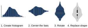
I have frequently remarked that “traditional” analysis of service events and the plotting of data is highly misleading. This is due to a distribution of data that is neither symmetric nor normal. A useful data plotting tool for asymmetric, non normal data distributions is the violin plot. This article joins my series of articles concerning […]

Filed Under: Graphical management tools, Kanban, Service Management Tagged With: asymmetric distribution, box plot, histogram, interquartile range, lead time, median, normal distribution, probability density, reliability, tools, violin plot

Using Sankey diagrams for kanban

31 January 2017 by Robert Falkowitz 3 Comments

Sankey diagram

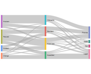
A Sankey diagram is used to provide a visual analysis of flows. While it might be most commonly used to display the flow of materials through a distribution system, such as petroleum and its derived products, Sankey diagrams are well adapted to provide visual analysis of the flow of any type of work. Thus, they […]

Filed Under: Graphical management tools, Kanban Tagged With: flow, kanban, Sankey diagram, visual management

How can a Marey chart help analyze the flow of work?

19 January 2017 by Robert Falkowitz 4 Comments

Marey Chart

The type of diagram called a Marey chart might be more than a century old, but it can be a useful new addition to the arsenal of tools at the disposal of lean and kanban practitioners. What is a Marey chart? A Marey chart is commonly used to analyze transportation systems. It displays the times […]

Filed Under: Graphical management tools, Kanban Tagged With: cause analysis, cumulative flow diagram, kanban, lead time histogram, marey chart, problem solving, value stream map

Primary Sidebar

Kanban eLearning

Kanban training online

Recent Posts

  • The Three Indicators
  • Visualization of Configurations
  • How to increase visualization maturity

Tag Cloud

change control incident management tools cause Cost of Delay service management tools process metrics value stream rigidity kanban Incident Management manifesto ITIL service request change management priority context switching problem incident value flow waste risk bias kanban board process definition Service Management agile lean management lean knowledge management urgency agility resource liquidity adaptive case management service manager automation flow efficiency impact manifesto for software development knowledge work
  • Kanban eLearning
  • Services
  • Posts
  • Events
  • Publications
  • Subscribe
  • Rights & Duties
  • Personal Data

© 2014–2021 Concentric Circle Consulting · All Rights Reserved.
Concentric Circle Consulting Address
Log in

This site uses cookies . You accept those cookies when you continue to use this site. Cookie policyAllow cookiesNo 3rd party non-functional cookiesCookie policy
You can revoke your consent any time using the Revoke consent button.Change cookie settings